

Most logos of large companies contain some kind of meaning – either a reference to historical roots, a graphic reflection of the position or goals of the brand, or the aesthetic vision of the company’s management. Therefore, on many logos, in addition to inscriptions, we see additional symbols that represent one or another quality.
Today we will talk about logos that have the Crown in them. In some logos it is the main element, in others, it is almost invisible. But the crown is always a symbol of strength and grandeur, confidence, and, of course, quality. In this article, we have compiled completely different logos, which we will discuss below, in alphabetical order.
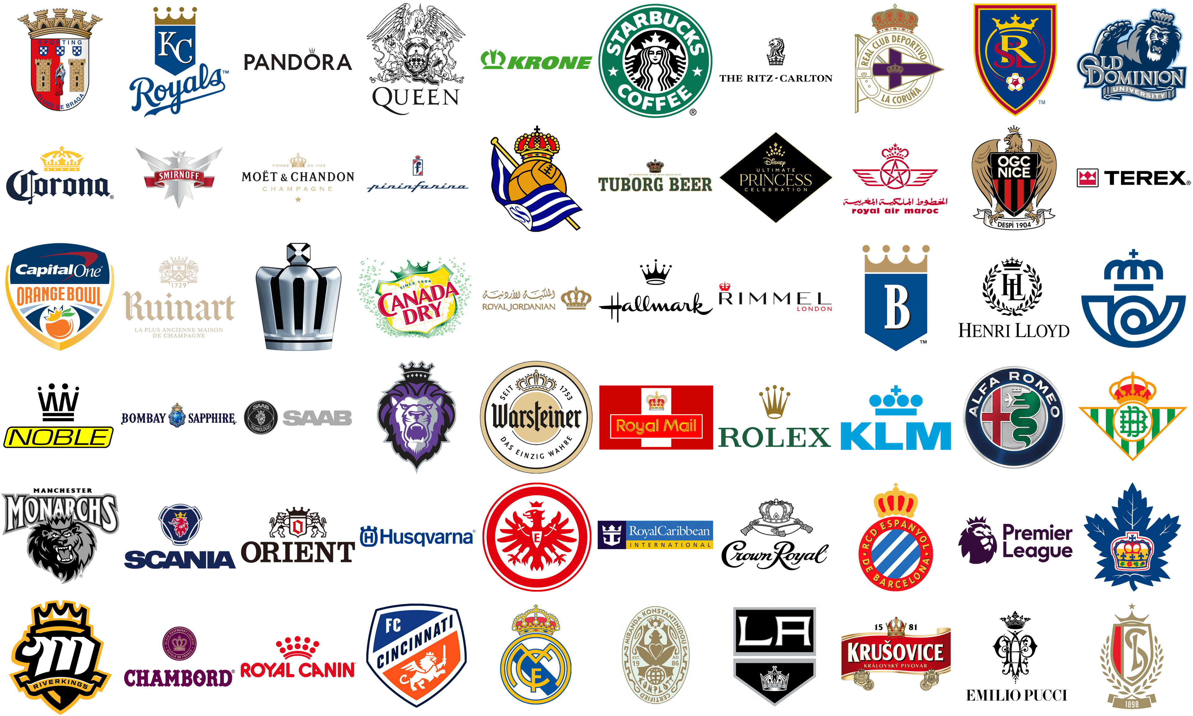
Smirnoff
![]() The famous brand of vodka, Smirnoff, has a logo, based on the iconic heraldic symbol, the two-headed eagle, with a small geometric crown on top. All elements of the badge feature clean straight lines and angles, hence the minimalistic style of the crown looks here very logical and stylish. The three triangular peaks of the Smirnoff crown are accompanied by the three large triangles pointing down at the tail of the bird.
The famous brand of vodka, Smirnoff, has a logo, based on the iconic heraldic symbol, the two-headed eagle, with a small geometric crown on top. All elements of the badge feature clean straight lines and angles, hence the minimalistic style of the crown looks here very logical and stylish. The three triangular peaks of the Smirnoff crown are accompanied by the three large triangles pointing down at the tail of the bird.
Canada Dry
![]() The popular Canadian soft drink has a very colorful and juicy logo, decorated with a playful crown on top. Drawn in glossy green color, it supports the frame of a wide yellow and white badge, with the enlarged red lettering crossing it. The crown has five sharp peaks with small spheres on top of them, and the middle peak is taller than four others, while the left and right ones are a bit taller than the two neighboring.
The popular Canadian soft drink has a very colorful and juicy logo, decorated with a playful crown on top. Drawn in glossy green color, it supports the frame of a wide yellow and white badge, with the enlarged red lettering crossing it. The crown has five sharp peaks with small spheres on top of them, and the middle peak is taller than four others, while the left and right ones are a bit taller than the two neighboring.
Royal Caribbean International
![]() Royal Caribbean International is a company, that is engaged in running cruises, so its visual identity is a perfect representation of its activity. The Horacio tally oriented rectangle is divided into three parts: the dark blue circle with an emblem on the left, the wide light-blue rectangle with the name of the company, and the narrow yellow one with the uppercase “International” tagline. The emblem of the company is composed of a white geometric crown, being the top part of an anchor with a triangular bottom part.
Royal Caribbean International is a company, that is engaged in running cruises, so its visual identity is a perfect representation of its activity. The Horacio tally oriented rectangle is divided into three parts: the dark blue circle with an emblem on the left, the wide light-blue rectangle with the name of the company, and the narrow yellow one with the uppercase “International” tagline. The emblem of the company is composed of a white geometric crown, being the top part of an anchor with a triangular bottom part.
Orient
![]() The Japanese watch manufacturer, Orient, has a very nice modern interpretation of a traditional crest design in its logo. The shield, placed between two lions rampant is decorated by a wide solid crown with four peaks with small circles on the ends. The color, used for the crown is also used for the bold serif lettering in the uppercase Orient logotype, set under the graphical part. Hence, it adds balance and equalizes the heavy parts of the badge, making it look harmonious.
The Japanese watch manufacturer, Orient, has a very nice modern interpretation of a traditional crest design in its logo. The shield, placed between two lions rampant is decorated by a wide solid crown with four peaks with small circles on the ends. The color, used for the crown is also used for the bold serif lettering in the uppercase Orient logotype, set under the graphical part. Hence, it adds balance and equalizes the heavy parts of the badge, making it look harmonious.
Alfa Romeo
![]() The famous Italian automobile manufacturer uses heraldic marines for its primary logo, and the crown on it is just a small detail in the complicated and intense composition. Drawn abstractly, above the head of a serpent, it is set in glossy silver on a silver background, so makes more of a delicate accompaniment, emphasizing the history of the brand and its heritage. The Alfa Romeo crow is a symbol of excellence.
The famous Italian automobile manufacturer uses heraldic marines for its primary logo, and the crown on it is just a small detail in the complicated and intense composition. Drawn abstractly, above the head of a serpent, it is set in glossy silver on a silver background, so makes more of a delicate accompaniment, emphasizing the history of the brand and its heritage. The Alfa Romeo crow is a symbol of excellence.
Old Dominion Monarchs
![]() The “Monarchs” part of the name of the athletic teams from the Old Dominion University is depicted on their logo in the shape of a crown. The crown is set on the head of a lion, drawn in blue and gray above the logotype, underlined by a thin gray ribbon with the white uppercase “University” lettering on it. The animal looks very aggressive and dangerous, and the crown on its head only elevated these feelings.
The “Monarchs” part of the name of the athletic teams from the Old Dominion University is depicted on their logo in the shape of a crown. The crown is set on the head of a lion, drawn in blue and gray above the logotype, underlined by a thin gray ribbon with the white uppercase “University” lettering on it. The animal looks very aggressive and dangerous, and the crown on its head only elevated these feelings.
Hallmark
![]() The iconic American brand, known for its postcards and toys, also has a crown in its logo, and here the symbol is as important as the recognizable cursive lettering. Both elements of the logo are set in solid black, on a transparent background, but sometimes the crown can be drawn in gold. The crown on the Hallmark badge has thin and sharp peaks with small dots above them, and a horizontally stretched oval under it. This oval looks more like a halo, which adds a specific charm to the badge.
The iconic American brand, known for its postcards and toys, also has a crown in its logo, and here the symbol is as important as the recognizable cursive lettering. Both elements of the logo are set in solid black, on a transparent background, but sometimes the crown can be drawn in gold. The crown on the Hallmark badge has thin and sharp peaks with small dots above them, and a horizontally stretched oval under it. This oval looks more like a halo, which adds a specific charm to the badge.
Nice
![]() The crown on the sports club from Nice is almost invisible. An eagle in light gold, holding a black crest with red vertical stripes, holding a white ribbon with the datemark on it. The bold white lettering in a clean sans-serif typeface is set on the top part of the black shield. As for the crown, it is drawn in the same shade of gold, like the bird, and placed at a slight distance above its head. It is very small and has five peaks, decorated with five circles.
The crown on the sports club from Nice is almost invisible. An eagle in light gold, holding a black crest with red vertical stripes, holding a white ribbon with the datemark on it. The bold white lettering in a clean sans-serif typeface is set on the top part of the black shield. As for the crown, it is drawn in the same shade of gold, like the bird, and placed at a slight distance above its head. It is very small and has five peaks, decorated with five circles.
Orange Bowl
![]() The crown on the logo of the Orange Bowl is sharp and playful. Drawn diagonally on the orange fruit, placed at the bottom of the blue and white crest, it is executed in a lighter shade of orange, with a white and blue outline, decorated by two green leaves on the right. The crown here looks more like a juice splash, showing the summer vibes and fun happy mood. One of the depictions of a crown is perfectly inscribed into a modern and friendly visual identity concept.
The crown on the logo of the Orange Bowl is sharp and playful. Drawn diagonally on the orange fruit, placed at the bottom of the blue and white crest, it is executed in a lighter shade of orange, with a white and blue outline, decorated by two green leaves on the right. The crown here looks more like a juice splash, showing the summer vibes and fun happy mood. One of the depictions of a crown is perfectly inscribed into a modern and friendly visual identity concept.
Queen
![]() The logo of the legendary band Queen has more than one crown on it. The central part of the badge is taken by an enlarged crown with arched lines, which is enclosed into a vertically oriented oval. On the sides of this medallion, there are two lions, and each has a heavy crown on its head. The one on the left has a more geometric crown, with triangular peaks, while the right one has a more elegant and smooth one.
The logo of the legendary band Queen has more than one crown on it. The central part of the badge is taken by an enlarged crown with arched lines, which is enclosed into a vertically oriented oval. On the sides of this medallion, there are two lions, and each has a heavy crown on its head. The one on the left has a more geometric crown, with triangular peaks, while the right one has a more elegant and smooth one.
Saab
![]() On the logo of the Swedish automobile marque, Saab, the crown is placed on the head of a griffin, drawn on a circular badge with a double rounded outline around it, and the bold sans-serif lettering above it. The crown is set in gold, and on some versions, its color is supported by the color of the logotype. The Saab crown has three ornate peaks with softened edges, which makes it look very exquisite and chic.
On the logo of the Swedish automobile marque, Saab, the crown is placed on the head of a griffin, drawn on a circular badge with a double rounded outline around it, and the bold sans-serif lettering above it. The crown is set in gold, and on some versions, its color is supported by the color of the logotype. The Saab crown has three ornate peaks with softened edges, which makes it look very exquisite and chic.
Warsteiner
![]() Warsteiner is another beer brand, which uses an image of a crown as one of the main elements of its logo. The badge of the brand is executed in an elegant white, light-gold, and black color palette, with the solid golden circle in the center, enclosed into a massive white frame with a gold and black outline. The black logotype is set in a gothic-style typeface and decorated by a sophisticated gold and black crown above it.
Warsteiner is another beer brand, which uses an image of a crown as one of the main elements of its logo. The badge of the brand is executed in an elegant white, light-gold, and black color palette, with the solid golden circle in the center, enclosed into a massive white frame with a gold and black outline. The black logotype is set in a gothic-style typeface and decorated by a sophisticated gold and black crown above it.
Braga
![]() The Portuguese football club has been using one traditional heraldic emblem for many years, and the crown has always been an essential element of the logo. Arched on top of the crest, the crown supports the rounded contour of the bottom part of the badge, making the composition very balanced. The crown itself has five peaks, stylized as towers, with square elements, looking stable and even brutal, at the same time reflecting the historical roots of the club.
The Portuguese football club has been using one traditional heraldic emblem for many years, and the crown has always been an essential element of the logo. Arched on top of the crest, the crown supports the rounded contour of the bottom part of the badge, making the composition very balanced. The crown itself has five peaks, stylized as towers, with square elements, looking stable and even brutal, at the same time reflecting the historical roots of the club.
Cincinnati
![]() The football club Cincinnati also has a crown on its badge, although it’s not very easy to see. The bold white geometric crown is placed on the head of a white griffon, drawn on the bottom part of a modern crest, over an orange background. The Cincinnati crown is very strict and minimalistic, compared to the same symbol on other badges, and this is what makes it more interesting.
The football club Cincinnati also has a crown on its badge, although it’s not very easy to see. The bold white geometric crown is placed on the head of a white griffon, drawn on the bottom part of a modern crest, over an orange background. The Cincinnati crown is very strict and minimalistic, compared to the same symbol on other badges, and this is what makes it more interesting.
Starbucks
![]() Another super-famous brand with the crown in its logo is Starbucks. The iconic mermaid in black and white, placed in the center of the roundel with a wide green framing, has a massive crown with five peaks on her head. The central peak is stylized as a large solid five-pointed star, and the other four peaks of the crown are balanced by the forked ends of the mermaid’s tails.
Another super-famous brand with the crown in its logo is Starbucks. The iconic mermaid in black and white, placed in the center of the roundel with a wide green framing, has a massive crown with five peaks on her head. The central peak is stylized as a large solid five-pointed star, and the other four peaks of the crown are balanced by the forked ends of the mermaid’s tails.
Crown Royal
![]() The name of the Canadian whiskey brand does not leave any doubt about what has to be depicted on its logo. Of course, the crown here takes the leading part. It is placed on a pillow above the cursive lettering, looking elegant and sleek. Although the official color palette of the Crown Royal‘s visual identity is black-and-white, the emblem can mostly be seen as a very “Royal” purple, gold, and red combination, which makes the crown look even chicer.
The name of the Canadian whiskey brand does not leave any doubt about what has to be depicted on its logo. Of course, the crown here takes the leading part. It is placed on a pillow above the cursive lettering, looking elegant and sleek. Although the official color palette of the Crown Royal‘s visual identity is black-and-white, the emblem can mostly be seen as a very “Royal” purple, gold, and red combination, which makes the crown look even chicer.
Standard de Liège
![]() A professional football club from Belgium, Standard de Liege, has a very sophisticated logo in gold and red, with lots of air due to the presence of white elements. The narrow smooth crest has a right top part, accompanied by a three-peaked crown with an elegant star above the middle one. Each peak has a very thin and sharp tail, which balanced the thin rays of the star. As the main part of the logo, it is vertically divided into two parts — with the golden monogram on the right, and a solid red segment on the left.
A professional football club from Belgium, Standard de Liege, has a very sophisticated logo in gold and red, with lots of air due to the presence of white elements. The narrow smooth crest has a right top part, accompanied by a three-peaked crown with an elegant star above the middle one. Each peak has a very thin and sharp tail, which balanced the thin rays of the star. As the main part of the logo, it is vertically divided into two parts — with the golden monogram on the right, and a solid red segment on the left.
Toronto Marlies
![]() The Canadian hockey club Toronto Marlies made a crown a central element of their logo, placing it on the blue maple leaf with thin white accents. The crown here is executed in yellow, blue, and red, and has an interesting floral ornament along the bottom line, and a pattern of different blue crosses on the wider yellow segment. The top part of the crown is also decorated by a cross, and the whole composition features a thin red outline.
The Canadian hockey club Toronto Marlies made a crown a central element of their logo, placing it on the blue maple leaf with thin white accents. The crown here is executed in yellow, blue, and red, and has an interesting floral ornament along the bottom line, and a pattern of different blue crosses on the wider yellow segment. The top part of the crown is also decorated by a cross, and the whole composition features a thin red outline.
Manchester Monarchs
![]() The logo of the Manchester hockey team, which doesn’t exist anymore, also had a crown in it, although it’s not the first thing you notice on this badge. The logo features an enlarged white inscription in a double black and gray outline, overlapped by a caricature head of a lion in the same palette. On the lion’s head, there was a gray crown, which could barely be seen because of the gray mane of the animal.
The logo of the Manchester hockey team, which doesn’t exist anymore, also had a crown in it, although it’s not the first thing you notice on this badge. The logo features an enlarged white inscription in a double black and gray outline, overlapped by a caricature head of a lion in the same palette. On the lion’s head, there was a gray crown, which could barely be seen because of the gray mane of the animal.
Toyota Crown
![]() One of the iconic models of Toyota, the Crown, has a super fancy and modern badge on its bonnet. It is just a three-dimensional silver crown, vertically oriented and slightly narrowed, flared up, and with a silver, cross decorating it on top. The crown is composed of four wide vertical elements, with all the negative space colored in black. The logo has nothing else but the massive Royal symbol, standing for excellence and quality.
One of the iconic models of Toyota, the Crown, has a super fancy and modern badge on its bonnet. It is just a three-dimensional silver crown, vertically oriented and slightly narrowed, flared up, and with a silver, cross decorating it on top. The crown is composed of four wide vertical elements, with all the negative space colored in black. The logo has nothing else but the massive Royal symbol, standing for excellence and quality.
Konplott
![]() Konplott is a jewelry brand from Germany, which has a very interesting and complicated logo, full of details. It is a vertically oriented oval in a light olive shade with all the elements drawn in greenish gold. The framing of the logo features the name of the brand with some bold vignettes, while the central part depicts a stylized frog, with the crown above it. The crown on this badge looks very unusual — it is decorated with a small cross at the bottom, and has a cut-out circle on the crown itself.
Konplott is a jewelry brand from Germany, which has a very interesting and complicated logo, full of details. It is a vertically oriented oval in a light olive shade with all the elements drawn in greenish gold. The framing of the logo features the name of the brand with some bold vignettes, while the central part depicts a stylized frog, with the crown above it. The crown on this badge looks very unusual — it is decorated with a small cross at the bottom, and has a cut-out circle on the crown itself.
Tuborg
![]() The logo of the famous Tuborg beer is based on the bold green lettering in the uppercase of a strong geometric serif font, with an ornate classy crown underlined by a lightweight gold tagline. The Tuborg crown is drawn in gold, red and black and has several circular and square gems in white and red decorating it. The top part of the crown has a white and red sphere with an elegant gold cross coming out of it. The gold shade of the crown is supported by the outline of the letters and the “By Appointment of The Royal Danish Court” inscription.
The logo of the famous Tuborg beer is based on the bold green lettering in the uppercase of a strong geometric serif font, with an ornate classy crown underlined by a lightweight gold tagline. The Tuborg crown is drawn in gold, red and black and has several circular and square gems in white and red decorating it. The top part of the crown has a white and red sphere with an elegant gold cross coming out of it. The gold shade of the crown is supported by the outline of the letters and the “By Appointment of The Royal Danish Court” inscription.
Emilio Pucci
![]() We got used to seeing the laconic text logo, used by the famous fashion brand, but its official version has a graphical part in it too. It is a stylized monogram in thin lines, looking like an abstract butterfly, and a large bold crown above it. The crown on the Emilio Pucci is the most eye-catching element, drawn with a wide base, and elegant ornate peaks, sharpened in different directions. The middle peak of five is the largest and tallest.
We got used to seeing the laconic text logo, used by the famous fashion brand, but its official version has a graphical part in it too. It is a stylized monogram in thin lines, looking like an abstract butterfly, and a large bold crown above it. The crown on the Emilio Pucci is the most eye-catching element, drawn with a wide base, and elegant ornate peaks, sharpened in different directions. The middle peak of five is the largest and tallest.
Noble
![]() The British manufacturer of sports cars, Noble, has a very cool stylized crown as a part of its primary badge. The logo is composed of a solid yellow banner in a black outline, with the black uppercase lettering on it, and the black graphical emblem above it. The emblem depicts two horizontal lines, with two mirrored letters “N” above them. The four solid black dots are placed above the vertical bars of the letters, forming a crown.
The British manufacturer of sports cars, Noble, has a very cool stylized crown as a part of its primary badge. The logo is composed of a solid yellow banner in a black outline, with the black uppercase lettering on it, and the black graphical emblem above it. The emblem depicts two horizontal lines, with two mirrored letters “N” above them. The four solid black dots are placed above the vertical bars of the letters, forming a crown.
Los Angeles Kings
![]() The bold and brutal emblem of the NHL team from Los Angeles is very minimalistic and laconic. The solid black pendant is divided into two parts — with the stylized white “LA” lettering on top, and a detailed black crown with a white outline at the bottom. The LA Kings Crown is drawn in a traditional shape with an arched top, but also has straight sharp lines, which make it look edgy and powerful.
The bold and brutal emblem of the NHL team from Los Angeles is very minimalistic and laconic. The solid black pendant is divided into two parts — with the stylized white “LA” lettering on top, and a detailed black crown with a white outline at the bottom. The LA Kings Crown is drawn in a traditional shape with an arched top, but also has straight sharp lines, which make it look edgy and powerful.
Henri Lloyd
![]()
The British brand, specializing in the production of clothing for men, Henri Lloyd, has a very elegant classic logo, composed of an uppercase serif logotype and a monogram, enclosed into a circular wreath frame with a stylish extended crown on top. The crown here looks very manly, supporting the essence of the brand. Drawn in straight black lines with crosses on the peaks, it has a straight horizontal line under its base, which adds confidence and brutality.
Royal Canin
![]() One of the world’s largest manufacturers of pet food, Royal Canin, has a cool stylized crown on its badge too. The crown on this bright red logo is composed of two arched lines, making up a bridge between two parts of the inscription, and five peaks above them, formed by two solid circles each. This is one of the most unusual crowns on our list, and it looks modern and friendly, also making think of a dog’s paw. The arched lines at the bottom feature different thicknesses.
One of the world’s largest manufacturers of pet food, Royal Canin, has a cool stylized crown on its badge too. The crown on this bright red logo is composed of two arched lines, making up a bridge between two parts of the inscription, and five peaks above them, formed by two solid circles each. This is one of the most unusual crowns on our list, and it looks modern and friendly, also making think of a dog’s paw. The arched lines at the bottom feature different thicknesses.
Correos
![]() The abstract and super cool crown from the visual identity of Correos, the Spanish postal service, is a tribute to its historical roots, and the representation of the service’s establishment, in the middle of the 18th century. The crown is drawn in bold blue lines and is composed of arches, with a thick vertical line in the center and a small solid cross above it. The bottom line of the crown is set at a slight distance from its main part, adding air and individuality to the image.
The abstract and super cool crown from the visual identity of Correos, the Spanish postal service, is a tribute to its historical roots, and the representation of the service’s establishment, in the middle of the 18th century. The crown is drawn in bold blue lines and is composed of arches, with a thick vertical line in the center and a small solid cross above it. The bottom line of the crown is set at a slight distance from its main part, adding air and individuality to the image.
Reading Royals
![]() The Reading Royals badge, executed in a purple and silver color palette is based on an image of a lion’s head, with the animal looking scary and aggressive. The face of the lion is drawn in gradient silver shades, which are balanced by the small silver studs on the black crown, placed on the animal’s head. The crown with four sharp peaks is outlined in silver and is divided into two parts by a horizontally arched line.
The Reading Royals badge, executed in a purple and silver color palette is based on an image of a lion’s head, with the animal looking scary and aggressive. The face of the lion is drawn in gradient silver shades, which are balanced by the small silver studs on the black crown, placed on the animal’s head. The crown with four sharp peaks is outlined in silver and is divided into two parts by a horizontally arched line.
Anastasia Beverly Hills
![]() The American brand of manicure cosmetics has a very elegant logo with a crow, where the symbol is drawn as an extension of the main element, the stylized letter “A”. Elegant and feminine as the brand itself, the crown is set on top of the butterfly-letter, making it look sharp and modern, and evoking a sense of quality and good taste. The whole badge, including the crown, is set in black, which makes it look powerful and chic.
The American brand of manicure cosmetics has a very elegant logo with a crow, where the symbol is drawn as an extension of the main element, the stylized letter “A”. Elegant and feminine as the brand itself, the crown is set on top of the butterfly-letter, making it look sharp and modern, and evoking a sense of quality and good taste. The whole badge, including the crown, is set in black, which makes it look powerful and chic.
Ruinart
![]() The premium champagne brand from France, Ruinart, has its logotype as the main element of the badge. But if you look closely at its delicate emblem, drawn in thin golden lines, you will see a crown with five peaks above the traditional contoured crest with two lions rampant on its sides. The crown is slightly extended horizontally and has five circles above its peaks. The thin gold contours of the emblem are complemented by the thin lines in the two-leveled underline of the badge.
The premium champagne brand from France, Ruinart, has its logotype as the main element of the badge. But if you look closely at its delicate emblem, drawn in thin golden lines, you will see a crown with five peaks above the traditional contoured crest with two lions rampant on its sides. The crown is slightly extended horizontally and has five circles above its peaks. The thin gold contours of the emblem are complemented by the thin lines in the two-leveled underline of the badge.
Premier League
![]() On the logo of the Premier League the crown is not the central element, but the additional one. It is drawn in sharp lines, but small size, on a head of a powerful and noble lion, set on the left from the simple two-leveled inscription in a full-shaped sans-serif typeface with rounded letters and straight cuts of the lines. The lion’s crown has five triangular peaks, very simple and clean ones. Here the symbol emphasizes the strength of the animal.
On the logo of the Premier League the crown is not the central element, but the additional one. It is drawn in sharp lines, but small size, on a head of a powerful and noble lion, set on the left from the simple two-leveled inscription in a full-shaped sans-serif typeface with rounded letters and straight cuts of the lines. The lion’s crown has five triangular peaks, very simple and clean ones. Here the symbol emphasizes the strength of the animal.
Husqvarna
![]() The famous European brand of motorcycles, Husqvarna, has its logo crown very cool and abstract. It is not even always seen as a crown, especially considering the specialization of the company. The Husqvarna crown is composed of three bold short lines, with slightly arched sides and straight cuts, coming out of the softened square with the Capital “H” in it. All elements of the badge are set in one dark shade of blue, which makes the crown even less visible.
The famous European brand of motorcycles, Husqvarna, has its logo crown very cool and abstract. It is not even always seen as a crown, especially considering the specialization of the company. The Husqvarna crown is composed of three bold short lines, with slightly arched sides and straight cuts, coming out of the softened square with the Capital “H” in it. All elements of the badge are set in one dark shade of blue, which makes the crown even less visible.
Eintracht Frankfurt
![]() The visual identity of the sports club from Frankfurt looks very confident and modern, even though it is based on the traditional heraldic elements. The secret here is in the perfect balance between the thickness of the lines and the brightness of the red color. The main element of the circular badge is a stylized bird with the flame coming out of its beak, and a small crown with three peaks set at a pretty significant distance from its head.
The visual identity of the sports club from Frankfurt looks very confident and modern, even though it is based on the traditional heraldic elements. The secret here is in the perfect balance between the thickness of the lines and the brightness of the red color. The main element of the circular badge is a stylized bird with the flame coming out of its beak, and a small crown with three peaks set at a pretty significant distance from its head.
Pandora
![]() The bold modern logotype of the famous jewelry brand Pandora is all about the self-sufficient stable letters, written in thick lines with very small sharp serifs on the ends of the bars. Although, this heavy inscription looks much lighter and more elegant due to the small sharp crown drawn above the letter “O”. The crown has three long pointed peaks and is divided horizontally into two parts with thin white lines.
The bold modern logotype of the famous jewelry brand Pandora is all about the self-sufficient stable letters, written in thick lines with very small sharp serifs on the ends of the bars. Although, this heavy inscription looks much lighter and more elegant due to the small sharp crown drawn above the letter “O”. The crown has three long pointed peaks and is divided horizontally into two parts with thin white lines.
Terex
![]() The American industrial company Terex has a very modern and minimalistic geometric icon, where several figures merge into a crown. Executed in pinkish-red, the crown is formed by a rhombus, two triangles, and a horizontally stretched rectangle as the base, set on a white background and enclosed into a black square frame. The emblem is placed on the left of the massive sans-serif logotype in the uppercase.
The American industrial company Terex has a very modern and minimalistic geometric icon, where several figures merge into a crown. Executed in pinkish-red, the crown is formed by a rhombus, two triangles, and a horizontally stretched rectangle as the base, set on a white background and enclosed into a black square frame. The emblem is placed on the left of the massive sans-serif logotype in the uppercase.
Rimmel
![]() The iconic British cosmetic brand Rimmel had a very stylish logo in black and red, with the uppercase lettering in a fancy sans-serif font, a delicate uppercase “London” underline in red, and an ornate red crow above the first letter of the logotype. The Rimmel crown has many lines of different thicknesses, most of them are arched and curved, balancing the straight bars of the black letters.
The iconic British cosmetic brand Rimmel had a very stylish logo in black and red, with the uppercase lettering in a fancy sans-serif font, a delicate uppercase “London” underline in red, and an ornate red crow above the first letter of the logotype. The Rimmel crown has many lines of different thicknesses, most of them are arched and curved, balancing the straight bars of the black letters.
KLM
![]() KLM is a reputable air carrier from the Netherlands, which has a very recognizable logo in a bright shade of blue. The KLM badge is composed of a massive modern and clean logotype in sans-serif, accompanied by a stylized geometric crown above it. The crown on this logo looks truly unique, with four solid circles set above the thick horizontal line, and under the small straight cross. The length of the line is less than the length of four circles, which makes it look like a classic crown.
KLM is a reputable air carrier from the Netherlands, which has a very recognizable logo in a bright shade of blue. The KLM badge is composed of a massive modern and clean logotype in sans-serif, accompanied by a stylized geometric crown above it. The crown on this logo looks truly unique, with four solid circles set above the thick horizontal line, and under the small straight cross. The length of the line is less than the length of four circles, which makes it look like a classic crown.
Royal Air Maroc
![]() Royal Air Maroc is one of the largest air carriers in Morocco, and the “Royal” part of the airline’s name is depicted on its sophisticated badge, executed in red and white. The stylized crown is set above the circular medallion with a huge five-pointed star in it. The roundel has two geometric wings, spread to the sides, and a two-leveled logotype under the graphical part, written in two languages.
Royal Air Maroc is one of the largest air carriers in Morocco, and the “Royal” part of the airline’s name is depicted on its sophisticated badge, executed in red and white. The stylized crown is set above the circular medallion with a huge five-pointed star in it. The roundel has two geometric wings, spread to the sides, and a two-leveled logotype under the graphical part, written in two languages.
Ritz Carlton
![]() The famous international hotel chain Ritz Carlton has its logo executed in a traditional concept, with the bold serif inscription in the uppercase placed under an elegant emblem with the lion and the crown. Although, in the emblem of the company the crown is not placed on the head of the lion. It is the head of the animal, drawn in profile facing to the left, drawn above the black crown with five peaks and the central one stylized as a cross.
The famous international hotel chain Ritz Carlton has its logo executed in a traditional concept, with the bold serif inscription in the uppercase placed under an elegant emblem with the lion and the crown. Although, in the emblem of the company the crown is not placed on the head of the lion. It is the head of the animal, drawn in profile facing to the left, drawn above the black crown with five peaks and the central one stylized as a cross.
Louis Philippe
![]() Although the men’s fashion brand Louis Philippe was born in India, its logo looks very European and exquisite. The crown above the elegant serif logotype in the uppercase looks pretty delicate, as has narrow contours, but its solid black color adds confidence, which is enhanced by a thick black underline. The top part of the crown features thin and sleek arched lines, and two tiny vertical strokes, making it sharper and more modern.
Although the men’s fashion brand Louis Philippe was born in India, its logo looks very European and exquisite. The crown above the elegant serif logotype in the uppercase looks pretty delicate, as has narrow contours, but its solid black color adds confidence, which is enhanced by a thick black underline. The top part of the crown features thin and sleek arched lines, and two tiny vertical strokes, making it sharper and more modern.
Pininfarina
![]() Pininfarina is an Italian brand, and like everything Italian, it pays a lot of attention to its visual representation. The logo of the brand logo extremely sophisticated and exquisite, showing different shapes and styles, which come together very balanced and harmonious. The badge, composed of a geometric crest and a stylized lowercase logotype, has a very small crown complementing it, placed on top of the crest and drawn in red and blue.
Pininfarina is an Italian brand, and like everything Italian, it pays a lot of attention to its visual representation. The logo of the brand logo extremely sophisticated and exquisite, showing different shapes and styles, which come together very balanced and harmonious. The badge, composed of a geometric crest and a stylized lowercase logotype, has a very small crown complementing it, placed on top of the crest and drawn in red and blue.
Krone
![]() Krone is a German manufacturer of agricultural machinery, which got its name after its founder, Bernard Krone. The graphical element on the badge of the company is not always seen as a crown, as it is pretty abstract and minimalistic. The Krone Crown is composed of a vertical line flared to its top, and forked, underlined by a trapezoid and accompanied by two bold arched lines on the sides.
Krone is a German manufacturer of agricultural machinery, which got its name after its founder, Bernard Krone. The graphical element on the badge of the company is not always seen as a crown, as it is pretty abstract and minimalistic. The Krone Crown is composed of a vertical line flared to its top, and forked, underlined by a trapezoid and accompanied by two bold arched lines on the sides.
Michael Jackson
![]() Which symbols, if not the crown, should the king of pop music, Michael Jackson, have on his badge? The logo of the iconic musician is composed of an elegant monogram, with the “J” overlapping the middle vertical bar of the “M”, and a clean geometric crown placed above its hat. All elements are drawn in plain black, which elevates the sophistication and style of the badge. The crown here has five solid triangular peaks, and small black dots attached to the top point of each peak. The badge looks timeless and exquisite.
Which symbols, if not the crown, should the king of pop music, Michael Jackson, have on his badge? The logo of the iconic musician is composed of an elegant monogram, with the “J” overlapping the middle vertical bar of the “M”, and a clean geometric crown placed above its hat. All elements are drawn in plain black, which elevates the sophistication and style of the badge. The crown here has five solid triangular peaks, and small black dots attached to the top point of each peak. The badge looks timeless and exquisite.
KPN
![]() The visual identity of the Dutch telecommunication company, KPN, also has a crown symbol as one of the main elements. The smooth and elegantly drawn crown is set on a medallion, formed by three voluminous drops, drawn in different shapes and colors, with a three-dimensional transparent structure. The crown itself is executed in thick white lines, with straight cuts, softened sides, and a small white rhombus set above its central axis. As for the lettering, it is written in the lowercase of a bold and modern sans-serif typeface, with the shapes of the letters slightly extended, and the lines cut straight. The logotype is set in an intense shade of blue.
The visual identity of the Dutch telecommunication company, KPN, also has a crown symbol as one of the main elements. The smooth and elegantly drawn crown is set on a medallion, formed by three voluminous drops, drawn in different shapes and colors, with a three-dimensional transparent structure. The crown itself is executed in thick white lines, with straight cuts, softened sides, and a small white rhombus set above its central axis. As for the lettering, it is written in the lowercase of a bold and modern sans-serif typeface, with the shapes of the letters slightly extended, and the lines cut straight. The logotype is set in an intense shade of blue.
HMRC
![]()
The visual identity of HM Revenue & Customs, the governmental agency of the UK, features a simple and elegant style, with a pretty minimalistic composition, depicting a lightweight emblem, set on the left from the two-leveled lettering in a laconic sans-serif typeface. The emblem here is a classic crown with lots of small elements, drawn in dark turquoise on a white background, and enclosed into a circular frame of the same color. The lettering is also executed in the same hue of turquoise, which makes the badge calm and balanced.
Gold Crown Logo
![]()
Kansas City Royals
![]() The baseball team from Missouri has its modest logo decorated with a golden crown on top. The dark crown with four peaks supports the Royals in the name of the team and adds a new color to its blue and white palette. The crown is separated from the solid blue pennant by a thin white line, which adds a little air to the massive intense composition of the Kansas City Royals badge.
The baseball team from Missouri has its modest logo decorated with a golden crown on top. The dark crown with four peaks supports the Royals in the name of the team and adds a new color to its blue and white palette. The crown is separated from the solid blue pennant by a thin white line, which adds a little air to the massive intense composition of the Kansas City Royals badge.
Clash Royale
![]() The logo of the online game Clash Royale uses a crown as one of the main elements. It is drawn in a three-dimensional way, in a traditional yellow-gold color with some gradients. It is set on a sharp geometric crest with a blue wooden texture and a bold gold frame and accompanied by a massive stylized inscription written on two levels on the left from it. The “Royale” part of the logotype is also executed in gold shades, supporting the crown, and making it look more significant and bright.
The logo of the online game Clash Royale uses a crown as one of the main elements. It is drawn in a three-dimensional way, in a traditional yellow-gold color with some gradients. It is set on a sharp geometric crest with a blue wooden texture and a bold gold frame and accompanied by a massive stylized inscription written on two levels on the left from it. The “Royale” part of the logotype is also executed in gold shades, supporting the crown, and making it look more significant and bright.
Disney Princess
![]() The logo of the Disney Princess Ultimate Celebration has a very elegant and unusual crown, with its four peaks composed of several small geometric elements, most of which have rhomboid shapes. The crow is arched above the iconic Disney logotype, which is set above the three-leveled inscription, written in the same shade of gold, as the graphical part. The whole composition is placed on a solid black rhombus, which supports the geometry of the crown.
The logo of the Disney Princess Ultimate Celebration has a very elegant and unusual crown, with its four peaks composed of several small geometric elements, most of which have rhomboid shapes. The crow is arched above the iconic Disney logotype, which is set above the three-leveled inscription, written in the same shade of gold, as the graphical part. The whole composition is placed on a solid black rhombus, which supports the geometry of the crown.
Mississippi RiverKings
![]() Mississippi RiverKings is the name of a former hockey team, which stopped its existence in 2018. The club has a very bright and modern badge, with the stylized white “M” placed on a triangular black and yellow crest, with a massive geometric crown on top. The crown was set in yellow and white, with a bold black outline, creating a strong contrast.
Mississippi RiverKings is the name of a former hockey team, which stopped its existence in 2018. The club has a very bright and modern badge, with the stylized white “M” placed on a triangular black and yellow crest, with a massive geometric crown on top. The crown was set in yellow and white, with a bold black outline, creating a strong contrast.
Bombay Sapphire
![]() The crown on the Bombay Sapphire logo looks truly Royal and chic. Drawn in gold and set on the top of the bright blue gem, the symbol supports and enhances the luxurious concept of the badge, adding confidence and elegance to it. The style of this crown is very classic — with an ornate top part and many decorative elements, yet without any additional gems or color accents, as the sapphire makes up the main part of the emblem.
The crown on the Bombay Sapphire logo looks truly Royal and chic. Drawn in gold and set on the top of the bright blue gem, the symbol supports and enhances the luxurious concept of the badge, adding confidence and elegance to it. The style of this crown is very classic — with an ornate top part and many decorative elements, yet without any additional gems or color accents, as the sapphire makes up the main part of the emblem.
Krusovice
![]() The crown on the badge of the famous beer brand, Krusovice, is drawn in a very elegant and classy way, using gradient gold and red shades. It is set on top of a wide ribbon-like banner, and surrounded by a bold black datemark, pointing to the establishment of the company. The color palette of the crown is fully supported by the main element of the logo, which is set in gradient red and framed in gold.
The crown on the badge of the famous beer brand, Krusovice, is drawn in a very elegant and classy way, using gradient gold and red shades. It is set on top of a wide ribbon-like banner, and surrounded by a bold black datemark, pointing to the establishment of the company. The color palette of the crown is fully supported by the main element of the logo, which is set in gradient red and framed in gold.
Chambord
![]() The visual identity of the raspberry liquor from France also has an image of a crown in it. The logo of Chambord is composed of two independent parts, the bold smooth lettering, and the classic circular seal, with the crown drawn in thin gold lines in the middle, and enclosed into a double gold frame with uppercase lettering around its perimeter. The Chambord crown looks very classy and heavy, being a perfect graphical representation of royalty.
The visual identity of the raspberry liquor from France also has an image of a crown in it. The logo of Chambord is composed of two independent parts, the bold smooth lettering, and the classic circular seal, with the crown drawn in thin gold lines in the middle, and enclosed into a double gold frame with uppercase lettering around its perimeter. The Chambord crown looks very classy and heavy, being a perfect graphical representation of royalty.
Deportivo La Coruna
![]() The visual identity of the football club from Galicia is based on traditional elements, which have stayed on the logo of Deportivo La Coruña for many years without any massive changes. At the very beginning of its history, the club was granted the “Real” title, which is “Royal” in Spanish, so it’s more than logical, that the top of its flag logo is decorated with a massive red and gold crown. It is drawn in smooth solid lines and looks very powerful and bright.
The visual identity of the football club from Galicia is based on traditional elements, which have stayed on the logo of Deportivo La Coruña for many years without any massive changes. At the very beginning of its history, the club was granted the “Real” title, which is “Royal” in Spanish, so it’s more than logical, that the top of its flag logo is decorated with a massive red and gold crown. It is drawn in smooth solid lines and looks very powerful and bright.
Real Sociedad
![]() One more football club with a crown on its logo is the Spanish Real Sociedad. The crown here is placed right on a beige ball, with the blue and white flag weaving around it. The Real Sociedad crown is large and bright, drawn in red and gold, with several small gems around the base, and a small black cross on top. Because of the pretty modest and calm color palette of the main part of the badge, the crown became the first element you see, when looking at this logo.
One more football club with a crown on its logo is the Spanish Real Sociedad. The crown here is placed right on a beige ball, with the blue and white flag weaving around it. The Real Sociedad crown is large and bright, drawn in red and gold, with several small gems around the base, and a small black cross on top. Because of the pretty modest and calm color palette of the main part of the badge, the crown became the first element you see, when looking at this logo.
Burlington Royals
![]() On the logo of Burlington Royals, the crown is one of the main elements. First of all, it supports the “Royals” part of the baseball club’s name, set on top of a blue pennant with the bold white capital “B” in a traditional serif typeface. The crown is drawn in calm gold, with some pinker hues, and has four peaks, decorated by four solid circles above them. Clean lines, no gradients, and minimalistic geometry make the Burlington Royals badge very stylish.
On the logo of Burlington Royals, the crown is one of the main elements. First of all, it supports the “Royals” part of the baseball club’s name, set on top of a blue pennant with the bold white capital “B” in a traditional serif typeface. The crown is drawn in calm gold, with some pinker hues, and has four peaks, decorated by four solid circles above them. Clean lines, no gradients, and minimalistic geometry make the Burlington Royals badge very stylish.
Qarabağ
![]() The crown on the badge of the football club Qarabag is very small and elegant but catches an eye from the first second. It is set on the top part of the inside of the white classic crests with a double blue and gold outline. The golden crown with five barely visible peaks and five massive solid circles above them. The golden five-pointed star above the peak of the crest is balancing the golden crown and is complemented by numerous small stars under the main element of the crest.
The crown on the badge of the football club Qarabag is very small and elegant but catches an eye from the first second. It is set on the top part of the inside of the white classic crests with a double blue and gold outline. The golden crown with five barely visible peaks and five massive solid circles above them. The golden five-pointed star above the peak of the crest is balancing the golden crown and is complemented by numerous small stars under the main element of the crest.
Moet Chandon
![]() Probably the most famous brand of Champagne in the world, Moët Chandon, also uses an image of a crown for its visual identity. The delicate gold crown is set in the middle of the top line of the logo, above the black uppercase inscription, which is underlined by the “Champagne” lettering in the gold capital letter. The whole composition is supported by a solid gold star, which is set on one vertical line with the crown.
Probably the most famous brand of Champagne in the world, Moët Chandon, also uses an image of a crown for its visual identity. The delicate gold crown is set in the middle of the top line of the logo, above the black uppercase inscription, which is underlined by the “Champagne” lettering in the gold capital letter. The whole composition is supported by a solid gold star, which is set on one vertical line with the crown.
RoyalMail
![]() Royal Mail is the British postal service, which was established by King Henry VIII at the beginning of the 16th century. And this tribute to the service’s roots is placed on its logo in the shape of the crown, drawn three-dimensionally in gold and red, with small turquoise gems all over it. The crown is placed on a white rectangle, which is set vertically on a solid red background, crossed by the banner with the yellow outlined logotype.
Royal Mail is the British postal service, which was established by King Henry VIII at the beginning of the 16th century. And this tribute to the service’s roots is placed on its logo in the shape of the crown, drawn three-dimensionally in gold and red, with small turquoise gems all over it. The crown is placed on a white rectangle, which is set vertically on a solid red background, crossed by the banner with the yellow outlined logotype.
Real Madrid
![]() Another iconic football logo with the crown as one of the main elements is the badge of Real Madrid, one of the most famous clubs in Spain. The very ornate crown in red and gold is full of small decorative elements, with rounded and rhomboid gems in white, blue, and red all over the golden lines. The crown is placed on top of the circular badge with a stylized monogram. The badge is set in gold, white, and blue, lacking only red shade from the palette of the crown.
Another iconic football logo with the crown as one of the main elements is the badge of Real Madrid, one of the most famous clubs in Spain. The very ornate crown in red and gold is full of small decorative elements, with rounded and rhomboid gems in white, blue, and red all over the golden lines. The crown is placed on top of the circular badge with a stylized monogram. The badge is set in gold, white, and blue, lacking only red shade from the palette of the crown.
Real Betis
![]() The Real Betis football club has a very bright and colorful badge, with the vertically striped triangular banner, having a circular element with the stylized monogram in the center, and the crown, set above this circle, as a representation of the Royal title of the club. The crown is drawn in a rounded shape and set in a yellow and red color palette with a very small dot on the top of it. The yellow lines of the crown are supported by the golden frame of the circle and triangle.
The Real Betis football club has a very bright and colorful badge, with the vertically striped triangular banner, having a circular element with the stylized monogram in the center, and the crown, set above this circle, as a representation of the Royal title of the club. The crown is drawn in a rounded shape and set in a yellow and red color palette with a very small dot on the top of it. The yellow lines of the crown are supported by the golden frame of the circle and triangle.
Espanyol
![]() Another Spanish football club, which was granted the royal title is Espanyol. Competing in La Liga, the club shows itself as a very confident and successful one and uses a very bright circular badge with a massive red and yellow crown on top. The crown on this badge is drawn in thick solid lines, with just one small detail — a delicate yellow cross above it. The lines of the crown look like stripes, which are supposed the blue and white stripes in the center of the logo.
Another Spanish football club, which was granted the royal title is Espanyol. Competing in La Liga, the club shows itself as a very confident and successful one and uses a very bright circular badge with a massive red and yellow crown on top. The crown on this badge is drawn in thick solid lines, with just one small detail — a delicate yellow cross above it. The lines of the crown look like stripes, which are supposed the blue and white stripes in the center of the logo.
Real Salt Lake
![]() The Real Salt Lake logo is composed of a solid blue crest in a double red and yellow framing, a stylized monogram in the palette repeating the frame, a white and red football at the bottom of the shield, and a bold elegant crown above the lettering, drawn in a bright yellow color. The crown is arched and extended horizontally, having three large peaks and two small triangular ones. It looks very sophisticated and strong at the same time.
The Real Salt Lake logo is composed of a solid blue crest in a double red and yellow framing, a stylized monogram in the palette repeating the frame, a white and red football at the bottom of the shield, and a bold elegant crown above the lettering, drawn in a bright yellow color. The crown is arched and extended horizontally, having three large peaks and two small triangular ones. It looks very sophisticated and strong at the same time.
Corona
![]() The visual identity of the famous beer brand, Corona, is fully based on the depiction of a crown, as it’s not only a symbol of power and excellence but also the name of the company. The crown from the Corina logo is drawn in flat yellow lines and set above the dark blue lettering with sharp gothic elements. The graphical part is horizontally extended and slightly flattened, with a bold massive cross on the top point.
The visual identity of the famous beer brand, Corona, is fully based on the depiction of a crown, as it’s not only a symbol of power and excellence but also the name of the company. The crown from the Corina logo is drawn in flat yellow lines and set above the dark blue lettering with sharp gothic elements. The graphical part is horizontally extended and slightly flattened, with a bold massive cross on the top point.
Rolex
![]() One of the most famous logos with a crown is the badge of Rolex, the brand of luxury watches. Drawn in dark gold above the moss-green lettering in the uppercase of an elegant serif font, the Rolex crown is tall and narrow, with five sharp elongated peaks and five solid enlarged circles above them. The bottom part of the crown is colored white, which adds more air to the composition.
One of the most famous logos with a crown is the badge of Rolex, the brand of luxury watches. Drawn in dark gold above the moss-green lettering in the uppercase of an elegant serif font, the Rolex crown is tall and narrow, with five sharp elongated peaks and five solid enlarged circles above them. The bottom part of the crown is colored white, which adds more air to the composition.
Scania
![]() Scania is another Swedish car brand, which was once merged with Saab, and still uses its logo with the red griffin in a golden crown set on a solid blue roundel. The difference between these two badges is in the additional contouring, and if the Saab logo is rounded, on the Scania one it is more triangular, making the insignia look like a steering wheel. The background of the roundel and the massive letters of the logotype are set in one shade of blue, so the bright red crown on the red griffin’s head is very eye-catching.
Scania is another Swedish car brand, which was once merged with Saab, and still uses its logo with the red griffin in a golden crown set on a solid blue roundel. The difference between these two badges is in the additional contouring, and if the Saab logo is rounded, on the Scania one it is more triangular, making the insignia look like a steering wheel. The background of the roundel and the massive letters of the logotype are set in one shade of blue, so the bright red crown on the red griffin’s head is very eye-catching.
Royal Jordanian
![]() The air carrier from Jordan, Royal Jordanian, has a very elegant badge in smooth gold shades, with the two-leveled lettering on the left, and a massive sophisticated crown on the right. The crown has arched lines and a straight bottom part, which adds a sense of stability and confidence to the image and the overall badge. The small element, pointing up, is placed on top of the crown between the two central arches.
The air carrier from Jordan, Royal Jordanian, has a very elegant badge in smooth gold shades, with the two-leveled lettering on the left, and a massive sophisticated crown on the right. The crown has arched lines and a straight bottom part, which adds a sense of stability and confidence to the image and the overall badge. The small element, pointing up, is placed on top of the crown between the two central arches.


