![]() Mississippi RiverKings Logo PNG
Mississippi RiverKings Logo PNG
The timeline of the Mississippi RiverKings logo started in 1992 when the ice hockey team was called the Memphis RiverKings and ended in 2018 when the franchise folded.
Meaning and history
![]()
Fans usually associate the RiverKings with their turtle logo. The team used it for four seasons when they were the Memphis RiverKings and for eight seasons as the Mississippi RiverKings.
1992 – 2002
![]()
Established in Memphis, for the first fifteen years the team was called Memphis RiverKings. And this was the wordmark, that could be seen on the two initial badges. The logo from 1992 featured a delicate and elegant style and a chic yellow and black color palette with some light gray additions. It was a fancy black letter “M” in a custom cursive, outlines in yellow. The letter was set on a light gray rhombus and underlined by an arched yellow ribbon with the uppercase “RiverKings” inscription on it. The “Memphis” part of the lettering was arched above the yellow crown in a bold black outline.
2002 – 2007
![]()
The redesign of 2002 introduced a completely different badge for the sports club. It was a caricature of a green turtle in a yellow and red crown with a hockey stick in its “hands”. The turtle was set on a stylized blue wave, with the “RiverKings” inscription written over it in a bold geometric sans-serif, with each letter solid and stable, in yellow, with a double red and black outline. The “Memphis” lettering in the lowercase was arched above the right part of the turtle image, in black, on a yellow background, which was repeating the contours of the letters.
2007 – 2015
![]()
The first Mississippi RiverKings logo was unveiled in 2007 when the team changed its name. It was based on the Memphis RiverKings signature mark. The logo depicted the same green turtle with a hockey stick and a beige crown on its head. The only difference was that the turtle appeared in the new logo with teeth due to which it looked fiercer. The “M” in the crown referred to Mississippi.
The inclined wordmark in beige below the turtle featured the team name. The “Mississippi” was in uppercase letters of small size, while the letters in the “RiverKings” were much larger.
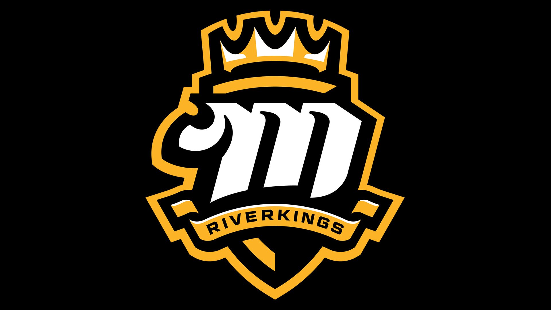
2015 – Today
![]()
In 2015 the RiverKings redesigned their logo. A black and white shield with a stylized letter “M” in white color replaced the turtle. The banner below has the inscription “RiverKings”. They still keep the symbol of “royalty” ‒ the crown.