

![]() Nice Logo PNG
Nice Logo PNG
Nice is the name of one of the oldest French football clubs, which was established in 1904. One of the strongest and most successful clubs of Ligue 1, today the team, nicknamed “Les Aiglons”, has Patrick Vieira as a head coach and is owned by Ineos.
Meaning and history
![]()
The visual identity of one of the most famous French football clubs has always been based on a very strong and powerful animalistic symbol — an eagle, which was drawn pretty abstract at the beginning of the club’s history and became sleek and detailed by today
1948 — 1992
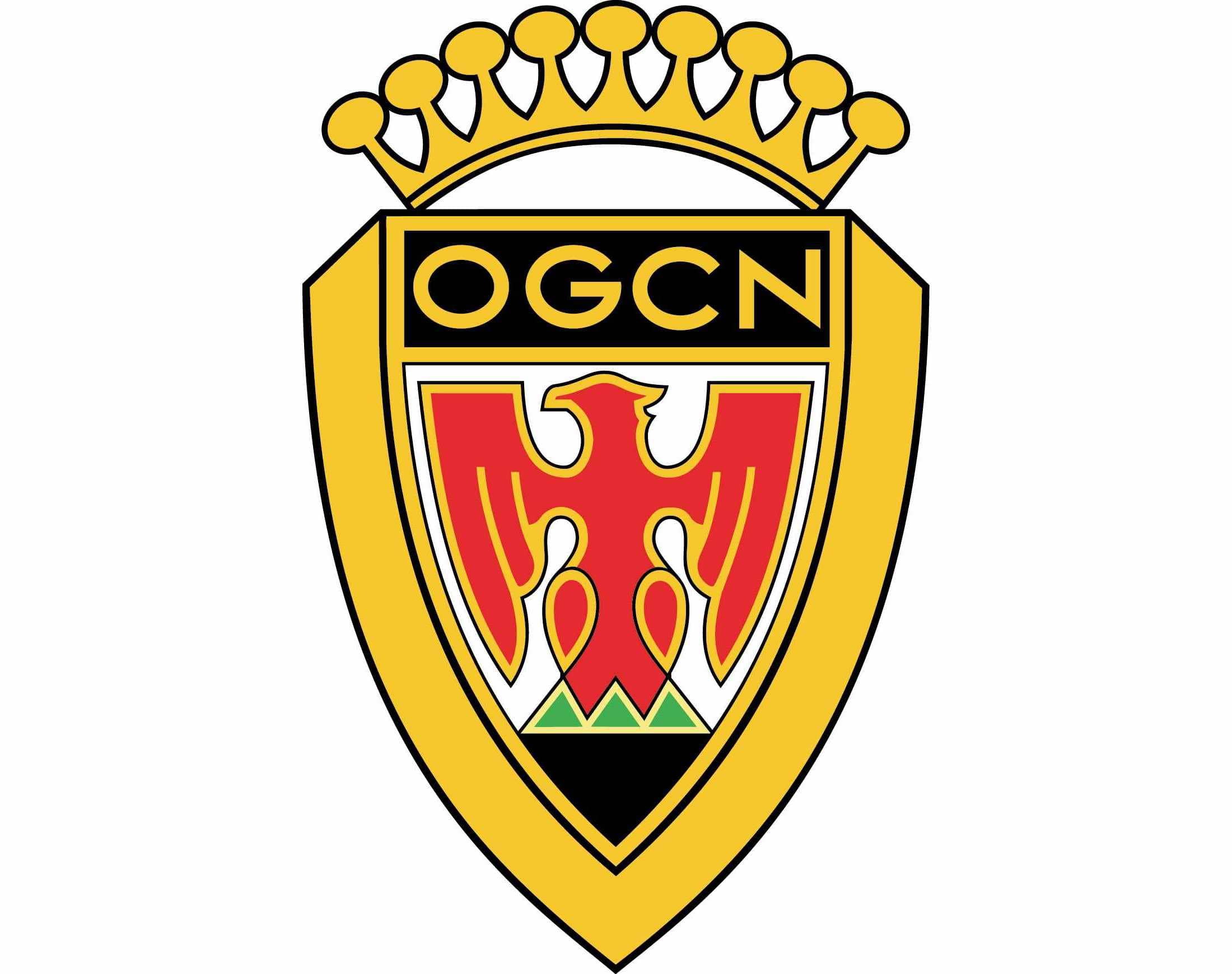
The logo, designed for the club in the 1940s looked like a royal coat of arms, yet a very modern and cool one. It was a geometric and sleek golden shield with an elongated and arched crown on top.
The body of the shield featured a red stylized eagle image with a black horizontal banner above it and a black triangle under. The “OSCN” inscription in gold was placed on the top banner.
The red eagle was outlined in gold and had three green triangles on its tailS the red, gold, and black color palette of the logo symbolized power, courage, and confidence, while the green and white details spoke for the club’s loyalty and growth.
1992 — 2013
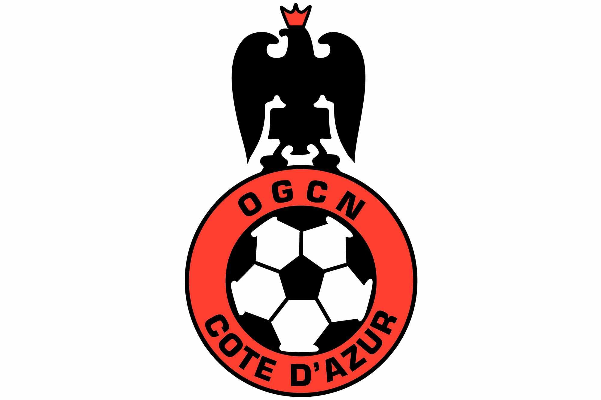
In 1992 the logo was completely redrawn, keeping an eagle as the main element. Now it was a black, red, and white composition with a solid blackbird sitting on an outlines football.
The eagle has a small red crown on its head, which was balanced by a thick red outline of a classic football.
The “OGCN Cote D’Azur” lettering in all capitals was placed around the red perimeter. The wordmark was executed in a strong and strict geometric sans-serif, which added to the badge’s power and masculinity.
2013 — Today
![]()
The redesign of 2013 brought a new color palette and contours to the French club’s visual identity. The new crest features an enlarged light brown eagle, which has a black shield replacing the body. The shield featured a vertical red stripes pattern and a white sans-serif “OGC Nice” inscription in its upper part. The inscription, executed in bold modern style, is set in two levels and has all the letters capitalized.
The redrawn in a more detailed manner eagle is standing on a white ribbon in a black outline, which has a “Despi 1904” lettering on it, celebrating the club’s foundation date and showing the team’s link to its history and heritage.
There is still a crown placed above the eagle’s head, but now it features the same light brown color as the bird itself.
The OGC Nice logo is powerful and Royal. Though it is executed in a pretty calm and confident color palette, it evokes a sense of stability, confidence, and strength, pointing on the club’s strongest features and showing its character and willingness to win.


