Crown Royal is the name of a Canadian whisky brand, which was established in 1939 and started its international distribution in the 1960s. The brand was acquired by Diageo, one of the world’s leaders in the beverage segment, in 2000, and since then it can be seen in stores all over the globe.
Meaning and history
The Crown Royal visual identity hasn’t had many redesigns throughout the years, as its original emblem was designed as a brilliant graphical representation of the label’s roots, idea, and legacy. The brand was established as a tribute to the Royal family.
The first monarch of Canada, King George IV had his first tour to the North American country in May 1939, and this was the year of the whisky brand foundation.
The Crown Royal logo depicts an ornate red and gold crown, placed on a purple velvet pillow with gold tassels. The elegant and sophisticated lettering in a smooth cursive font is set under the emblem in the same purple shade the pillow has.
In the 2000s the company introduced a three-dimensional version of the logo, where the emblem gained gradient shades and volume and was placed on a solid background, colored in a lighter shade of purple. The nameplate of this version was executed in flat gold, adding professionalism and simplicity to the ornate and detailed picture.
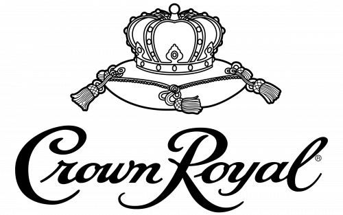
The logo can also be seen in monochrome, and in that case, the lettering becomes its brightest element, written in thick black lines, while the emblem’s contouring is thin and delicate.
Font and color
The chic and luxurious font of the Crown Royal visual identity was designed exclusively for the brand and has no commercial analogs. Though such fonts as Serafina Bold and Lunair Base have something in common with the unique lettering of the label. The most recognizable details of the nameplate are its capital letters, “C” and “R”, with their elongated and curved lines, which add a royal touch.
 The red and purple color palette with golden elements is also the most common representation of monarchy, power, and grace, and in the brand’s logo, all three shades are perfectly balanced, looking light yet sleek and confident.
Purple also stands for wisdom and relaxation, and this is what the brand’s drink is about — to make their customers’ evenings calm, cozy, and relaxed.
The Crown Royal logo is timeless and sophisticated. It is a perfect reflection of the brand’s name and its positioning. The red and purple color palette evokes a sense of passion and mystery, while the gold adds finesse and style to the overall picture.
The brand sometimes uses a monochrome version of the logo and even without colorful accents, it looks powerful and confident.


