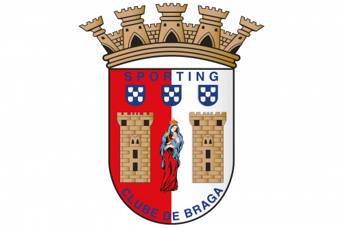
Braga is the name of the Portuguese football club, which was established in 1921. The club, nicknamed “The Archibishops” (which is “Os Arfebisops” in Portuguese) and coached by Carlos Carvalhal, today is one of the most successful in the country.
Meaning and history
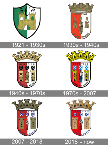
The visual identity of the Portuguese club had its major redesign just once in history. Though both the main versions of the logo features the same style and mood, the emblem, created in the 1930s became official and was only slightly modified throughout the years.
1921 – 1930s
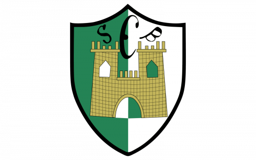
The logo, designed for Braga FC in 1921 was composed of a classic crest with a pointed top part. The crest was vertically divided into two equal parts — a green one on the left, and a white one on the right. In the middle of the badge there was a golden-brown image of an ancient castle placed, and above it — the elegant old-style “SCB” inscription in black.
1930s – 1940s
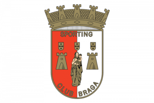
In the 1930s the visual identity is being redesigned. It becomes brighter and gets more detail on it. The shape of the crest now features a rounded bottom part and a stylized crown on top. The crown is composed of a golden-brown stonewall with towers.
The body of the crest is vertically divided into red and white halves, and each of the parts has an image of a square stone tower on it. The drawing of the Virgin Mary with Jesus is placed in the center of the emblem.
Above the images, there is three blue and white crest with checkered pattern located, and higher — the “Sporting” lettering in blue capitals. The “Clube de Braga” in-scription is arched along the bottom side of the crest and features the same blue sans-serif typeface.
1940s – 1970s
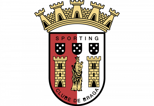
Compared to the previous design, a lot of things became black. It goes to the dice imagery, the text, as well as outlines all over the place. They actually added more nuance to the elements, and these were also outlined in black, making the whole logo more striking.
1970s – 2007
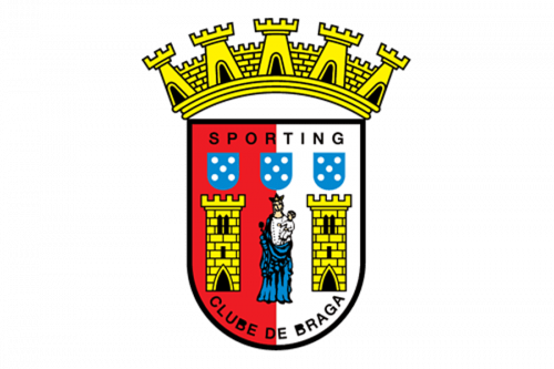
By the 70s, the coloring became much brighter. The colors themselves also changed slightly: dices became turquoise and the figure in the middle took on several natural colors instead of its usual yellow.
2007 – 2018
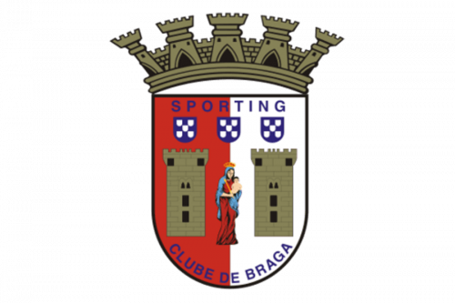
The colors became darker in this one, although the changes also affected the images. Inside the shield, the towers became thicker and blocky, the dots on dices grew thicker and bigger. The figure in the middle also took on a new pose, as well as a new color scheme.
Lastly, text all over the shield switched black for blue.
2018 – Today
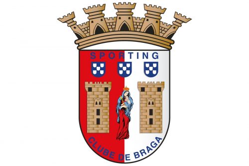
The 2018 evolution uses the same imagery, for the most part. The colors became lighter in this design, but they also added more nuance to everything. You can clearly see the smaller details now.


