![]() NHL Logo PNG
NHL Logo PNG
The National Hockey League is a professional ice hockey league comprising a little more than 30 teams, both in the US and Canada.
Meaning and history
![]()
The visual identity of the National Hockey League has been very constant and stable throughout the league’s history. Once created, in 1917, its logo became just a bit modified by today, showing the strength and seriousness of the NHL.
1917 — 1946
![]()
The original logo was designed for NHL in 1971 and featured a sleek black crest with a black, white and yellow outline and a wordmark in yellow, placed diagonally in a black background, framed in two parallel yellow lines. The letters were set from the upper left corner to the bottom right one, capitalized and executed in a simple yet solid sans-serif typeface with straight lines, evoking a sense of seriousness and stability.
1946 — 2005
![]()
The redesign of 1946 slightly changed the shape of the crest, making it wider and shorter, and removed the white outline, keeping only thick dark yellow and black lines in the emblem. The shade of the yellow became more intense, almost turning orange, and the contrast between it and a black background became smoother yet made the whole badge look more professional and confident. As for the lettering, it’s typeface was changed to an extended and bolder one, making the look of the logo balanced.
2005 — Today
![]()
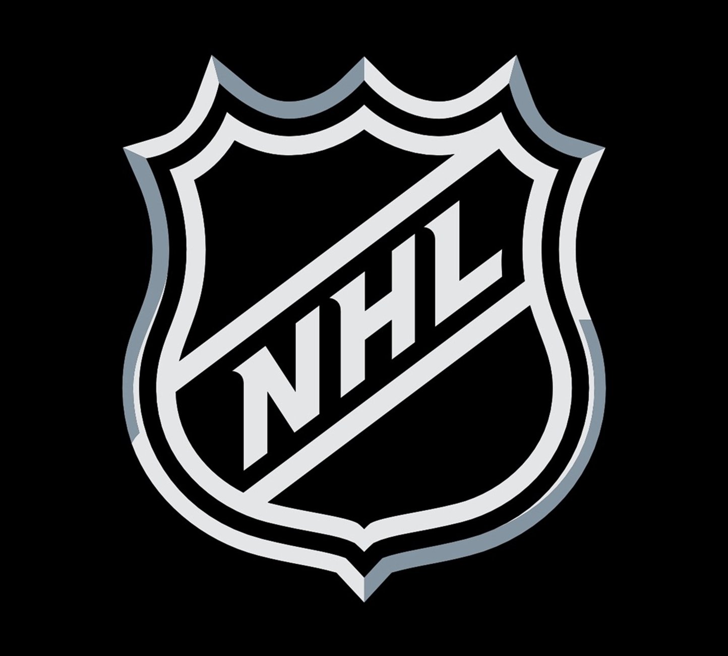
With the NHL rebranding of 2005, the logo was also changed, and this was the first time when there were really visible modifications. The dark yellow shade was switched to a silver-gray, which made the whole logo look sleek and powerful. The lettering changed its typeface to a sharp and elegant one, with the upper parts of the letters slightly elongated and pointed to the left, and the direction of the inscription was switched, so now the lettering is placed from the bottom left corner to the upper right one, symbolizing growth and progress.
The outline of the frame is drawn in gradient shades and looks voluminous and glossy, adding a modern and stylish touch to the emblem, and making it look powerful and masculine.
Earliest symbol
The famous shield logo was introduced in 1946 (according to other sources, in 1917). It featured a shield shape given in orange and black colors.
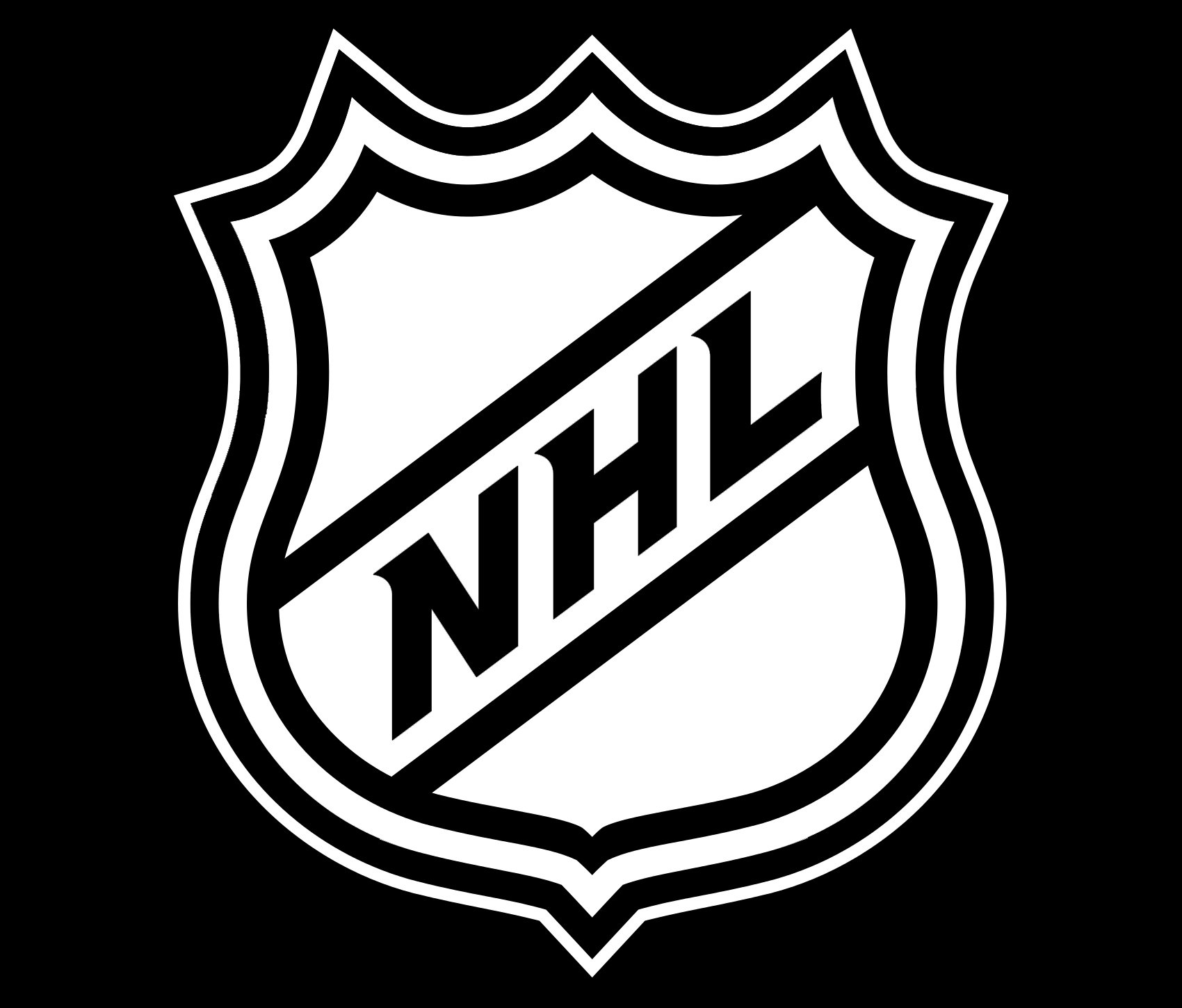
Current emblem
The current logo, which was adopted in 2005, looks very similar to the previous one, at least the core visual metaphor remains the same: a shield shape. However, the black-and-brown color scheme has been replaced by the black-and-white one (with shades of silver grey). One more notable change refers to the way the diagonal lettering is positioned (it goes upward now). The typeface has also been slightly tweaked.
Font
![]()
The custom typeface used for the National Hockey League wordmark is neither a serif nor a san-serif one. Each letter has only one serif, while all the other ends of the characters are not “covered” by serifs.
Color
![]()
The current NHL logo is monochromatic, using only black and white. In addition to this, silvery shades of grey appear in the emblem as a result of the gradient effect.