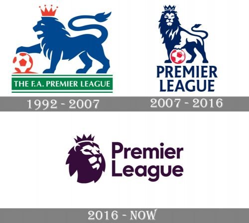
The lion iconography was present in the Premier League logo ever since it was created in 1992. Yet, it was not the same lion as in the current version. The animal featured in the current emblem looks more 3D.
Meaning and history
The Premier League visual identity has had two major redesigns held throughout the league’s existence, and all of the emblems featured different styles and moods but were built around one symbol — a lion, the animal, standing for power, courage, and strength.
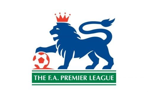
1992 — 2007
The logo, created for Premier League in 1992, boasted a blue heraldic lion with a red and white football under its paw, placed on a horizontally strengthen green banner in double green and white outline. The blue lion has a red crown with four peaked and four dots above them on its head, and the white wordmark in all capitals was written on the green background, which stood for the field.
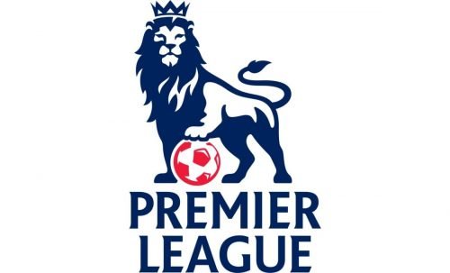
2007 — 2016
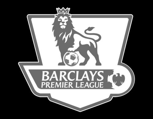
In 2007 the logo was redrawn, keeping the blue lion with a red and white football as the main theme. All the lines and contours of the badge were completely changed, and now the animal turned its head to face everyone watching on him. The crown got more modest and geometric, executed in the same blue and white palette as the lion. The wordmark was now placed directly under the graphical part of the logo, without any framing, and featured blue color of the capital letters, executed in a modern and sleek typeface with diagonal cuts of the letters and slightly pointed tails.
2016 — Today
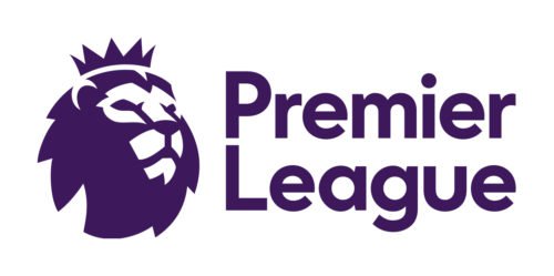
The current design of the Premier League logo was introduced in 2016 and is a shortened and simplified version of the previous badge. The emblem, executed in purple and white, boasts a stylized head of the lion in a crown, placed on the left from the wordmark, which is set in two levels. The inscription in a title-case is executed in a rounded sans-serif typeface with traditional slightly extended shapes and straight cuts of the letter-lines. Though this is the first logo without a white and red football on it, it still keeps the original style and mood, showing the strong connection to the roots.
Font
The typeface could be a bit more unique, but in any case, it looks simple and modern.
Color
Dark purple and white color combination is a standard, yet an inverted red outline version may be used for darker backgrounds.


