Scania is the name of a Swedish truck manufacturing company, which was founded in 1911. The company is highly recognizable and respected around the world for its high-quality trucks, engines, and busses.
Meaning and history
One of the leading Swedish automobile companies, Scania, got its name after the area in Sweden, where the brand was established. It has a rich history and its logo’s evolution is a good illustration of all the Scania milestones.
1901 – 1911
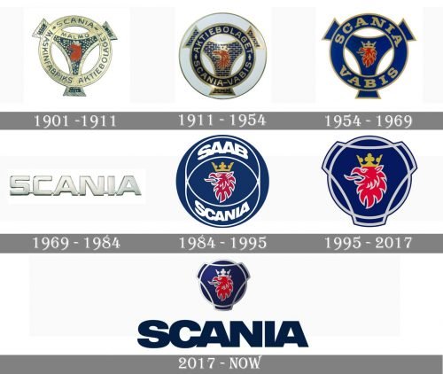
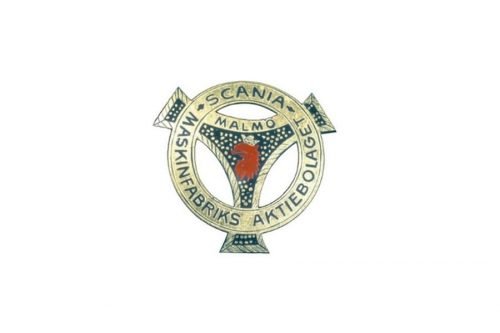
The first Scania logo was composed of a stylized bicycle pedal crane with a head of a griffin on it.
The golden letters of the “Maskinfabriks Aktiebolaget Scania” were placed around the perimeter of the blue circle, with the word “Malmö” above the griffin’s head.
1911 – 1969
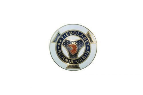
In 1911 Scania merged with VABIS and the company redesigned its logo. The griffin’s head became bigger and brighter, while the wordmark was changed to “Aktiebolaget Scania-Vabis” and featured enlarged and bolder lettering.
A few years later the Scania-Vabis logo changes its color palette to a deep blue, which makes the gold letters of the serif font stand out and the red griffin head — look stronger.
1969 – 1984
Scania merges with Saab in 1969 and the company’s name changes to Saab-Scania. However, the brand’s cars use the simple “Scania” wordmark for its logos.
The blue capital letters of the nameplate are executed in a sans-serif typeface with clear bold lines. The font looks neat and modern in its simplicity. The rich blue color evokes a sense of professionalism and high quality.
1984 – 1995
The base of the logo we know today was designed in 1984 by Carl Fredrik Reutersward. It was composed of a circular emblem with an enlarged griffin’s head and two ellipses in thin lines.
The wordmark was split into two parts: “Saab” was placed above the griffin, and “Scania” — beyond it.
The traditional brand’s color palette remained untouched — feel blue background with a red mascot and white lettering made the logo look stylish and elegant, reflecting the brand’s authority and confidence.
1995 – 2017
In 1995 Saab and Scania become two different companies, Scania is now independent. The brand decided to modernize its traditional pedal crank logo, keeping the basic elements.
The emblem is refined and the wordmark is now placed underneath it, without overloading the mascot image. Scania uses the typeface from 1969 for the nameplate, and the logo looks strong and sharp.
2017 – Today
In 2017 the Scania logo was slightly redesigned by Brand Union agency, which refreshed the iconic griffin and the custom typeface of the wordmark.
The griffin emblem now looks more three-dimensional, and the new font adds unique traits to the brand.
It is a powerful and modern logo, which shows the brand’s heritage and celebrates its authority and expertise.
The Emblem
The iconic Scania griffin is executed in red and had two versions of crown color during its history: gold and silver.
The combination of red and gold added more royalty and courage to the brand, while the new silver crown makes the griffin a symbol of strength, speed, and reliability.
The idea of the mascot was taken from one of the Swedish coat of arms, but the brand made it look fresh and contemporary, without any retro or historical feeling, but with a strong devotion to the Scania heritage and roots.
This is a great example of how the old heraldic symbol can get a new life and become one of the most recognizable icons of the automobile brand’s visual identity.


