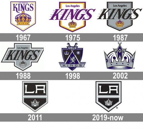
One of the most popular ice hockey teams in the US, the Los Angeles Kings have gone through a succession of logos throughout their more than 50-year history.
Meaning and history
The Los Angeles Kings logo history started in 1967. At the time, there were a lot of rumors concerning the Western Hockey League’s plans to compete for the Stanley Cup. Because of this, the National Hockey League decided to expand and add six new teams. Jack Kent Cooke, an entrepreneur from Canada, purchased the rights to start one of them in Los Angeles.
1967 — 1975
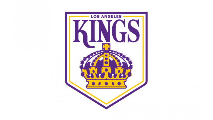
Among the many variants of the name proposed during the name-the-team contest, Cooke chose the name “Kings” as he liked its royal feel. This was also the reason why he opted for purple and gold as the team’s official colors – they possessed a long-standing history as colors of royal courts.
Taking into consideration these facts, it’s hardly a surprise that the team’s first logo featured another royal symbol, a crown, encrusted with jewels. Above the crown, there were the words “Los Angeles” and “Kings” in purple. The shape of the frame looked like a hanging banner or a shield. It was purple and yellow.
1975 — 1987
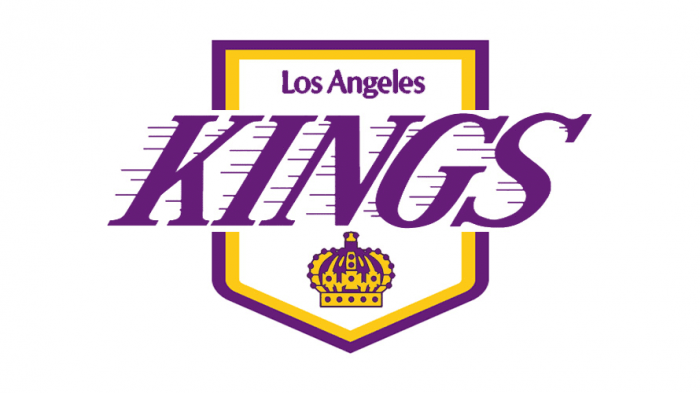
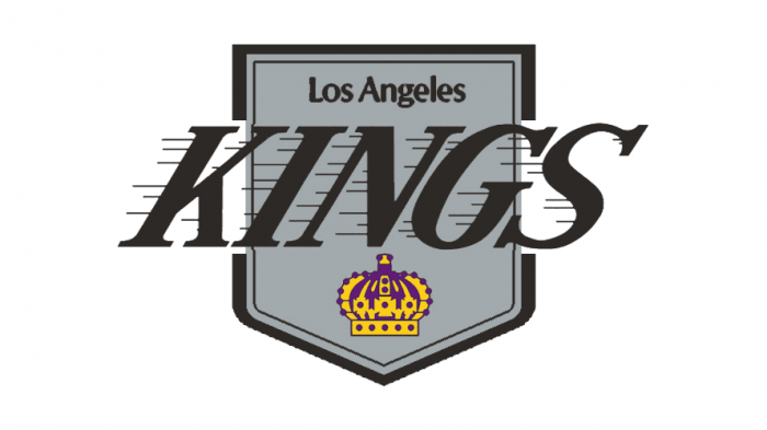
In 1976, the LA Kings logo went through an update. Short horizontal streaks were added to the word “Kings” giving it more dynamic appearance. The proportions of all the elements changed, too. The lettering “Kings” grew bigger, now it extended beyond the shield frame, while the crown grew smaller. The colors and the horizontal streaks looked very much like those on the logo of the Los Angeles Lakers team, which was perfectly natural as both the clubs shared the same owner.
1987 — 1988
While preserving the “moving” word “Kings,” as well as all the other elements of its predecessor, the Los Angeles Kings logo introduced in 1988 looked very different due to a modified color palette. Purple and gold were preserved only for the small crown, while the rest of the emblem featured black and silver. This emblem was used for one playing season only. The following year, it was updated once again.
1988 — 1998
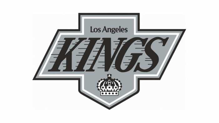
The silver-and-black color scheme now was used for all the elements, including the crown. White was added to provide some contrast. A parallelogram frame was placed over the hanging banner. As a result, the word “Kings” now didn’t extend beyond the main body of the logo.
1998 — 2002
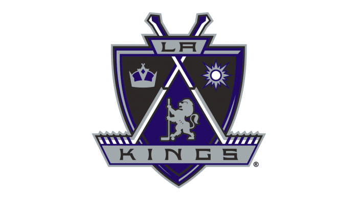
In 1998, the logo saw a major overhaul. Inside a classic shield shape, three royal emblems were placed: a lion, a crown, and the Sun. There were also two crisscrossed hockey sticks and the word “Kings” in black over a grey tab. In addition to the colors of the previous palette, a noble shade of blue (or purple) was used. One of the reasons for modifying the palette was that the old colors started to be connected with the gang culture.
2002 — 2011
Four years later, the team’s owners decided to make the crown the only element of the logo. It was rather a more refined and elaborate version of the 1999 crown than the one from the original logo. This time, the crown looked modern and more discreet, with its dark blue, black, and grey details. Its most notable decoration was a couple of crisscrossed hockey sticks on the top. The 2004 logo was the first one where there was no name of the team.
2011 — 2019
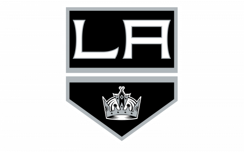
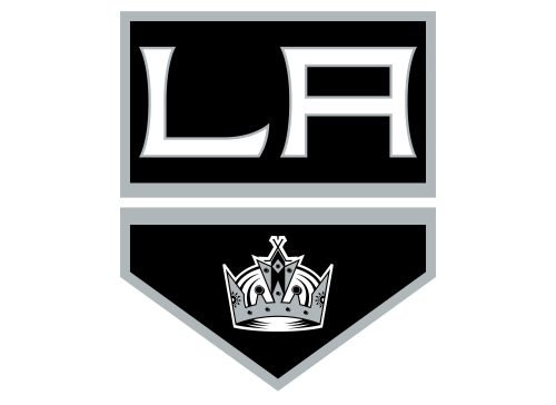
While looking entirely different from all the previous emblems, the 2011 logo borrowed several elements from them: the shield shape, the distinctive type, in which the letters “LA” were given, and the crown.
2019 — Today
In contrast to the vivid colors of the original logo, the palette of the current Los Angeles Kings logo looks strict and minimalistic. There’re only three colors: silver, black, and white.
Los Angeles Kings Colors
BLACK
PANTONE: BLACK C
HEX COLOR: #111111;
RGB: (17,17,17)
CMYK: (0,0,0,100)
SILVER
PANTONE: 429 C
HEX COLOR: #A2AAAD;
RGB: (162,170,173)
CMYK: (21,11,9,23)
WHITE
HEX COLOR: #FFFFFF;
RGB: (255,255,255)
CMYK: (0,0,0,0)
PURPLE
HEX COLOR: #572A84;
RGB: (87,42,132)
HSB: (269,67,51)
CMYK: (83,100,9,1)
GOLDEN YELLOW
HEX COLOR: #FFC80C;
RGB: (255,200,12)
HSB: (45,95,100)
CMYK: (0,21,99,0)
WHITE
HEX COLOR: #FFFFFF;
RGB: (255,255,255)
HSB: (200,0,100)
CMYK: (0,0,0,0)


