

![]() Toronto Marlies Logo PNG
Toronto Marlies Logo PNG
Being a part of the American Hockey League, the Toronto Marlies are the top affiliate of the NHL’s club Toronto Maple Leafs.
Meaning and history
![]()
The Toronto Marlies, an esteemed professional ice hockey team, were founded in 2005. They emerged as a continuation of the historic legacy of the Toronto Marlboros, a junior ice hockey team with a rich history dating back to 1904. The Marlies play in the American Hockey League (AHL), serving as the primary minor league affiliate for the Toronto Maple Leafs of the National Hockey League (NHL).
Over the years, the Marlies have achieved notable success in the AHL. Their crowning achievement came in the 2017-2018 season when they clinched the Calder Cup, marking their first championship in the league. This victory was a testament to their growth and competitive prowess within the AHL. The team has consistently been a formidable force in the league, regularly qualifying for the playoffs and showcasing a strong development platform for aspiring NHL players.
Currently, the Toronto Marlies continue to hold a significant position within the AHL. They are known for their robust player development system, contributing significantly to the grooming of future NHL talents. Their ongoing commitment to excellence maintains their reputation as a key player in the hockey world, both in fostering new talent and in their competitive endeavors on the ice.
What is Toronto Marlies?
The Toronto Marlies are a professional ice hockey team playing in the American Hockey League (AHL). As the primary affiliate of the NHL’s Toronto Maple Leafs, they focus on developing players for the major league. Their history of success, including a Calder Cup win, underscores their significance in professional hockey.
1978 — 1982
![]()
Logo for the New Brunswick Hawks was created in 1978 and stayed with the club until 1982 when it changed its name to St. Catharines Saints. The badge was executed in a navy blue and white palette with the stylized “Hawks” inscription forming a contour of the bird, placed above a solid blue banner with white “New Brunswick” in all capitals of a simple and clean sans-serif typeface.
1982 — 1986
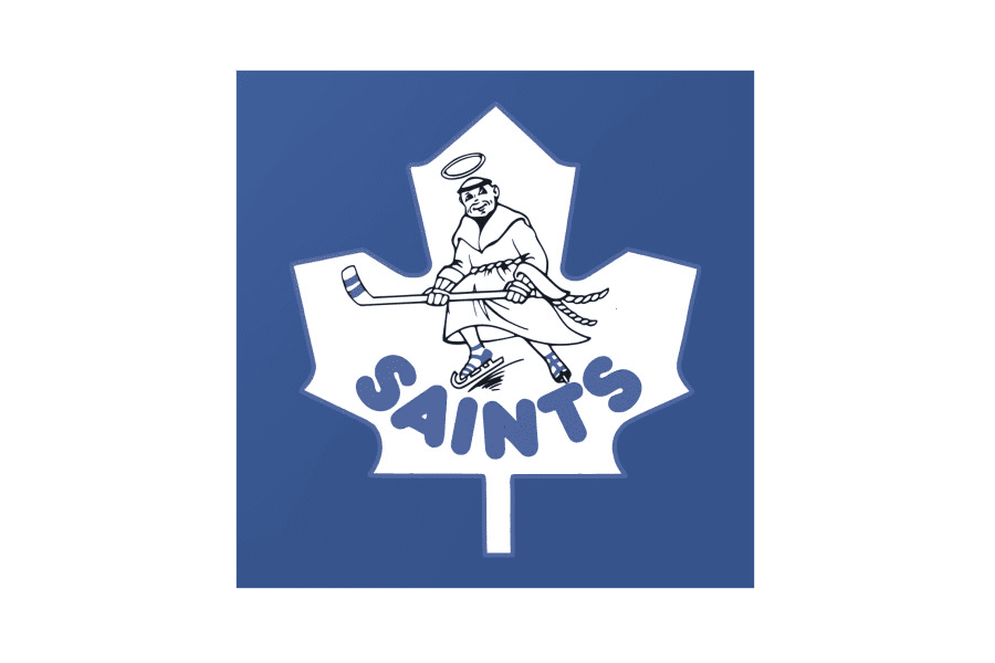
The redesign of 1982 introduced a completely different badge for a new naming, though the main two colors remained the same — blue and white, — and only thin black lines were added to the palette. It was a solid blue square with a white maple leaf on it. Inside the leaf, there was a black contoured image of a monk in skates and with a hockey stick in his hands. The man also had a halo above his head and was kindly smiling. The new logo stayed with the club for another four years.
1986 — 1991
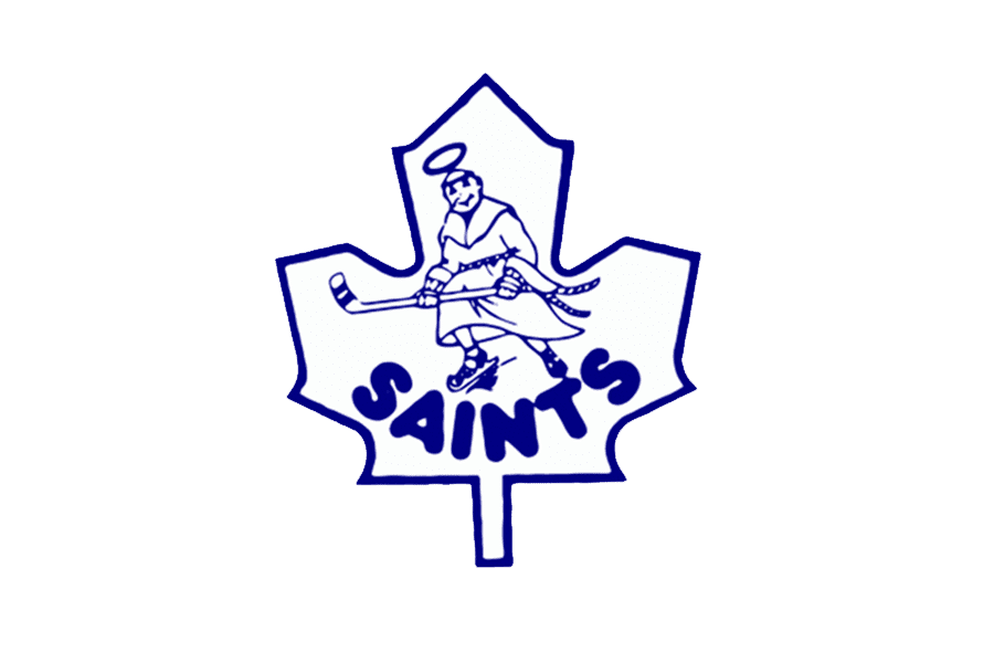
The badge was redesigned in 1986, with the color palette simplified to only blue and white, but the blue shade brightened up and intensified. The solid square was gone, and now the logo featured a blue contoured maple leaf with a blue contoured link image drawn on it. All the lines of the insignia were executed in one color. The “Saints” lettering was still arched under the man, in the same rounded and bold sans-serif typeface, as on the previous version.
1991 — 2005
![]()
The badge was redesigned in 1986, with the color palette simplified to only blue and white, but the blue shade brightened up and intensified. The solid square was gone, and now the logo featured a blue contoured maple leaf with a blue contoured link image drawn on it. All the lines of the insignia were executed in one color. The “Saints” lettering was still arched under the man, in the same rounded and bold sans-serif typeface, as on the previous version.
2005 — 2016
![]()
The redesign of 2005 brought a refreshed and brightened logo to the club. The maple leaf got its contours redrawn in a more confident and sleek way, and changed its color palette from light gray to blue and white. As for the lettering, it was also completely changed, and now only “Marlies” was written in the uppercase of a bold sans-serif typeface, with its white letters placed on an arched blue banner with a double blue and white outline.
2016 — Today
![]()
The Marlies logo clearly shows the connection with the parent club by using the same design code. Both the logotypes are based on a dark blue leaf with white veins. Marlies replaced the text “Toronto Maple Leafs” from the parent club’s logo by their emblem – a beautiful crown embellished with flowers, the fleur-de-lys symbol, as well as other elements bearing symbolic meaning.

Colors
![]()
While the team’s official color scheme is comprised of only blue and white, the palette of the Toronto Marlies logo is much more diverse. It also includes red, yellow, and green – the colors that are used for the stylized crown on the emblem.


