The earliest Real Madrid logo was totally different from the one that is used now. However, in 1908 the emblem acquired the shape that was very close to the current one.
Meaning and history
Real Madrid, the Royal football club, is one of those whose visual identity hasn’t changed much throughout more than 100 years of its history. One of the most recognizable football emblems of the world is fully based on the logo, designed in the 1900s, and this shows the club’s value of its roots and heritage.
What is Real Madrid?
Real Madrid is the name of a professional football club from Spain, which was established in 1902. One of the most titled European football clubs in history, Real Madrid competes in La Liga, has Santiago Bernabeu Stadium as the home arena, and Carlo Ancelotti as the head coach.
1902 — 1908
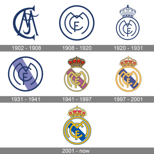
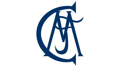
The very first Real Madrid Logo was designed in 1902 and featured an “MFC” monogram, standing for Madrid Football Club. It was a deep blue gothic-style composition, where letters were executed in a custom serif font with sharp ends. “C” and “M” featured clean straight contours, while “F” was smooth and curvy.
1908 — 1920
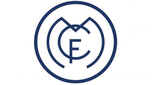
The prototype of today’s logo was created in 1908. It was still an “MFC” monogram, but in a modern unique style and enclosed in a circle. The biggest letter of the emblem, “M” repeated the contour of the circular frame, “C” featured a bit smaller size and was placed inside the “M”, crossing it by its top part. The smallest letter, “F”, crosses the bottom line of the “C” with its vertical bar.
The emblem was executed in the same blue and white color palette, which represents reliability and fundamental approach.
1920 — 1931
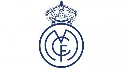
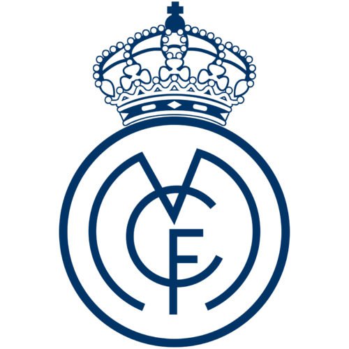
The club was granted a Royal title in 1920, and this is how the famous crown appeared in the emblem. It was still the badge from 1908, with slightly modified contours of the letters, but with a big and ornate crown, sitting on the circle. It was also executed in blue and white and looked strong and balanced.
1931 — 1941
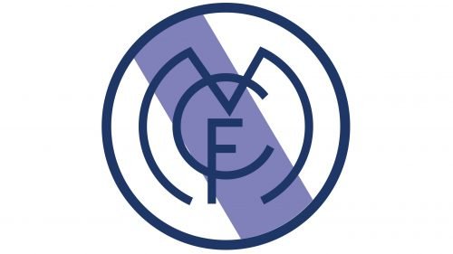
In 1931 the crown was removed from the logo and the wide purple diagonal was placed inside the circle of the logo. It was a celebration of the Castile region, repeating its flag.
The logo from the 1930s was the last without a crown, and it only happened because of the prohibition to use any symbols connected to the monarchy during that historic period.
1941 — 1997
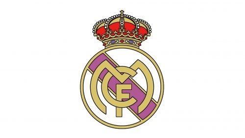
The crown comes back in 1941, and the whole logo is being redrawn. Though the composition remained untouched — an iconic monogram enclosed in a circle with a wide diagonal, and a massive crown on top, the color palette has been changed and the lines modified.
Now the crown featured gold and red shades with multiple colored stones. The main badge was executed in white and gold, with the light purple diagonal.
Another significant change was about the monogram itself — the letters became thicker and gained a delicate black outline, which made them look not overlapping, but intertwined.
1997 — 2001
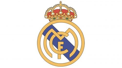
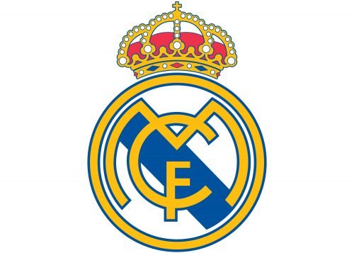
In 1997 the color palette is changed to a brighter and fresher one — the purple is replaced by a calm blue, and the golden frame with letters became more yellow and vivid. The crown was also redrawn and became more delicate and elegant.
2001 — Today
The redesign of 2001 made the logo flat again, and the letters are placed in one plane, with a common blue contour outline. The yellow frame of the emblem has the same bright blue outline, which perfectly balanced the whole look of the logo.
The Real Madrid visual identity is based on the minimalist and stylish emblem from the beginning of the club’s history. It also brilliantly represents the “Royal” status of the club, and shows its strong link to its roots and traditions, staying actual and stylish at the same time.
The 1931 symbol
After the Second Republic was proclaimed in 1931, it was unwise to retain any symbols of the monarchy. So, the crown was removed from the crest, while the word “Real” disappeared from the club’s name. Instead of the crown, a mulberry band, the symbol of Castile, was added to the emblem.
In 1941, following the Civil War, the crown returned to the logo. It appeared together with the mulberry band. The word “Real” appeared in the club’s name again.
Font
The three letters used in the logo do not belong to any of the existing typefaces. Each character has been created from scratch. The most unusual letter is probably “M”, while “C” and “F” look more standard.
Color symbolism
Each of the colors dominating the logo has a symbolic meaning. Yellow is known as the symbol of gold. In case of Real Madrid, it also represents the connection with the royal house. Red stands for energy, passion, and desire to win, while blue symbolizes loyalty and stability.
The colors have the following hex codes: #FEBE10 (yellow), #00529F (blue), and (#EE324E).The colors shouldn’t be modified irrespective of the size of the emblem itself. They look the same no matter whether they are used on Real Madrid logo 512×512 or a very small version of the emblem.
On this page, you’ll be able to find Madrid logo for Dream League Soccer application. You can download the pictures and use them in your version of the game.
Real Madrid Colors
GOLD
PANTONE: PMS 123 C
HEX COLOR: #FEBE10;
RGB: (254, 190, 16)
HSB: (43, 93, 99)
CMYK: (0, 27, 99, 0)
BLUE
PANTONE: PMS 2145 XGC
HEX COLOR: #00529F;
RGB: (0, 82, 159)
HSB: (208, 100, 62)
CMYK: (99, 76, 5, 0)
RED
PANTONE: PMS 1787 C
HEX COLOR: #EE324E;
RGB: (238, 50, 78)
HSB: (350, 78, 93)
CMYK: (0, 94, 65, 0)


