The Bernard Krone Holding is a German manufacturer of agricultural machinery, trailers, semi-trailers, swap systems, steel-clad swap bodies, and more.
Meaning and history
In 1906, Bernard and Anna Krone established a blacksmith’s shop, where a range of agricultural hardware, ovens, and stoves was sold.
Corporate logo
The corporate Krone logo features the word “Krone” paired with an emblem. The emblem can be interpreted in two ways. On the one hand, it looks like a crown, which is an allusion to the name of the company. On the other hand, it resembles the agricultural machinery the company produces.
Evolution of BiG Pack Bailer’s logo
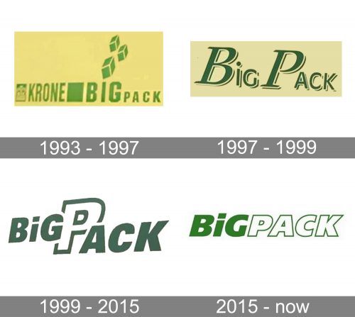
1993
The first Krone big baler already featured a logotype that looked pretty close to the current one. It was green on the white background, with heavy letters.
The most meaningful element was probably the combination of square bales replacing the dot above the “i.” The rectangular letters also were inspired by the machine’s function.
1997
The designers decided to make the logo lighter and more modern. They replaced the heavy rectangular sans serif type with a lighter italicized serif one.
1999
The 1997 version lacked meaning, so a new redesign was only natural. The authors of the logo returned to the strong features of the original wordmark – the heavy letters (looking “powerful” and “reliable”). Yet, they rounded them and made them italicized, to add a dynamic and modern feel.
For some reason, the “P” had a reversed color scheme and was half-hidden behind the other letters, so the name of the brand could be misread as “Big Ack.”
2015
A sleeker and more logical wordmark was introduced. The letters had equal height (except maybe for the “i,” which was just a little higher).
The visual border between the two words was created by the color (the lettering “big” was solid green, while “pack” was white with green trim). This approach seemed more beneficial than the large “P” in the previous version.
Also, the letters grew simpler (for instance, the “g” and the “c”), which made the design easier-to-grasp and more meaningful. The “cube bale” theme from the original logo was preserved in the shape of the “dot” above the “i.”
Font
The type on the primary Krone logo is quite heavy, which conveys the “reliability” and “power” message. Such a type implies that the brand’s products will last years and years.
There are no serifs or other decorative elements, which can be interpreted as an indication of the fact that the machinery doesn’t have any unnecessary details – you pay only for the essential functions.
Eventually, the italicized letters represent motion – another indication of the type of products the brand makes.
We should also add that the logo of the BiG Pack bailer, one of the company’s core products, features almost the same type (a very bold italicized sans).
Color
The old Krone logo was dark blue on the white background. In the current website, a different palette is used. The main color is green, while white is used as an additional color. The green, which has been known as the most “natural” color (the color of the leaves) is used for many reasons. One of them is to refer to the plants grown with the help of Krone’s machinery. Another reason can be that the BiG Pack logo is also green and white.


