Standard de Liege is the name of a football club, which was established in 1898 in Belgium. Being one of the oldest and strongest Belgian clubs and nicknamed “The Reds” (Les Rouches), today it is managed by Philippe Montanier.
Meaning and history
One of the oldest Belgic football clubs has been very consistent and conservative with its visual identity. And it is totally understandable, as the badge, designed for them at the very beginning of the club’s history, is a brilliant example of elegance, power, and style.
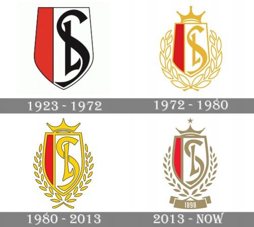
1923 — 1972
The Standard de Liege logo, introduced in 1923 featured an elegant narrowed crest, vertically divided into two parts — the red on the left, and the wider one on the right, in white. The crest featured nothing but the delicate black outline and the “SL” intertwined letters in black, placed on the white side of the shield. The letters were executed in a bold and sleek hand-written typeface with their lines elongated.
1972 — 1980
In 1972 the logo of the club was redesigned and became more sophisticated and bright. The black color was replaced by a light gold, which added vitality and elegance to the badge. Two more detailed appeared on the emblem — the golden crown above the crest and a white and gold wreath under it.
1980 — 2013
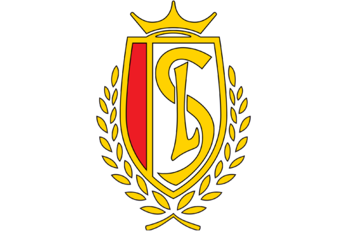
The lines and contours of the badge were redrawn in 1980. The framing and separation line became bolder, while the wreath was now more schematic and light. The logo started looking modern and strong.
2013 — Today
In 2013 the gold shade of the club’s color palette was changed to a darker shade, which made the whole badge sleeker and chicer. The five-pointed star was added above the crown, and the ribbon with a white “1898” date mark — under the crest.


