

![]() Orient Logo PNG
Orient Logo PNG
The Orient logo has been inspired by the company’s approach to customer relations and by the policies regarding its dealers and partners.
Meaning and history
![]()
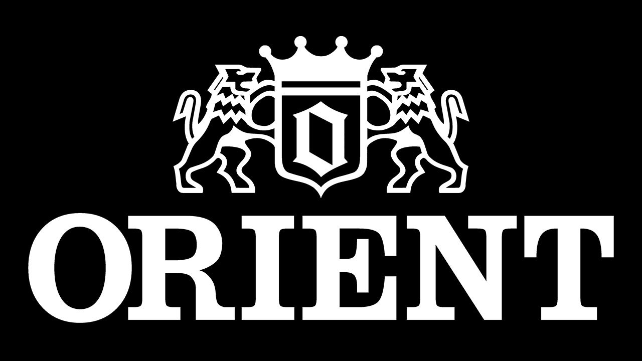
Unlike many other watch brands, Orient has not only a wordmark but also a pictorial part in its logo. It appears to have been inspired by coat of arms of medieval knights and towns. There’re two lions standing erect with forepaws raised (a “lion rampant,” speaking in heraldry terms). The lions are holding a shield with a black crown on its top. Inside the shield, there’s the letter “O,” the initial of the company name.
According to a message by the brand’s president Jun Watanabe, the lion on the left symbolizes the company, while the second lion symbolizes their dealers and partners. The crown that can be seen above the shield symbolizes the customer. In other words, the emblem is supposed to represent the Orient’s respect for its customers and the desire to provide them with quality products.
Despite its symbolism, the Orient logo has been often criticized. Quite a few customers and professional designers find it overloaded with pictorial elements and claim it would look better with only the wordmark, especially if it was given in a different type.
Font
The typeface, with its elegant serifs, has a slightly retro look, which seems to fit the medieval-style crest.
Colors
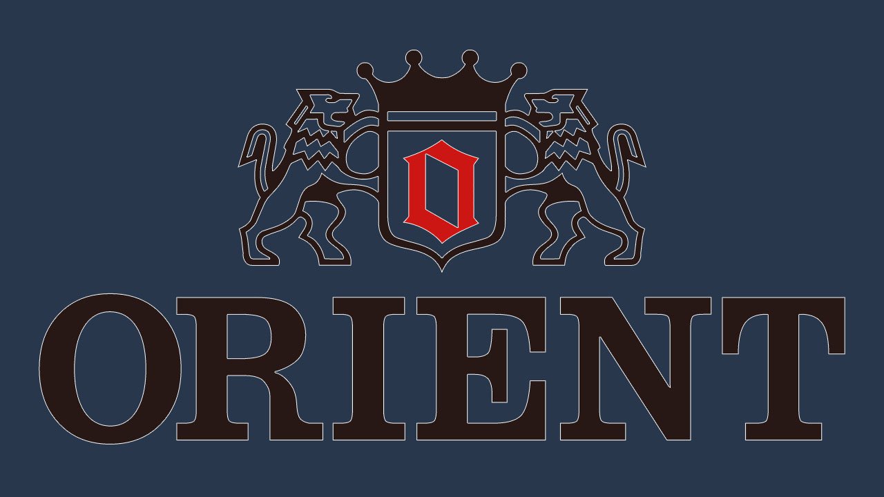
The generic black-and-white color scheme is enriched with red. The color puts the emphasis on the “O.”


