One of the Major League Baseball teams, Kansas City Royals, was established in 1969 and until 1993 they played in the West Division of the American League. Since 1994 the club “moved” to the Central Division, and still competes in the MLB as its member.
Meaning and history
Kansas City Royals is a pretty famous club in the Major League Baseball, which had both loud wins and losses. The club is the league’s records maker in the win-loss. Kansas City Royals have made it to the World Series four times, and two of them were won by the club.
Although the club has never changed its name, it has three nicknames: The Blue Crew and Boys in Blue (due to the color palette of the cub’s visual identity and uniforms) and The Crowns (for the “Royal” part of the club’s name and the massive golden crown on their logo).
Today the baseball team from Kansas City, Missouri, is owned by John Sherman, and managed by J. J. Piccolo, who previously played for New York Yankees, and worked for Atlanta Braves.
What are Kansas City Royals?
Kansas City Royals is the name of a professional baseball club in the united states, which was established in 1969. Today the club competes in the Major League Baseball as a member of the Central Division of the American League. Kansas City Royals have Kauffman Stadium as their home arena since 1973, and J. J. Piccolo as the general manager.
1969 — 1978

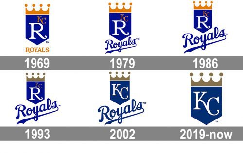
The Kansas City Royals logo, designed in 1969, was composed of a bright blue crest with an orange crown on top, a fancy white letter “R” with its tail curved, set in the center, and a small “KC” monogram written in orange above the upper right corner of the “R”. The “Royals” wordmark was written under the crest, in all capitals of a custom typeface, with the first letter fully repeating the shape of the one from the shield. The logotype was executed in juicy orange color.
1979 — 1985
 In 1979, the comparatively simple font for the word “Royals” below the shield was replaced by a script. The wordmark color was changed from yellow to blue.
1986 — 1992
 In the 1986 version, the word “Royals” became bigger in comparison with the shield. Another change was made to the color palette of the Kansas City Royals badge — the orange became calmer and darker, which made the whole logo look more stable and serious.
1993 — 2001
 The redesign of 1993 has played with the team’s color palette again. This time the orange was completely removed from the concept, and the elegant and muted shade of gold has stepped in. With the new “neighbor”, the blue also started looking a bit differently.
2002 — 2018
 In 2002, the capital “R” disappeared from the shield. Instead, there was the “KC” lettering, executed in the same style as the character in the previous version, but with narrower contours of the letters, to better fit the width of the solid blue pennant. The small additional lettering in gold was completely removed.
2019 — Today

The redesign of 2019 simplified the official logo of the club to just a dark blue crest with a pale gold crown and a white monogram on it. The script lettering was removed from the primary version, though is still used by the club depending on the occasion. Compared to the previous badge, the new one is flat, without the black outline of the lettering, and this minimalistic approach makes it look chic and expensive.
Cap symbol
The cap insignia features the interlocking letters “K” and “C” in gold on the blue background. The script looks the same as that used on the shield KC Royals logo.
The 50th Anniversary emblem
The Anniversary KC Royals logo features a modernized shield with the number “50” topped by a crown. On the left, the year when the franchise was founded (1969) is given, on the right, there is the year of the team’s 50th season (2018).
Font
The script featured on the “Royals” lettering is a custom artwork, as are the letters “K” and “C”. None of them seems to belong to an existing typeface.
Color
The team’s palette encompasses the four colors: royal blue (hex: #004687), gold (#C09A5B), light blue (#7AB2DD), and white (#FFFFFF).


