![]() Reading Royals Logo PNG
Reading Royals Logo PNG
The Reading Royals are based in Reading, Pennsylvania. Being a professional ice hockey team, they are one the ECHL’s participants.
Over the period of its history the franchise has had two names. The team that was founded in 1991 was called the Columbus Chill. When the franchise relocated to the city of Reading and started the 2001-2002 season, they became known as the Reading Royals.
![]()
The name “the Royals” came from the traditional Name-the-Team contest. It turned out to be quite to the point as it was in line with their affiliates’ names ‒ the Manchester Monarchs and the Los Angeles Kings.
1991 – 1999
![]()
The very first logo for Reading Royals was created in 1991 when the club was established under the name Chill Columbus. And the name of the club was actually the only element of the badge from those years. It was a two-leveled inscription in black and white, with the enlarged “Chill”, placed above slightly extended horizontally “Columbus” in all capitals. The bold clean letters of the top part were decorated by sharp white lines (all but the last “L”), which created a sense of motion and strength, and we were supposed to reflect the character of the club and its dedication to sports.
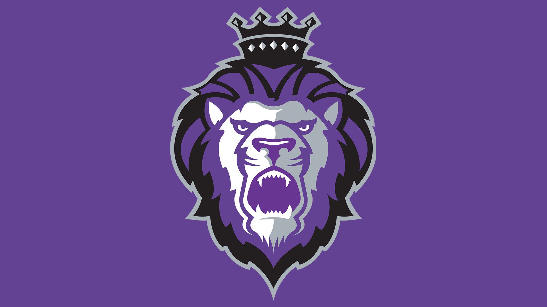
2001 – Today
![]()
The Royals boast of a “royal” logo ‒ the Lion King Logo. It is a lion head in purple, silver, black and white. The king of the jungle is wearing a crown, which fits the “royal” theme nicely.
The present logo was introduced in 2008. The Royals’ first logo of 2001-2008 was practically the same. The only difference was that it featured the team name below with “Reading” in silver letters and “Royals” in purple trimmed in silver.
![]()
The key to success of the Royals’ logo is its color range which is also “royal” ‒ purple, black, silver, and white. Fans have always associated these colors with this team.