Warsteiner beer is brewed in the Arnsberg Forest Nature Park outside of Warstein, North-Rhine Westphalia, Germany since 1753. Warsteiner is Germany’s largest privately owned brewery. Catharina Cramer is the owner of Warsteiner.
Meaning and history
The history of the Warsteiner brewery, Germany’s largest private brewery, begins in 1753, when the company was taken over by the Kramer family.And today Warsteiner is one of the most famous beer producers.
Since 1980 Warsteiner has been exporting beer to the USA and Canada. Moreover, in the 1990s the brewery acquired shares in several breweries in Argentina and Africa and is now trying to establish itself in these new markets. Warsteiner has been producing specialty beers for Oktoberfest for decades and is an official partner of the event. Year after year, more than 3 million clams of Warsteiner beer are sold.
What is Warsteiner?
Warsteiner is the name of a German beer brand, which was established in the middle of the 18th century. Today the brand is very famous not only in Europe but all over the globe. Warsteiner is considered to be the largest privately-owned brewery in the country.
Before 2013
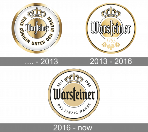
Their original logo was a white badge with a golden circle in the center and a golden frame around. Both had excessive lighting effects. The central circle held the white name ‘Warsteiner’ in their usual font. The white space right around it accommodated their motto – ‘the queen among beers’ – written in a ring around the center. They culminate in an image of a golden crown above,
2013 – 2016
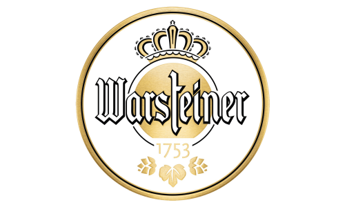
In this design, the golden frame became thinner, and much of the lighting was gone. The name bit became much bigger, while the crown image was placed right atop the central circle. The only notable addition is the year ‘1753’ written in gold in the bottom section.
2016 – Today
The Warsteiner logo is an example of a classical beer emblem – a round-framed wordmark with the crown on top.
It’s color scheme is soft and elegant – light gold with black and white. The gothic bold typeface reflects the brand’s rich history, so does the traditional crown.
The attention-grabbing logo also includes a Warsteiner’s signature claim – “Das Einzig Wahre”, which means “The one and only”. There is also a brand’s foundation date displayed alongside the crown.
The Warsteiner logo shows the brand’s authenticity and a high quality of its product, making it one of the most popular beer bran in the world.
Font and Color
The narrowed gothic-style inscription from the sleek Warsteiner badge is set in a custom typeface with elegant and stable glyphs. The closest fonts to the one, used in this insignia, are, probably, Killviners Regular, or Byzantus Regular, but with significant modifications of the characters’ contours.
As for the color palette of the Warsteiner visual identity, it is set in gold, black, and white, a very sophisticated and chic tricolor, which evokes a sense of professionalism and confidence. The logo looks timeless and sophisticated, reflecting the high quality of the branded product.


