

![]() Eintracht Frankfurt Logo PNG
Eintracht Frankfurt Logo PNG
Eintracht Frankfurt is the name of one of the oldest and most famous football clubs of German Bundesliga, which was established in 1899. Today the team, nicknamed “The Eagles” (“Die Adler” in German) is managed by Adi Hutter with Peter Fischer as the club’s chairman.
Meaning and history
![]()
One of the most popular German football clubs has had an eagle as its main symbol for almost all the time of its existence. The eagle changed contours and colors but has always been the main part of the Eintracht’s badge, making the team’s visual identity remarkable and powerful.
1965 — 1970
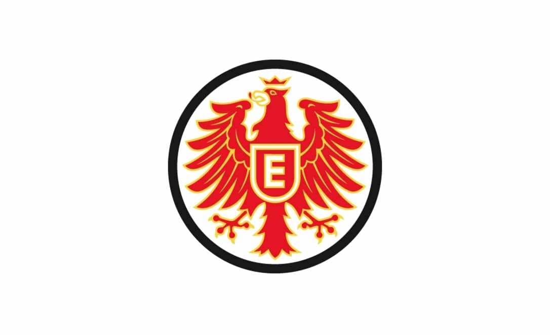
The Eintracht badge from 1965 was composed of a white circle with a bold black outline and a red and gold eagle in the middle. There was no wordmark or anything else on the badge, but the bird and the shield on its body with the strong and straight letter “E”, executed in white and gold.
The red and gold color palette of the Eintracht visual identity, complemented by monochrome details, was a perfect representation of power and confidence of the team, reflecting their strength and determination.
The red and gold crown on the eagle’s head made the club’s badge look like a his-torical crest, showing the strong link of the team with its roots and legacy.
1970 — 1977
The redesign of 1970 brought a new color palette and composition to the club’s in-signia. Now the circle was outlined in a thick black frame, where the “Eintracht Frankfurt” lettering in white was placed around the perimeter. The inscription in the title case was executed in a bold sans-serif typeface, which looked confident and calm.
As for the main element, the eagle was redrawn and became even more heraldic. Now the bird’s beak was opened and the lines curved tongue could be seen. The shield with the letter “E” was still there but now had two a wordmark coming to it from the eagle’s wings.
The simplified color palette, with the golden shade removed, made the badge look even more powerful and masculine, showing the club as strong and stripe competitor, evoking a sense of danger and courage.
1977 — 1998
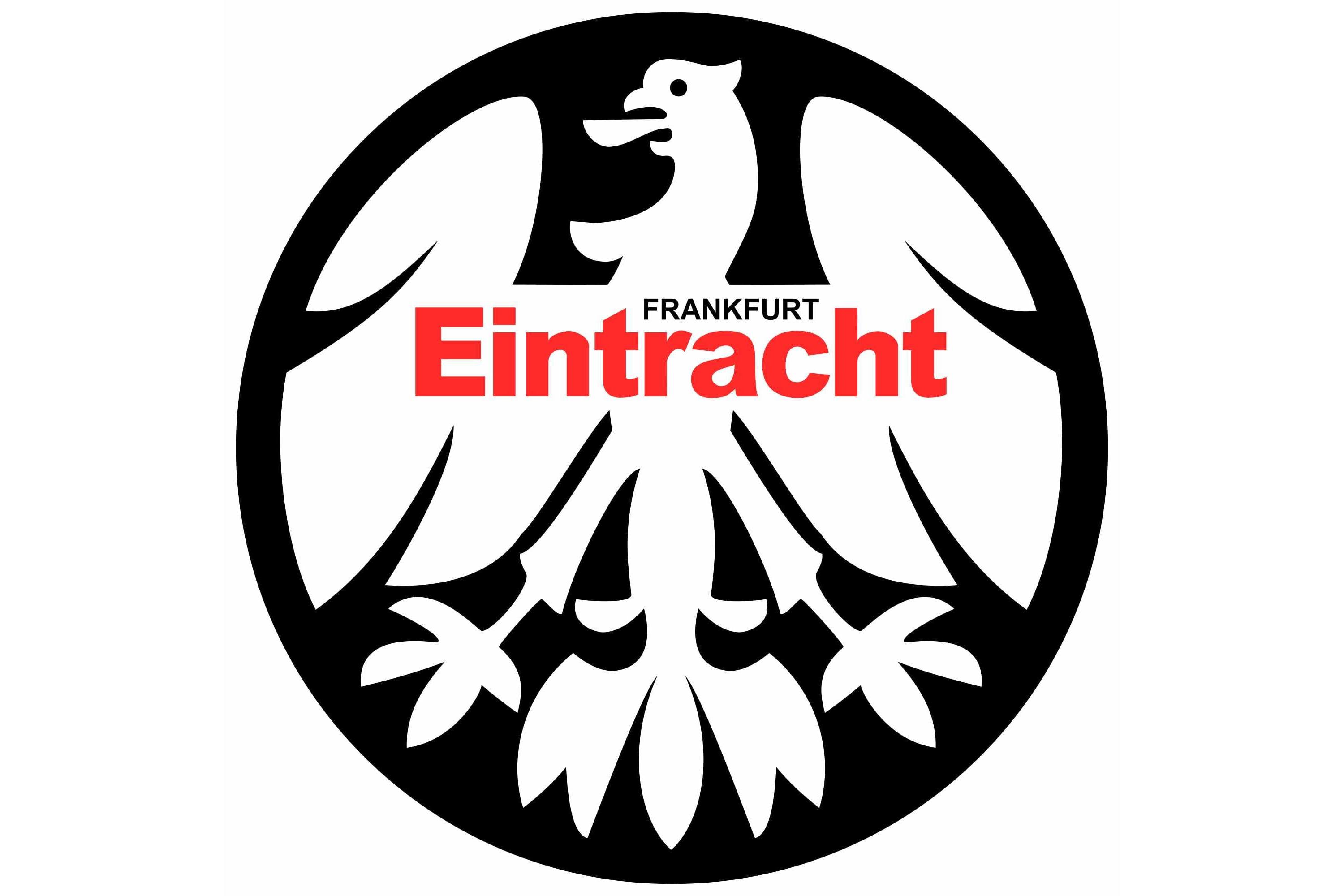
The logo was redrawn again in 1977. A contemporary and stylish emblem of those years was composed of a solid black circle with the white eagle on it. There was no outlines and frames, so the “Eintracht” lettering in red was placed on the bird’s body, and had a black delicate “Frankfurt” above it. The inscription was still set in the title case and used a bold sans-serif font, which looked very modern and memorable in red color.
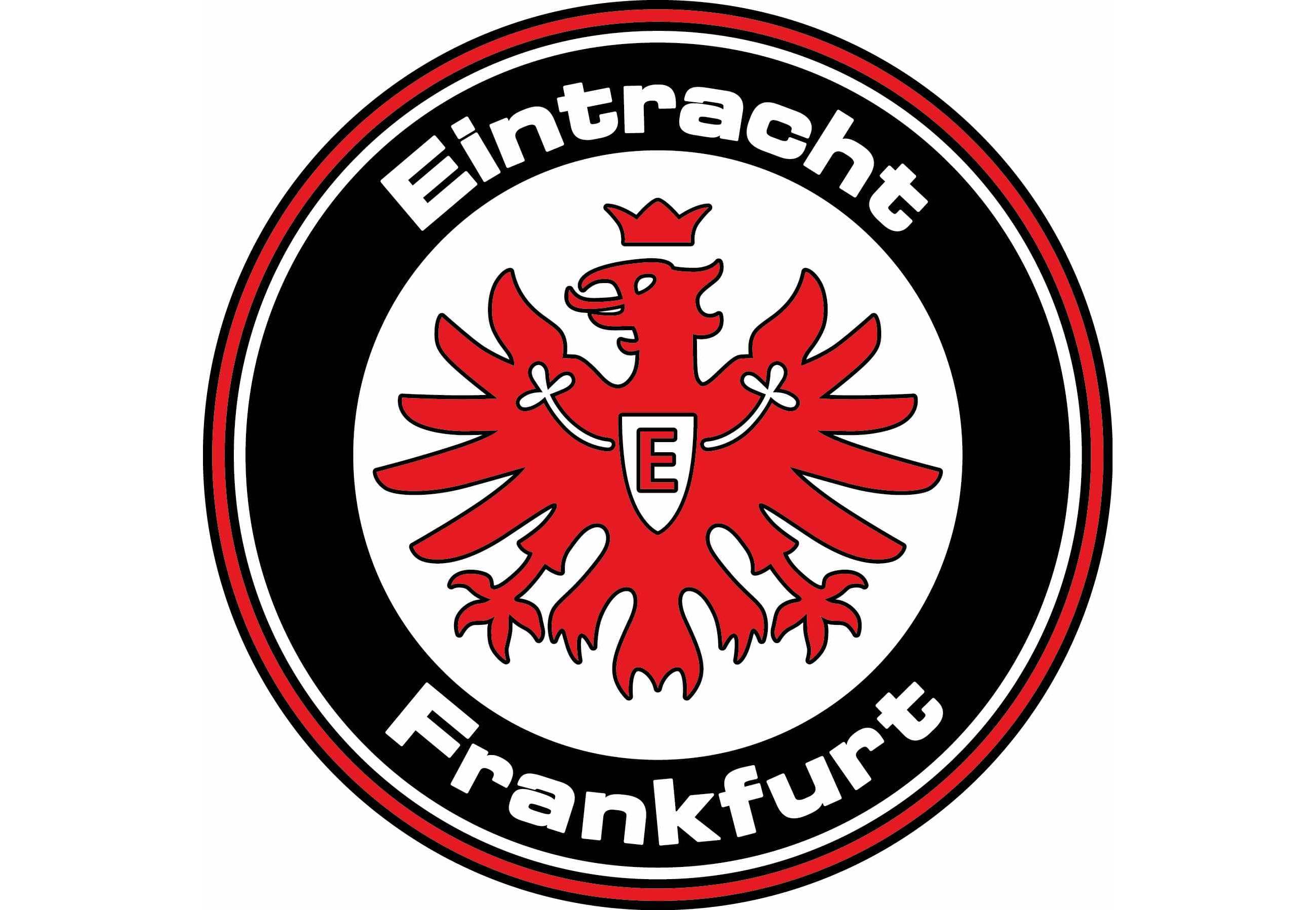
1998 — Today
![]()
In 1998 the club decides to get back to its logo, created in 1970 but changes it a little. The wordmark is now removed from the badge, and the red heraldic eagle is enclosed in a thick red frame.
The new color palette, without any black details, looks passionate and powerful, pointing on the team’s attitude to sports and their expertise.
Eintracht Frankfurt Colors
RED
PANTONE: PMS 2347 C
HEX: #E1000F
RGB: (225, 0, 15)
CMYK: (5, 100, 100, 1)
WHITE
HEX: #FFFFFF
RGB: (255, 255, 255)
CMYK: (0, 0, 0, 0)
BLACK
PANTONE: PMS BLACK 6 C
HEX: #000000
RGB: (0, 0, 0)
CMYK: (0, 0, 0, 100)


