

![]() Manchester Monarchs Logo PNG
Manchester Monarchs Logo PNG
The name “Manchester Monarchs” relates to the AHL team that played from 2001 to 2015 and the ECHL team that have been performing since 2015, their location being in Manchester, New Hampshire.
The current Monarchs (previously the Ontario Reign) replaced the AHL Monarchs who became the Ontario Reign after their relocation to Ontario, California.
Meaning and history
![]()
Manchester Monarchs, established by a group of enthusiastic sports professionals, embarked on its journey in the early 2000s. From the onset, their vision was to create a sports club that not only excelled in competitions but also nurtured talent and sportsmanship. The club’s notable achievements over the years include winning several regional championships, establishing a renowned youth academy, and gaining recognition as a formidable force in the sports community. They have been particularly successful in football and athletics, with their football team reaching the finals of national tournaments multiple times and their athletes setting regional records. Today, Manchester Monarchs stands as a beacon of excellence in sports, continuing to compete at high levels while focusing on community engagement and youth development. Their current position in the sports world is not just as competitors but as influencers, shaping the future of sports through their commitment to excellence and community involvement.
What is Manchester Monarchs?
Manchester Monarchs is a dynamic and prestigious sports club known for its excellence in various sports, particularly football and athletics. They are celebrated for their competitive spirit and significant contributions to youth sports development.
2000 — 2014
![]()
Fans saw the original Monarchs’ logo for the first time at the beginning of 2000-2001 season. A lion head as the logo of the ice hockey team with a “royal” name didn’t come as a surprise. The lion is wearing a crown to lay more emphasis on their “royalty”. The team’s name is above the lion’s head. The Monarchs used black, gold, silver and purple in that logo. Thanks to the color scheme the logo looks spectacular.
2014 — 2015
![]()
Then the club decided to remove the purple and gold colors. Some part of their identity was lost. Yet, the black and grey version looks modern and is great as well.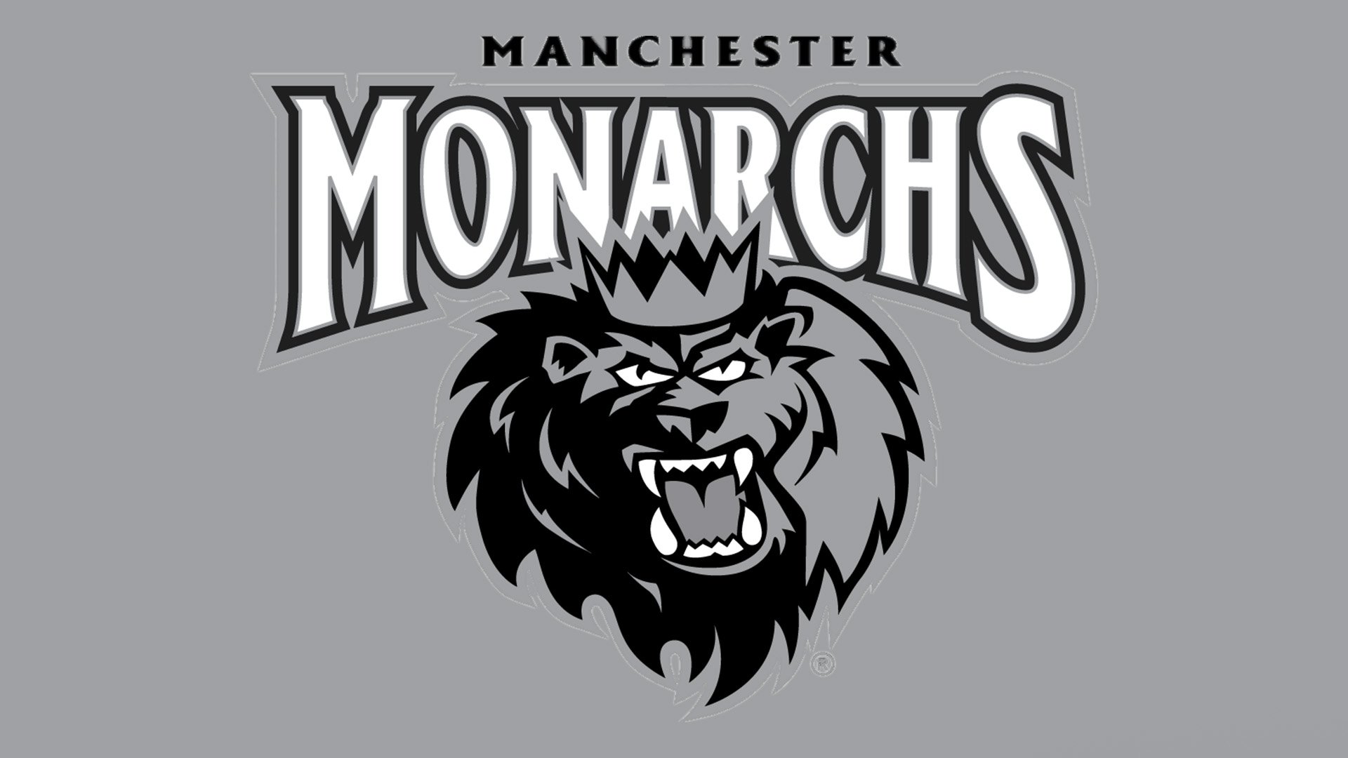
The new Manchester-based franchise keeps not only the name of their predecessor but also their logo. They made just one alteration ‒ they withdrew from the wordmark with the team’s name. The result they got was a simple and at the same time a solid logo.


