Proud and free, horses have for centuries symbolized success and good luck in business, loyalty and endurance, and determination. Horse and man have coexisted together for a very long time. And the image of this graceful animal exists in almost all world cultures.
In the Romans, Greeks, Slavs, and Europeans horse was honored and highly valued, it was attributed to almost magical properties. Horses were sacrificed to the gods as a good and rich tribute. The images of the gods themselves in different cultures were either represented in the image of a horse or a divine rider on this glorious animal.
The horse symbolizes dynamics and movement. It is also an animal inherent in courage, loyalty, grace, and endurance. In feng-shui horse means victory, strength and perseverance, respect and peace.
The horse implies power, speed, and elegance in one package, so the image of this particular animal can often be found on the logos of companies associated with the automobile industry. But not only auto brands use the image of a horse in their visual identity. And in this article, we have collected for you the coolest and most interesting logos with the image of this beautiful animal.
Alabama Huntsville Chargers
The fresh and airy logo of the Alabama Huntsville Chargers team, executed in a white, blue, and gray color palette, features a laconic yet elegant image of a horse’s head, placed above the bold contoured lettering in a sharp geometric sans-serif typeface.
Arkansas Travelers
The Arkansas Travelers‘ visual identity boasts a very modern and sleek image of a white horse, inscribed into its emblem, intertwining with the red three-dimensional letter “A” in a confident and stable typeface. The emblem is accompanied by a sophisticated two-leveled lettering in red and black.
Asquith
The elegant Asquith badge is drawn in a calm-green, white, and black color palette, which on its own stands for sophistication and luxury, and with the graphical element, depicting a horse, these qualities are only elevated. The graceful animal is contoured in black and placed on top of the medallion, above the green ribbon with the wordmark.
Billings Mustangs
The Billings Mustangs‘ visual identity is based on a strong and timeless combination of red, black, and white. The central part of the circular medallion is stylized as a white baseball with red stitched, and decorated by a solid black silhouette of a Mustang horse. As for the name of the club, it is written around the solid red frame of the badge.
Boise State Broncos
The modern and bright image of a horse head is the only element of the Boise State Broncos logo. The animal is drawn in a solid blue and red color palette, which makes it very well visible on almost any background. The eye of the bronco is the only white spot in the composition.
Bordrin
A super cool and progressive horse can be seen in the logo of the Bordrin brand. The animal, executed abstractly and geometrically is drawn here as a rhomboid crest, placed above the uppercase inscription written in a modern custom sans-serif typeface. The contours of the emblem resemble more a chess knight than an actual horse.
Brisbane Broncos
The Brisbane Broncos team features a bold logo with a depiction of a horse head, executed in a burgundy and yellow/Gold color palette. The creature on the badge is depicted in profile, looking to the right, and accompanied by two/leveled lettering in small capitals, to not distract from the graphical part.
Brumbies
The Brumbies visual identity is also based on the image of a horse, which is drawn in a yellow and blue color palette, in a heraldic “rampant” pose. The emblem is enlarged and placed on top of the bold geometric lettering, written in the same color scheme, and accompanied by a delicate gray background depicting a mountain landscape.
Cal Poly Mustangs
The logo of the Cal Poly athletic program, named The Mustangs, features an image of a running horse, which is drawn in quite a minimalistic manner, but looks super elegant and strong. The horse, executed in a blue, yellow, and white color scheme is placed between the parts of the largest “Cal Poly” part of the lettering, written in the uppercase of a modern sans-serif typeface, and accompanied by the “Mustangs” tagline in the same style but a smaller size.
California Davis Aggies
The California Davis Aggies badge is executed in the same blue, yellow, and white color palette, but has a more modern image of a horse in its identity. The voluminous b white and gray emblem in a blue outline is inscribed into a crest with the extended “C” on a solid yellow background, and accompanied by a simple yet Stable blue lettering in two lines.
Carlsson Automobile
This German company specializes in tuning Mercedes-Benz vehicles. It was founded in 1989 by brothers Rolf and Andreas Hartge. The company is better known for the production of customized car wheels. Not much is known about the origin of the logo, but Carlsson is named after Swedish rally driver Ingvar Carlsson, who competed for Mercedes in the 1980s.
Coach
At the beginning of its history, Coach was engaged in the production of leather goods for horses and saddles. However, over time, the company began producing accessories for people, such as wallets, bags, and belts. And the company’s “horse” heritage remained for years in its logo.
Continental
The first Continental logo was adopted in 1872, almost immediately after the company was founded. The horse on the reins is a reference to the coat of arms of the Kingdom of Hanover, which existed in the first half of the 19th century. The modern version of the logo, like all previous versions, also uses a horse together with the original Continental spelling.
Corre La Licorne
The super traditional old-school logo of the Corre La Licorne company also features an image of a horse similar to the one you might find in the Ferrari Badge. The silverfish three-dimensional stallion is drawn on a solid red background of a classy roundel in a wide transparent framing with silver serif lettering around its perimeter.
Dallas Mavericks
The Dallas Mavericks logo, executed in a blue, white, and black color palette, looks quite modern and ok for today’s realm. It is composed of a graphical part, which depicts a monochromatic image of a horse’s head on a blue basketball background and a stylized banner with the wordmark written on it in a narrowed modern font.
Dark Horse Comics
The Dark Horse Comics‘ visual identity, drawn in a stable and minimalistic black-and-white color palette, is based on quite a caricaturish yet modern and sharp, image of a horse, which is drawn on top of the composition, accompanied by three solid black ribbons with white lettering on them.
Denver Broncos
The logo of the Denver Broncos team is also based on an image of a horse, a bronco. It is drawn in a modern manner above the geometric sans-serif lettering. The main white color of the animal’s head is accompanied by a thick blue outline and a solid orange color of the mane.
DigitalPlayground
The horse image on the DigitalPlayground logo is inscribed into the lettering, being more a negative space than a separate element. The head of the animal is cut out in the left vertical bar of the “D” in the bold red abbreviation, set above the narrowed black lettering at the bottom of the composition.
Eicher
The Eicher visual identity is also based on the image of a horse, but an abstract one. The logo of the brand is a horizontally oriented oval medallion with a white silhouette of a horse embedded into the red background with straight and short lines cutting it. The emblem is placed above the super heavy gray lettering in a geometric sans-serif typeface.
Engler
The Engles horse is somewhat unique and truly memorable. The three-dimensional geometric image of this animal is executed in a gray and black color palette with matte gradients. The contours of the emblem are perfectly balanced yet the laconic futuristic sans-serif typeface of the wordmark is written at the bottom of the badge in medium-weight black bars.
Etro
The logo of the famous Italian fashion brand Etro is a horse with wings, Pegasus. The animal is a symbol of creativity, beauty, and positive energy. It combines two beginnings: earthly and sublime. Just like the designers of the brand combine bold colors and classy silhouettes in their collections.
Fairleigh Dickinson Knights
For the fans of chess, the logo of the Fairleigh Dickinson Knights may seem just right. The blue figure is Dean in a pretty minimalistic way and outlined in white. The emblem is placed above the arched serif lettering, written in bold red capitals and evoking a sense of quality and stability.
Ferrari
The Ferrari logo, also called “Cavalry”, is one of the most recognizable logos of automobile production. The emblem includes the flag of Italy and the image of a stallion, which was chosen by Enzo Ferrari as a symbol of the speed, elegance, and high power of Ferrari cars.
Godiva
The trademark of Godiva is a girl with long hair on horseback. There is a legend behind it: Lady Godiva was the wife of Lord Leofric and advocated lower taxes on his subjects. The Lord was against it, but one day, he offered his wife a deal – he would reduce taxes if she would ride through the streets of the city “dressed only in her lush curls”. The next morning, she made the trip.
Hanteng Autos
The logo of the young automobile brand from China Hanteng Auto resembles the Ferrari label in its composition – it is also a horse, but on a red background, not yellow, as the Italian supercar manufacturer. The bold lines of the horse and the crest’s frame add a touch of stability and brutality.
Hermes
In 1900, the luxury French fashion house Hermes developed the Haut à ourroies bag, designed specifically for riders so that it could carry a saddle. Hermes has not forgotten the equestrian tradition of its company and depicted a horse and carriage on the logo, which appeared in the 1950s.
Holsten
The horse on the Holsten logo is a tribute to the brand its heritage and its historical legacy. The animal is a significant part of the company’s emblem, as it is a horse the Holsten knights are riding. The image in solid black is placed behind the red and white crest with the elegant capital “H” on it and above the lettering, executed in a super sleek serif typeface.
Iran Khodro
Iran Khodro or IKCO, the oldest Iranian automobile manufacturing company, was founded by Ahmad Khayyam in 1962. The company’s first logo appeared in 1962 and has not changed since then. The graphic part of the emblem is in the form of a shield, which symbolizes power, strength, and safety. Inside is drawn a stylized silhouette of a horse’s head, which represents beauty, grace, and speed.
KAMAZ
The running horse appeared on the KAMAZ logo in 1988. The logo was drawn by Moscow artists Viktor Kryuchkov and Viktor Markovsky. In the Rabochy KAMAZ newspaper from the same year, it was stated that the emblem symbolizes the vehicle’s speed, the versatility of its application, and adaptability to different operating conditions.
Kansas City Mavericks
The horse from the Kansas City Mavericks‘ visual identity looks both funny and fierce. The gray image depicts an animal with its nostrils wide-blown but in a pretty caricaturish way. The drawing is set in the center of the traditional circular medallion with a wide white frame where the black uppercase lettering is written in a clean and distinctive sans-serif typeface.
LEVC
LEVC is the successor of the famous British company London Taxi Company, founded in 1919. Today, the company is owned by the Chinese concern Geely. The logo of the marque is executed in a stylish and progressive manner, with the sleek depiction of a horse drawn in a circular medallion enclosed between two wings.
Liquipedia
The logo of Liquipedia features an interesting emblem, composed of a blue and white puzzle detail with the drawing of a horse on it. The image is set against a transparent background and accompanied by neat lowercase lettering in a traditional sans-serif, which makes the logo look very calm and friendly.
Lloyds Bank
The visual identity of Lloyds Bank is somewhat very elegant and traditional. The uppercase sans-serif lettering is written in green, the color which is associated with wealth and success; and decorated by a small three-dimensional figure of a stallion, drawn in gray and black gradients. The horse looks super sophisticated and adds lightness to the stable inscription.
Longwood Lancets
The distinctive and strong logo of Longwood Lancets evokes a sense of motion, speed, and power, which perfectly suits a representation of a sports team. Executed in dark blue and white, the badge looks balanced and clean, yet has all the strong accents set properly.
Malagrida
The horses from the Malagrida fashion brand can not be called typical. The delicate emblem depicts an interesting composition with two intertwined contours of horses’ heads, which look in different directions. The fine and light image evokes a sense of luxury and beauty, while the classy bold lettering gives a more professional appearance.
McNeese State Cowboys
Would be weird to see something but a cowboy on a horse on the logo of a team with “Cowboys” in its name. The solid blue contour of a man on a horse is set on the background of the composition and overlapped by an enlarged wishbone capital “M” colored in yellow and outlined in white.
Middle Tennessee Blue Raiders
The square and stable “MT” abbreviation from the Middle Tennessee Blue Raiders logo is balanced by the sharpness and distinction of the graphical part, drawn on top of it and depicting a flying Pegasus with the lighting bolts coming out of its mouth. A perfect representation of speed and strength.
Murray State Racers
The visual identity of Murray State Racers looks very well-balanced and stable. Executed in a dark yellow and blue color palette, the badge is composed of an enlarged capital “M” with sharp ends of the vertical bars, and an image of a man riding a horse overlapping the character in the very middle.
Mustang
The Mustang logo was originally designed by Phil Clark. The animal was depicted against a background of red, white, and blue stripes to signify the car and the brand’s American heritage. The Mustang logo symbolizes the power and strength that this car represents.
Pegaso
One of the most elegant depictions of a horse can be seen on the logo of Pegasus. Surprisingly, the animal on this badge doesn’t have wings, but it still looks as if it is flying. The solid black silhouette of a horse is drawn on a transparent background and accompanied by a medium-thick circular framing, which has a cut-out in the left part.
Porsche
The logo of the German brand is based on the coat of arms of the Free People’s State of Württemberg. There are two versions of how this design became the Porsche logo. The first says that the legendary importer of German cars to the United States, Max Hoffmann, drew it on a napkin for Ferry Porsche, and the second says that it was designed by an engineer named Franz Xaver Reimpiss.
Qarabag
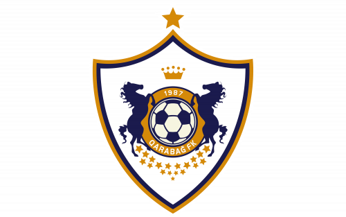
The Qarabag logo is executed in a traditional heraldic style, with the classy sharp crest as the main shape. The blue and white image of a football is set in the very center of the crest and outlined in a thick golden frame with two solid blue horses on the sides. The composition is decorated by numerous golden stars and a delicate crown on top.
Ralph Lauren
The great American designer Ralph Lauren wanted buyers to realize that the product was special and belonged to the luxury class, as soon as they saw the logo. Loren did not fail: the logo in the form of a player on a horse first appeared on a collection of women’s shirts, which began to be produced in 1971 and is now considered one of the most recognizable trademarks in the world.
Red Horse Extra Strong
The Red Horse Extra Strong logo includes not only the image of a horse but also a horseshoe, which makes up the shape of the whole badge. As for the horse symbol, it is drawn on top of the banner, in solid red, and features classy contours, resembling the ancient Roman theme. The badge is balanced by geometric black lettering, which brings us back to real-time.
Remy Martin
Remy Martin is the oldest cognac producer in the world. The logo with a centaur, which still adorns each bottle of the cognac, was developed in 1870. At that time the company was owned by Paul-Emile Remy Martin, who in addition to winemaking was seriously interested in astronomy. He took the image of Sagittarius – the sign of the zodiac under which he was born – as the basis for the emblem.
Rider Broncs
The horse from the Rider Broncs logo is a pure fighter. The determination and power can be seen in each detail of the gray and black animal, placed above the stylized red lettering in a sleek modern typeface. This badge is an example of how the graceful and elegant horse can perfectly represent an aggressive spirit and fighting mood.
SMU Mustangs
The visual identity of SMU Mustangs only contains one element — a solid red silhouette of a Mustang horse, drawn against a transparent background with no graphical or text additions. The image, the color, the contours — this badge doesn’t need anything else.
St. George Illawarra Dragons
On the logo of St. George Illawarra Dragons, a horse is not the main hero. The black silhouette of a knight riding a horse is drawn on the background of a classy red and white crest. The image is overlapped by a white drawing of a dragon with sharp contours and thin black outlines.
Team Empire
The Team Empire visual identity is a modern interpretation of historical crests. The image of a knight in a horse is drawn in the top part of a bold gold and red crest; and accompanied by the lettering, which top part is written across a solid red ribbon, and the bottom — is set in stylized white characters with a slightly arched underline.
TEMU
The popular marketplace TEMU also has an image of a horse in its logo, but here the symbol looks completely different from all the badges we saw above. One of the four icons set above the bold white lettering is a drawing of a rocking horse toy, which represents the selection of goods for kids available on the platform.
Texas-Arlington Mavericks
A sharp and elegant image of a horse can be found in the logo of Texas-Arlington Mavericks. The white neck and head of the stallion are outlined in thick and clean orange strokes, and the short and sharp mane of the animal is drawn in blue and oranges these orange accents of the mane resemble the tongues of flame, which make the image even stronger.
Tristar Pictures
The visual identity of Tristar Pictures is composed of modern geometric lettering in thick black lines with angular contours of the uppercase characters, and an airy and elegant emblem, which depicts a flying Pegasus with enlarged wings spread to the sides. The animal represents fantasy and creativity and adds an airiness to the solid wordmark.
TVS Motors
TVS Motors is another brand that chooses a red color for its emblem with a horse. The stylized depiction of the moving animal is set in the right part of the composition, grounded by the geometric serif lettering in thick blue bars. However, the characters of the wordmark are slightly slanted to the right, moving in the same direction as the horse.
Winchester
The legendary firearms company Winchester also has a depiction of a horse in its logo. The black-and-white image of a cowboy on a horse makes up the main part of the brand’s badge. The image is accompanied by stylized red lettering in a very interesting geometric font with short sharp elements. The red, black, and white color palette makes the Winchester logo sleek and timeless.
Wyoming Cowboys
The Wyoming Cowboys logo depicts a silhouette of a cowboy on a horse, drawn in a solid brown color with a bright yellow outline. There is no additional lettering on the badge, but it is not even needed here. The intensity of the colors does its job pretty well.


