Mercedes-Benz, a beacon of automotive mastery, operates at the intersection of heritage and innovation. Its global footprint is rooted in the factual prowess of engineering and a relentless quest for excellence. The cornerstone of its operation lies in the heart of Affalterbach, where the fusion of tradition and cutting-edge technology breathes life into the ultimate performance vehicles. Here, the passion for automotive excellence transcends mere manufacturing; it’s a testament to the enduring legacy and the forward-looking vision of Mercedes-Benz.
Meaning and history
The storied journey of Mercedes-Benz began with the merger of Daimler-Motoren-Gesellschaft (DMG) and Benz & Cie in June 1926, a pivotal moment orchestrated by visionaries Gottlieb Daimler and Karl Benz. This union not only marked the inception of a brand that would epitomize luxury automotive engineering but also set the stage for universal motorization. In the heart of their operations, the Daimler sons, inspired by the location of their home beneath an apple tree, conceptualized the now-iconic three-pointed star logo, symbolizing their ambition for the domination of the land, air, and sea.
Amidst the fervor of innovation, Mercedes-Benz carved its path to global recognition. The company’s drive was evident in its relentless pursuit of excellence, leading to groundbreaking achievements that included the introduction of the valve spring and cam mechanisms, which revolutionized engine performance. The Mercedes-Benz logo history, with its coat of arms adorned by a laurel border, signifies the merger’s success, embodying a trademark of unparalleled quality and prestige.
Today, Mercedes-Benz stands as a colossus in the automotive world, its position cemented by its reputation as one of the world’s most successful automotive companies. The merger of Daimler-Motoren-Gesellschaft (DMG) with Benz & Cie has evolved into a global powerhouse, Mercedes-Benz Group AG, under the leadership of Ola Källenius. The brand’s commitment to innovation is unwavering, with Mercedes-Benz Mobility AG offering innovative mobility services and Mercedes-AMG at the forefront of manufacturing ultimate performance vehicles. The company’s emblem, a three-pointed star encased in a laurel wreath border, continues to be a beacon of excellence, guiding Mercedes-Benz as it pioneers the future of motoring.
What is Mercedes-Benz?
Mercedes-Benz, renowned for its lineage of high-end passenger cars and premium vans, stands as a paragon of automotive excellence. This bastion of luxury and innovation upholds a tradition that intertwines the Mercedes-Benz symbol with a legacy of performance and elegance, setting the benchmark for the automotive industry.
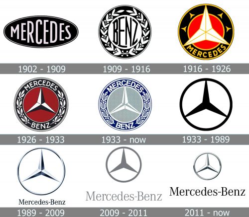
1902 – 1909
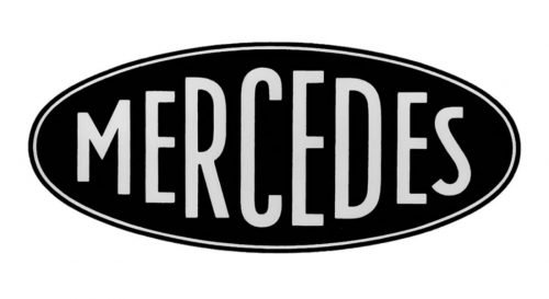
The very first Mercedes logo was composed of a strict oval badge, which was located horizontally and featured a bold sans-serif wordmark, where all the letters were in different sizes, enlarging to the center and then getting smaller to the right. The badge had a double outline and was executed in monochrome for documents and dark blue with silver for the emblem.
The star has a double meaning for the company — it was adopted in the 1920s, as a tribute to the Daimler family, whose father used a traditional five-pointed star as a signature, and put it on all the postcards he sent. The traditional contours were modified to make a three-pointed Star as a representation of the family’s intentions — to motorize the whole world on land, water, and in the air. Three directions, three points, three aims.
1909 – 1916
The Benz logo from 1909 was elegant and ornate. Its traditional circular badge had a thick double outline where the stylized wreath was drawn. The wordmark in an eddy custom sans-serif was written in black on a white background of the inner circle. It was an ornate and beautiful logo, which at the same time represented the power and energy of the brand.
1916 – 1926
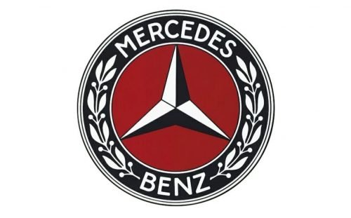
The logo, designed for the brand in 1916, featured a blue and white star placed on a burgundy-red background and enclosed in a thick circular frame, where the wordmark and leaves ornament were drawn in white. It was a very elegant badge, which color palette represented style, sophistication, and power.
1926 – 1933
The logo, designed for the brand in 1926, featured a blue and white star placed on a burgundy-red background and enclosed in a thick circular frame, where the wordmark and leaves ornament were drawn in white. It was a very elegant badge, which color palette represented style, sophistication, and power.
1933 – Today
In 1933 the burgundy background was switched to light gray, and the star was now executed in white and gray, while the thick blue framing remained almost untouched. The leaves on the frame were redrawn and became a bit bigger than on the previous version of the logo.
1933 – 1989
Later in the same year, another badge was created. The super minimalist and very futuristic for its times, the badge was executed in black and featured a stylized thin and sharp three-pointed Star placed inside the white circle with a medium-thick black outline.
1989 – 2009
In 1989 the logo became three-dimensional and the color palette of the badge was switched to gradient gray. Now the symbol was executed in a glossy metallic texture and featured an enlarged serif lettering in black placed under it. The classy and neat inscription boasted a slightly visible shadow, which added volume and style to the whole image.
2009 – 2011
In 2009, flat design took over the three-dimensional approach, marking a significant shift in the aesthetic of car branding, particularly for Mercedes-Benz. The emblem and wordmark were redesigned in a simple gray color, devoid of any accents or embellishments, echoing the minimalism that has come to be associated with modern car logos. The font of the lettering stayed consistent, yet the lines appeared thinner due to the shadow’s absence. This change underscored a new era in automotive logo design, moving away from the traditional approach symbolized by the 3-pointed star on the left side of the Mercedes-Benz AMG to a more contemporary and streamlined style.
2011 – Today
The brand underwent another visual identity redesign in 2011. The new logo bore a striking resemblance to the one introduced in 1989, yet the circular framing of the emblem became thicker, and the wordmark lines thinner. The typeface of the lettering mirrored the Corporate A font family, showcasing timeless elegance. This redesign reflected Mercedes-Benz AG’s commitment to perfection in detail, from the officially approved testing organization to trademark registration, emphasizing the importance of every aspect from the certificate of conformity to fleet management. The update not only reinforced the brand’s position among car companies but also highlighted its dedication to digital services and legal protection, offering consumers reliable and official figures on electric energy consumption for new vehicles.
Symbol
The star that became the Mercedes symbol was originally seen by Gottlieb Daimler as an image protecting his own home. Later on this image acquired additional semantic meaning. Three (the number of the rays) was considered to be a sacred number, the number of perfection. Daimler also pointed out that the products of his enterprise were conquering the three elements ‒ water, air and land. After all, the concern produced engines for maritime and river transport, engines for the aviation industry and engines for land transport. Later among the company’s products there were also full-fledged vehicles, first of all, cars.
By the way, for the first time the Mercedes car was presented to the public as a racing car. The car took part in the race with “Monsieur Mercedes” behind the wheel ‒ Emil Jellinek took this nickname for the time of the race (being an aristocrat he could not participate in the race under his own name). By the way, later Emil, according to the aristocratic tradition, added a prefix to his name, and became Mercedes-Jellinek.
The first Mercedes logo was interpreted as a stylized image of the steering wheel. However, this explanation was dragged by the head and ears, especially as Daimler’s biographers definitely claim that the sign, which was later patented as the Mercedes logo, had been used by Gottlieb Daimler long before the company started manufacturing cars.
After the defeat of Germany in the Second World War, Mercedes cars became the life belt that allowed the company to withstand the international ban on the military industry.
Emblem
The Mercedes emblem, with the exception of the first years of the brand’s existence, was in a circle shape. Originally the emblem (the print writing MERCEDES) was made in an oval shape elongated in the horizontal direction. However, the company was faced with the fact that their closest competitor, the Italian brand Maserati, also used an oval logo, though it was elongated in the vertical direction.
Do you know that the name of the brand Mercedes was invented not by Daimler, but by the consul and the French dealer of the Daimler Company Emil Jellinek? He convinced his employer that this name was very attractive for a car, though he did not say that it was his daughter’s name. Formally, it was impossible to find fault with Emil Jellinek’s suggestion, because his daughter’s name was Adrian Manuela Ramona. So the girl’s home name became the name of one of the most successful brands in the history of automotive industry.
The attempt to make the logo look like just an acute-angled star with three rays turned out to be not very successful (nor did a star with four rays find its practical application). The shape of the circle in which the three-rayed star was inscribed was recognized as optimal.
Font
In the nascent years of the twentieth century, when the Daimler brothers and their descendants, including Daimler’s sons Paul, were laying the foundation for what would become the Mercedes-Benz legacy, the print element was prominently featured in the logo’s design. This choice reflected the company’s ambition to underscore its uniqueness and the individual meaning behind each aspect of its operations, including the innovation of Mercedes-Benz engines. However, as Mercedes-Benz solidified its position among the leading global suppliers of high-end passenger cars, the decision to phase out the print element from the logo was made by Mercedes-Benz officials. This decision was motivated by a desire to simplify and purify the emblem, reflecting the company’s drive towards elegance and simplicity. The font chosen for the logo, while classic and easily legible, carried a deep significance linked to the company’s heritage and innovative spirit, making it unique without overtly unique characteristics.
Over time, even without the active use of a font in the logo, its design continued to reflect Mercedes-Benz’s commitment to excellence and simplicity, integral to the company’s ethos. This decision highlighted the depth of the Mercedes-Benz logo meaning, transforming it from a mere signet into a symbol of the brand’s long history of innovation and quality. This evolution was inspired by the legacy of the Daimler family and the dedication of Mercedes-Benz officials, ensuring the logo remained a potent emblem of prestige and reliability in the automotive sector.
Color
The color scheme of the Mercedes-Benz logo has undergone numerous changes throughout the brand’s history, mirroring its evolution and adaptation to a changing world. Initially, the vibrant hues of gold, white, red, and blue chosen for the three-pointed star symbolized the company’s drive towards leadership in innovation and quality — foundational principles instilled by the Daimler brothers. By 1916, reflecting a shift towards a more refined and technologically advanced image, the three-pointed star was rendered in silver, a decision endorsed by Mercedes-Benz officials. This color became a symbol of purity, precision, and high technological prowess that Mercedes-Benz aimed to demonstrate in each of its vehicles.
After World War II, Mercedes-Benz reverted to the silver logo, stripping away all decorative elements except for the silver circle and star, in a nod to its roots and the inspiration drawn from its heritage and commitment to innovation. Today, the silver logo not only symbolizes the historic legacy and future of Mercedes-Benz but also reflects its status as one of the leading global suppliers of high-end passenger cars. This transition to a more modern and simplified design is supported by the company’s leadership and board of management, including key figures such as Britta Seeger and Markus Schäfer, highlighting Mercedes-Benz’s ongoing pursuit of innovation and excellence.
What does the Mercedes-Benz logo represent?
The iconic logo of the Mercedes-Benz company, the elegant and sophisticated three-pointed star, inscribed into a circular frame, represents the power and reliability of the engines, produced by the Daimler Corporation.
Why did Mercedes choose their logo?
The Mercedes-Benz three-pointed star in a circular frame, which has already become iconic, was adopted as the primary emblem of the company in 1916, and since then has only slightly refined its contours. The emblem was designed by the owners of the brand, Adolf and Paul Daimler, who were inspired by an image from the postcard they received from their father, Gottlieb Daimler, at the beginning of the 1870s. It was a star, which Gottlieb marked his birthplace with, accompanying it with the wishes for the new fabric to glow and shine.
What does the Mercedes-Benz emblem represent?
There are several interpretations of the iconic three-pointed star on the Mercedes-Benz badge. The first is that the three rays are the names of three people: Wilhelm Maybach, the great engineer and designer, Emil Jellinek, and his daughter Mercedes. According to another version, the Star symbolizes the dominance of the company on land, in the sea, and the sky.
What Mercedes car has the glowing emblem?
The glowing emblems on the Mercedes cars are the iconic silver three-pointed star in a circle badge with LED lighting. The cars, equipped with this kind of badge are mainly Mercedes-Benz GLE and GLS class SUVs, as well as some CLS and E-class sedans. However, in 2020/2021, some Mercedes-Benz cars began to be recalled due to a faulty glow star, which causes different sorts of problems.
What does the Mercedes symbol represent?
The three-beam star symbolizes the superiority of the brand in all directions: on land, on water, and in the air, since Daimler produced marine and aircraft engines in addition to cars. The three-beam star also signifies the trinity of the Mercedes car for the driver, passenger, and mechanic.


