

![]() Brisbane Broncos Logo PNG
Brisbane Broncos Logo PNG
The club played its first official game in the NSWRL’s 1988 Winfield Cup premiership. It was during that match that the first Brisbane Broncos logo made its debut.
Meaning and history
![]()
The team founders were Barry Maranta and Paul Morgan, who used to play in the Brisbane Rugby League. Initially, the team’s logo was supposed to include a kangaroo and the letter “Q,” which had been present in the emblem of the Queensland Rugby League for decades. Yet, as the country’s national rugby league team was called Australian Kangaroos, the founders had to forget about the kangaroo idea.
Among other suggestions that were eventually ruled out were the Cooktown Orchid (the state flower) and such Australian animals as the brumby, possum, galah, and the kookaburra.
One of the reasons why the name “Broncos” was chosen was that it features alliteration with the word “Brisbane.” Also, one of the founders, Barry Maranta, was a long-time fan of the NFL team Denver Broncos.
What is Brisbane Broncos?
Brisbane Broncos is the name of a professional rugby club from Australia, which was established in Queensland in 1988. Today the club successfully competes in the National Rugby League, has Lang Park with a capacity of 52,500 as the home arena, and Kevin Walters as the head coach.
1988 — 1999
![]()
Similar to the original kits, the first logo was dominated by gold. It featured a yellow wild horse with the team’s name inside a white shield with a maroon border.
2000 — 2006
![]()
The maroon color dominating the current logo is by far closer to the shade that has been traditionally associated with Queensland rugby league and Queensland sport in general. Unlike the previous version, this logo features only the horse’s head.
2007 — Today
![]()
Font
![]()
Being highly legible and traditional, the type is also unique and is clearly linked with the pictorial part of the logo. The serifs are so tiny and thin that it’s possible to overlook them at smaller sizes and the type may seem a sans serif one. At larger sizes, they become more prominent and you can see their delicate shape create a visual rhyme with the sharp and thin edges of the horse’s mane.
Colors
Maroon and gold dominate the Brisbane Broncos logo, while white is left for the accents and the background.
The three colors are deeply rooted in the history of rugby league in Queensland. Originally, the people who created the team wanted to use the palette of Brisbane City Council (blue and gold), but John Singleton, an advertiser from Sydney, recommended the board to steer clear of them.
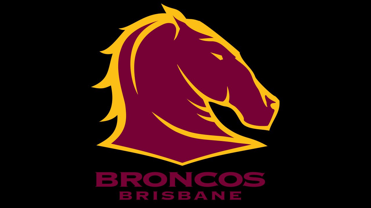
As a result, the kits the players wore during their inaugural season were gold, maroon, and white. The palette of the jerseys underwent several modifications (including the addition of blue in 2001) until it came to its current style. Now, the color taking up most of the surface in both the jerseys and the logo is maroon (the shade is close to Hex: #760036, RGB: 118, 0, 54). If you’re looking for a similar shade of gold, you may try Hex: #FABF16, RGB: (250, 191, 22).


