KAMAZ is a prominent Russian truck manufacturer, majority-owned by the state corporation Rostec. Founded in 1969, it’s headquartered in Naberezhnye Chelny, Tatarstan, Russia. The company has a vast operational footprint, with its products in more than 80 countries across the globe. As a key player in the automotive industry, KAMAZ consistently evolves, manufacturing trucks and buses of various specifications and purposes.
Meaning and history
Founded in 1969 in Naberezhnye Chelny, KAMAZ was established as a response to the growing demand for trucks in the USSR. Over the years, the company has garnered significant achievements, becoming the largest truck producer in Russia and a dominant figure in the global truck market. Its accolades include multiple wins in the Dakar Rally, a testament to the reliability and efficiency of its vehicles. Today, with strong backing from Rostec, its majority shareholder, KAMAZ stands at the forefront of truck manufacturing and innovation, having expanded its market presence to over 80 countries.
What is KAMAZ?
KAMAZ is a leading Russian truck manufacturer, established in 1969. Renowned for its robust vehicles, the company has a global presence, exporting to over 80 countries.
1969 – 1970
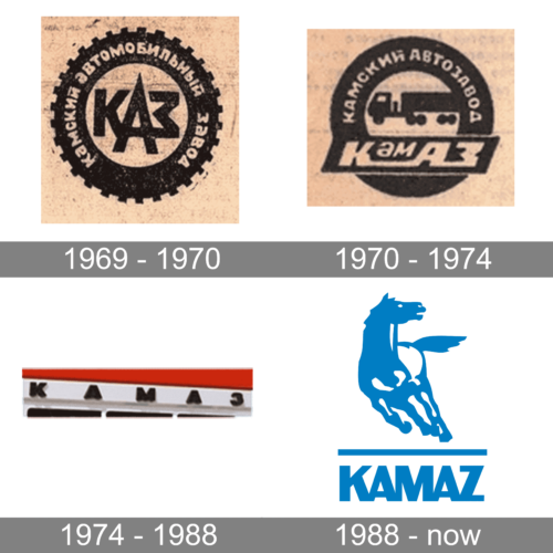
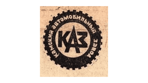
An offroad tire served as the base for this logo. It was done in black and had the full name of the company printed in Russian using a basic, sans-serif typeface and all uppercase letters. The font color matched the beige color of the square background, which was also seen in the center of the tire. Large, sans-serif letters had “KAZ” printed in Russian. The letter “A” was made larger to feel the space in the center and add a unique touch to the logo. It was quite clear what the company was doing even without reading the name.
1970 – 1974
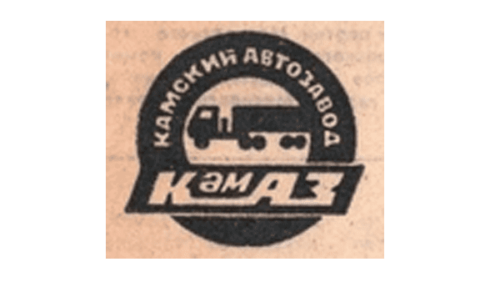
This logo does not look much different than the earlier version. The designers made the tire smoother on the outside. The full name was shortened, allowing for the addition of a horizontal banner carrying the brand name in the bottom half. A truck silhouette was the new element in this logo, replacing the initials featured in the center.
1974 – 1988
A simplified and more modern design was introduced in 1974. The company left only its name, doing away with the tire and other elements. The name was still printed in Russian, which reflected the fact that the company was not going international yet. However, the lack of other elements made it clear that the company was well-recognized within the country. The wide spacing, black lettering, and bold font showed a stable and confident position of the brand.
1988 – now
The new logo looks more dynamic and modern as it now depicts a running horse. The animal was done in a white and blue color palette and was full of power and determination. The horse had a horizontal line underneath that served as the ground line and separated it from the inscription underneath. The latter had “Kamaz” printed using the English alphabet, which was not the case in earlier versions. As for the font, the company went for a bold sans-serif font and used all uppercase characters that slightly overlapped, being joined at the bottom. The logo looked strong and was a perfect match for powerful vehicles manufactured by this brand.


