Digital Playground is an old studio from North America. They are owned by the Canadian conglomerate MindGeek, although much of the work is done in the United States. DP is considered one of the biggest and most successful film studios on the continent, with few competitors.
Meaning and History
Digital Playground was founded in 1993 by the American businessman called Joone. The horse has been their usual symbol since then, as an embodiment of strength, endurance and such qualities. The company entered somewhat of a decline in 2012, because of the introduction of many new suppliers on the market.
Old Logo
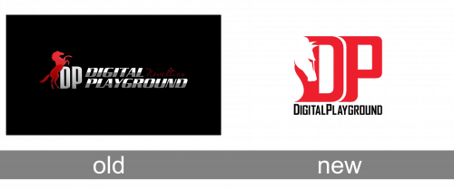
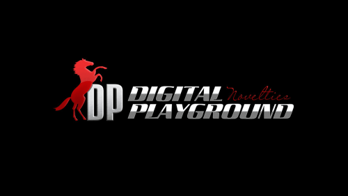
The old logo depicts a red stallion standing on its rear legs next to a white ‘DP’ acronym. The letters in this part are tall sans-serif characters. Next to it, there is the full name, written in two lines of text. The overall height is virtually the same as the height of the acronym on the left. The font, however, is different – these letters are sharper, tilted and colored 50/50 on grey and white.
New Logo
The newer logo is more compact. The acronym became the centerpiece of the logo. It’s bigger, colored red now and made in a new style. The letters aren’t as tall now, but they are still pretty abrupt and rounded. They are positioned as if the ‘D’ is in front of the ‘P’ and blocks part of the latter’s left side. In the former’s left side, there’s a big imprint of a horse’s head.
‘DigitalPlayground.com’ is written the length of the acronym below the main elements. The color is black here, and the letters are sharper. They also like to put this bit on the acronym’s right in full height, on occasions.


