The company, then called Continental-Caoutchouc & Gutta-Percha Compagnie, was founded in Hanover in 1871. Until today it has come a long way full of outstanding achievements. In the beginning, the company was engaged in the production of fashionable rubberized fabrics, but quickly moved on to the creation of tires for bicycles and carriages, and later also for automobiles.
Meaning and history
Continental was founded in Hanover in 1871. The company specialized in the production of rubber products. Initially, the company was engaged in the production of rubberized fabrics, which were in steady demand. After some time the company started to produce cast tires for carriages and tires for bicycles.
In 1892, the group’s work resulted in the production of the first pneumatic bicycle tire. And already six years later the first tire with tread appeared, which was named Hanover-Vahrenwald. In addition, at the end of the century, the company Continental successfully supplies materials for the manufacture of the first German airship Zeppelin LZ-1.
In 1904, German engineers managed to develop the world’s first tires with an original tread pattern, and a year later the production of anti-skid tires began. They gave an impetus to the development of the line of winter studded tires. Since then, Continental has repeatedly managed to outperform competitors by developing its methods of improving tread shape, rubber compounds, and original technologies to ensure comfort and safety on trips.
Today the company includes more than 2000 different companies and more than 25 enterprises located in France, the USA, Germany, Spain, Greece, Italy, Chile, Slovakia, and many other countries. Continental ranks first in Germany in terms of revenue and volume of production and is steadily catching up with the three world leaders.
What is Continental?
Continental AG is the name of a German manufacturer of tires and automotive components. The company ranks second in Europe and fourth in the world market for tire production. Continental rubber is one of the most popular brand-name manufacturers of rubber products.
In terms of visual identity, Continental brand has been pretty consistent, and only redesigned its badge twice throughout the years, with the second redesign more of a refinement and emboldening the previous badge.
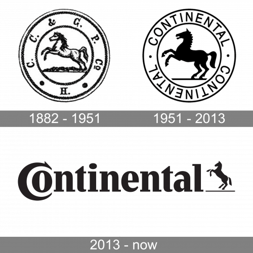
1882 – 1951
The very first Continental logo was designed in 1882 and stayed with the company for almost seventy years. It was a roundel in a double frame, with a contour of a horse in the center, and the “C. C. & G. P. C. H.” Lettering around the perimeter of the circular medallion. One of the versions, of why this animal, is depicted on the Continental logo is that a horse has long time been a symbol of Hanover, the region where the company was established.
1951 – 2013
The redesign of 1951 has replaced the main accent on the Continental badge, making the roundel smaller and placing it on the right from an enlarged bold lettering, set in a custom serif font with a stable character, clean and smooth contours, and thin geometric serifs. The horse on the badge was now colored black and the abbreviation was replaced by a full inscription.
2013 – Today
In 2013 the Continental badge for modernized and refined, with the contours of the characters getting more distinctive, and the emblem was redrawn in a minimalistic way. The new Continental emblem depicts a black silhouette of a horse, set against a white background over a thin horizontal line without any framing.
Font and color
The recognizable and very elegant lettering on the primary Continental badge is set in a custom and sleek serif typeface with very elegant yet stable shapes of the characters. The lettering with a recognizable “C” hugging the “O” is set in a font, which is pretty close to such types as Jimbo Bold Condensed, or GHEA News Black, but with some minor modifications.
As for the color palette of the Continental visual identity, there are two options: the classic black-and-white one, and a bright and memorable dark yellow on white. Both schemes represent a brand as a very powerful and professional one and evoke a sense of speed and strength.


