

![]() Billings Mustangs Logo PNG
Billings Mustangs Logo PNG
The Billing Mustangs affiliation with the Cincinnati Reds is considered the longest among all the teams playing on the Rookie level. And yet, the parent team’s influence on the Billing Mustangs brand identity has been comparatively small.
Meaning and history
![]()
The Billings Mustangs were founded in 1948, establishing a rich tradition of baseball in Billings, Montana. Over the decades, the team has become synonymous with the development of young talent, serving as a starting point for many players who have gone on to succeed in Major League Baseball. Notable achievements include winning multiple league championships, with a particularly memorable victory in 2014, which highlighted their competitive prowess.
In recent years, the Mustangs have continued to play a crucial role in their community and the broader baseball landscape. They transitioned from an affiliate of the Cincinnati Reds to an independent team in the Pioneer League following the restructuring of Minor League Baseball in 2021. Today, the Mustangs remain a beloved team in Billings, consistently drawing fans with their exciting games and community involvement, ensuring their position as a cornerstone of local sports culture.
What is Billings Mustangs?
The Billings Mustangs is a professional minor league baseball team. They compete in the Pioneer League and are known for their vibrant community presence and role in nurturing future baseball talents.
The Logo
![]()
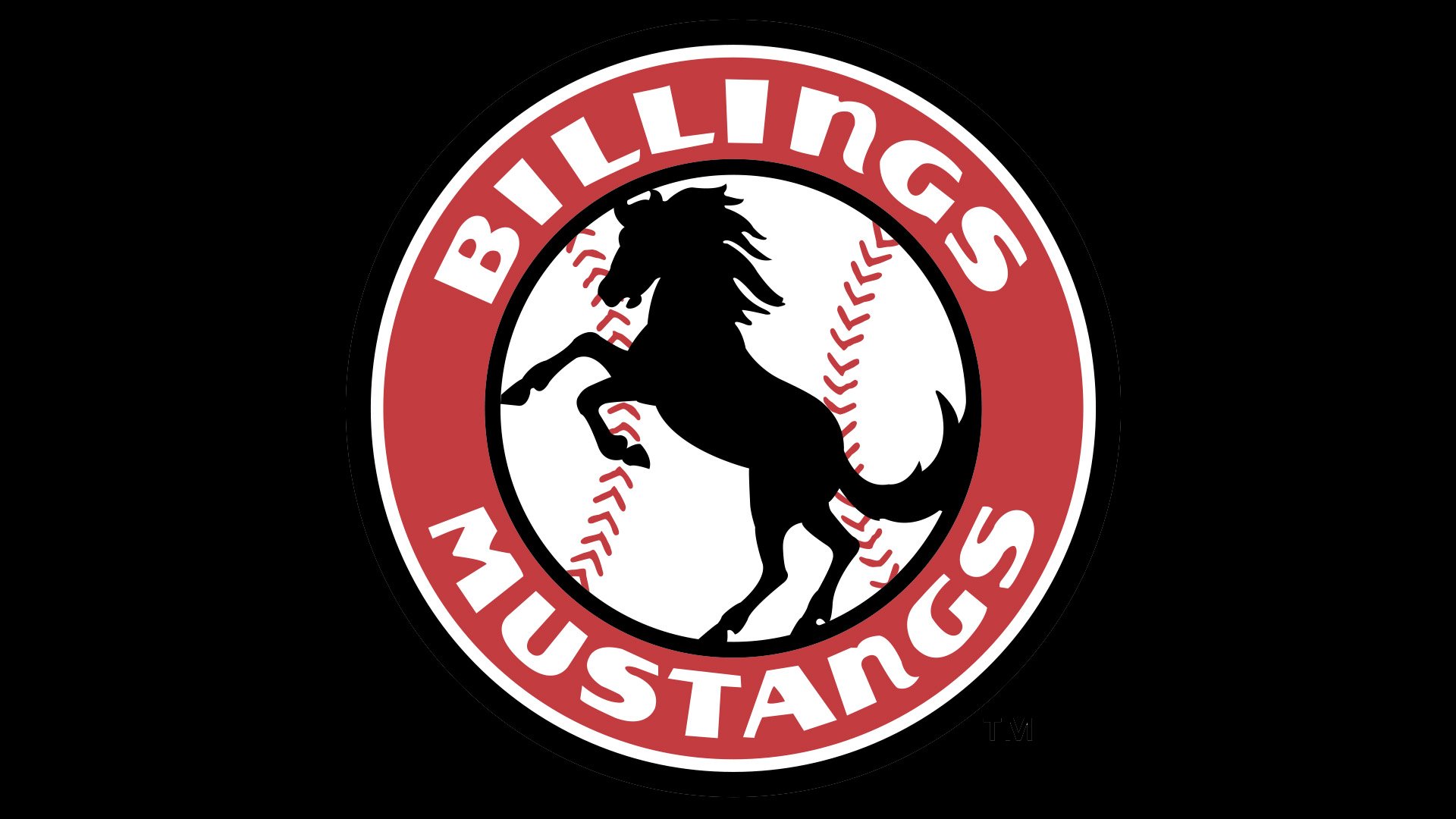
The logo is for the Billings Mustangs, a minor league baseball team. It features a vibrant and dynamic design, encapsulating the energy and spirit of the team. The primary element of the logo is a silhouette of a rearing mustang, captured in full motion, symbolizing power and agility. This mustang is set against a stark white background, outlined by a bold, red circular border which enhances its visual impact.
The team’s name, “BILLINGS MUSTANGS,” is boldly inscribed along the upper and lower curves of the circle in large, block letters, also in white, which stands out vividly against the red. The font choice is strong and straightforward, suggesting the team’s robust and competitive nature. Adding a subtle nod to the sport, the inner edge of the circular border is detailed with a pattern that mimics the stitching on a baseball, reinforcing the baseball identity of the logo.
The overall composition of the logo is balanced and cohesive, effectively conveying the essence of a baseball team while promoting a sense of local pride and team spirit. The logo’s use of contrasting colors and dynamic imagery makes it memorable and instantly recognizable, embodying the spirit of the Billings Mustangs.
Primary symbol
The fact that a prancing horse is the focal point of the Billings Mustangs logo seems absolutely natural, taking into consideration the name of the team. The mustang placed over a baseball is encircled by the lettering “Billing Mustangs” in white against the red background.
Cap emblem
Two horseshoes in brown and black are placed over the red background. The team also has an alternative logo depicting the head of a horse.


