Tristar Pictures is the name of one of the world’s most famous film production companies; which was established in 1982 in the USA. Today the company is owned by Sony Pictures Entertainment and has dozens of iconic movies released under its label. Among the most famous projects of Tristar Studios are such films as The Running Man, Godzilla, Jerry Maguire, The Mask of Zorro, Basic Instinct, Angel’s Heart, and Air America.
Meaning and history
Tristar Pictures is a company with complicated destiny. It was founded in 1982 as Nova Films, and renamed two years later, in 1984. The eighties were glorious for the company, as well as the beginning and the middle of the 1990s, but then something got broken and Tristar got lost from the radars for several years. In 2015 the company gets a second life, but this time only as a sun-division of Sony Pictures, responsible for marketing and right acquisitions.
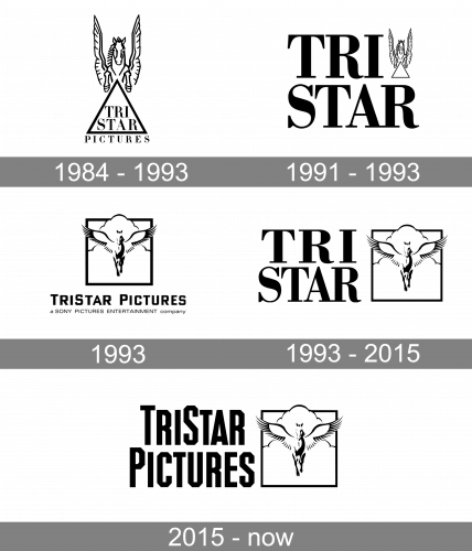
1984 – 1993
The first official Tristar logo saw the light two years after the company’s establishment, in 1984. And the iconic symbol, the brand is still strongly associated with today, has been depicted on it from its first days. The mythological creature, Pegasus, or a winged horse, was drawn above the triangular banner with “Tristar” in the uppercase of a bold selfie typeface written in it, and underlined by the “Pictures” in smaller capitals.
1991 – 1993
In 1991 the secondary version of the Tristar Pictures logo was introduced. And here the wordmark became the star. It was enlarged and emboldened, written in two levels, with the “Tri” above the “Star”. On the right from the upper line of the inscription, there was a small and elegant emblem, depicting the Pegasus flying over the empty contoured triangle, pointing up.
1993
The emblem, used by the film-production company for a few months in 1993, used a slightly different concept, even though the main symbol of the brand was still there. The black-and-white badge was showing a quietly walking Pegasus with its wings spread to the sides. The creature was enclosed in a square frame and drawn on a cloudy background. As for the lettering, in this version, it was something completely different: the modern san geometric sans-serif typeface with softened angles, and three letters of the uppercase inscription enlarged (T, S, and P).
1993 – 2015
Another redesign was held by Tristar Pictures at the end of 1993. It was a mix of two previous badges. The bold and elegant serif lettering in two levels was set on the left from the emblem in a square frame. The lines of the emblem became thinner, and all the elements — smaller, to give all the attention to the lettering with the bold sophisticated shapes and slightly narrowed contours. This badge has been in use by the company until its rebirth in 2015, which makes it the most long-lasting logo of Tristar Pictures.
2015 – Today
The redesign of 2015 was held to celebrate the beginning of the second Tristar Pictures era. It was the same concept as on the previous logo, from 1993, but the lettering was completely rewritten. Now it was not just “Tristar”, but “Tristar Pictures”, a set not in a smooth and elegant serif, but a geometric and angular sans-serif typeface with lots of edges and corners on the narrowed capital letters of the insignia.


