

![]() Kansas City Mavericks Logo PNG
Kansas City Mavericks Logo PNG
The Kansas City Mavericks’ history dates back to 2009 when the club was founded. At that time this ice hockey team had the name the Missouri Mavericks.
Before the 2017-2018 season they changed their name to the Kansas City Mavericks. The fact is that Independence, Missouri, where the team is based, is a satellite city of Kansas City. Their intention was to identify themselves more clearly on a national level.
Meaning and history
![]()
The Kansas City Mavericks, an American professional ice hockey team, were founded in 2009 by Lamar Hunt Jr. This team, based in Independence, Missouri, plays in the ECHL, a mid-level professional ice hockey league. The Mavericks began their journey as an expansion team, quickly establishing a reputation for competitive play and a passionate fan base.
Throughout their history, the Kansas City Mavericks have achieved notable success. One of their main achievements includes qualifying for the playoffs in several seasons, showcasing their competitive spirit and dedication to the sport. The team has also been recognized for its community engagement and youth development programs, contributing significantly to the local community and the sport’s growth at the grassroots level.
As of now, the Kansas City Mavericks continue to be an integral part of the ECHL, competing vigorously each season. They remain committed to maintaining high standards of play and contributing to the development of hockey, both in their local community and within the broader context of the sport. Their current position reflects a blend of past achievements and future aspirations, symbolizing their ongoing journey in the world of professional ice hockey.
What is Kansas City Mavericks?
Kansas City Mavericks is a professional ice hockey team in the ECHL. Known for their competitive play and community engagement, they have been a significant presence in the league since 2009.
2009 — 2013
![]()
The Kansas City Mavericks logo from 2009 was composed of a funny and playful caricature of a horse in a hockey uniform, ice-skates, and with a hockey stick in its hands (worn in blue gloves). The horse looked strong and determined, showing the mood of the club. On the background, the delicate blue and white contour of Texas could be seen, and under the mascot emblem — the wordmark on a black banner. The “Mavericks” inscription in the uppercase was executed in a slightly slanted sans-serif typeface with bold lines and straight cuts, in a light blue color and thin white outline.
2013 — 2014
![]()
The 2013 emblem looks like a skewed, black shield with the team’s name written in black letters along the top line. The shield itself occupied three objects: a blue hockey stick above, the bronze horseshoe in the middle and a white puck in the bottom.
2014 — 2015
![]()
In 2014, the team’s original logo returned unchanged.
2014 — 2016
![]()
All the Mavericks’ logos are in line with their name ‒ they feature a horse. Their first logo which was in use from 2009 to 2014 is the image of a stallion on skates holding a hockey stick. The horse looks intense and aggressive. As a sign of their belonging to the state of Missouri there is its outline in the background. The wordmark “Mavericks” is placed below. The colors are light blue, orange, black and white ‒ a combination that is meant to attract attention.
The logo introduced in 2014 shows the horse’s head with an orange mane. It is framed by a circle with the word “Missouri” above and “Mavericks” below and two horseshoes on the sides.
2016 — 2018
![]()
The 2016 design depicts a big black ‘M’ with orange and blue outline, as well as smaller ‘KC’ letters in the left top corner of this character (the design’s the same for them).
2019 — 2020
![]()
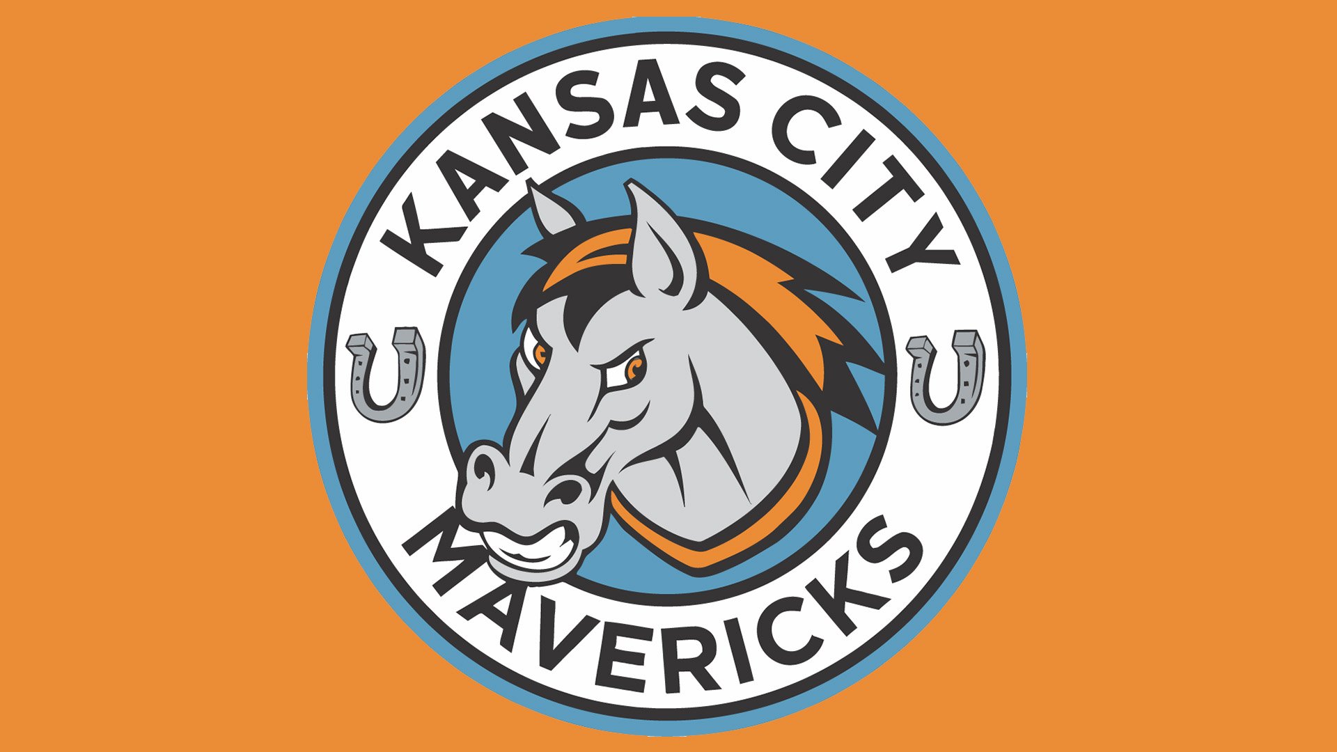
The change of the name brought about just one revision in the logo of 2017 ‒ “Kansas City” instead of “Missouri”.
2020 — Today
![]()
This emblem is a direct continuation of the previous design. For this one, the color scheme switched to red, black and grey, the horseshoes on the sides vanished and the bottom section was blocked by a big word ‘Maverick’ made from metal-looking, sharp letters.


