

![]() Porsche Logo PNG
Porsche Logo PNG
Porsche is the German automobile marque, specialized in the production of luxury and sports vehicles. The company was established in 1931 and named after its founder, Ferdinand Porsche. Today one of the world’s best-known high-class car brands is owned by Volkswagen Group and distributes its cars all over the globe.
Meaning and history
![]()
Porsche is the marque, which values traditions and mixes them with innovations. All of the luxury cars are the brand feature timeless elegance and beauty outside and the latest technologies inside. The same is with the company’s logo — historic legacy is enclosed into a frame of style, power, and exclusiveness.
The Porsche logo was introduced in 1952 and hasn’t changed much since then, as it had everything the brand needed — uniqueness, grace, and memorability.
What is Porsche?
Porsche is a luxury automobile brand from Germany, which was established in 1931, and by today has become one of the most recognizable car marques in the world, synonymous with exquisite design and speed. The brand has its sports cars, sedans and SUVs sold all over the globe.
The brand, established in Stuttgart, adopted the crest of Wurttemberg as its emblem, to celebrate the history and roots. Stuttgart was the capital city of the Wurttemberg, a region of Germany, famous for its horse farms.
The coat of arms of Wurttemberg State was created in 1922 — a large crest with two deers on both sides. It was modified in 1948 after the state was expanded and became Wurttemberg-Hohenzollern.
The coat of arms of Stuttgart with a black horse on a yellow background was designed in 1938. This crest became the most recognizable part of the Porsche logo.
1922 – 1945
![]()
The original crest of a Porsche is based on a heraldic symbol, executives in a yellow, red and black color palette, with two deers placed on the sides of a shield, divided into four segments. Two of the segments featured a striped black and red pattern, while the other two depicted black antlers on a plain yellow background.
1938 – 1948
![]()
The yellow crest with a black stallion drawn against it is an official coat of arms of Stuttgart, the motherland of the legendary brand. It was executed in clean bold lines with distinctive contours, elevating the brightness of its color palette.
1948 – 1952
![]()
In 1948 the composition of the logo was simplified to a clean-contoured crest with the rounded bottom line and the straight too one. It was also divided into two fragments, whist like the historical coat of arms of the Wurttemberg State. The deers and all the additional decorative elements we’re moved from the composition.
1952 – 1963
![]()
The official logo of Porsche was introduced in 1952, combining the two historical heraldic symbols. The yellow crest with the stallion got an additional golden banner with the “Stuttgart” inscription on top, and was placed in the center of the Wurttemberg a state coat of arms, which, in its turn, also got an additional golden banner with the “Porsche” logotype.
1963 – 1994
![]()
In 1963 the logo of the automaker was refined, gaining a triangular shape, which created a more chic image for the brand. The color palette was switched to gold, red and black, and the top banner with the name of the company was now arched, while the characters or extended. The stallion in the center of the crest was also redrawn.
1994 – 2014
![]()
The redesign of 1994 has introduced a flat and bold version of the iconic crest, strengthening all the black contours of the logo and using a darker color palette with the plain flat shades of all three colors. The lettering turned black, becoming more readable and distinctive and evoking a sense of power and confidence.
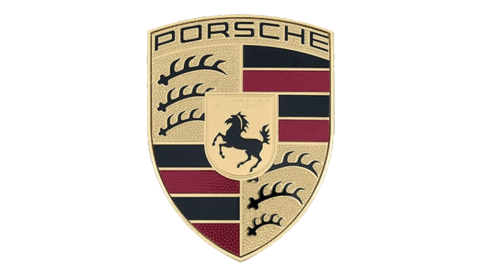
2014 – 2023
![]()
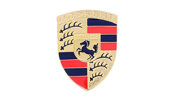
The logo the whole world knows today is composed of a golden crest, which consists of four segments and has a smaller crest in the middle. The wordmark is written along the upper part of the crest, in black modern sans-serif.
The four segments of the badge have two different ornaments: the upper left and bottom right parts depict three antlers each, and the upper right and bottom left segments have burgundy and black stripes on them, which are also taken from the Wurttemberg heraldry.
The smaller crest, located in the center of the badge depicts a black horse with a delicate “Stuttgart” inscription in sans-serif above it.
In 1963 an additional text-based logo was created for the brand. This logotype can be used on its own or placed under the ornate gold emblem. The custom sans-serif typeface of all-caps wordmark looks powerful and confident with clean smooth lines, which are slightly extended and flattened.
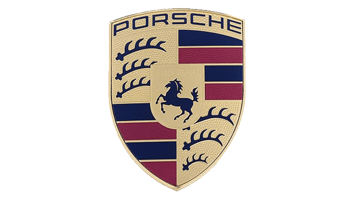
2023 – now
![]()
A modernized Porsche crest was presented several years after the last update. First, the entire logo is now in a matte metallic style instead of shiny gold. The brand removed the bulging background, used a honeycomb pattern for the red stripes, and highlighted the Stuttgart lettering in black. There are also slight changes in the shape of the six horns. The horse looks more assertive and jumps higher on the hind legs.
Porsche Crest History
![]()
1954
The first versions of the Porsche logo were brighter and glossier than the one, we can see today. The logotype of the brand was written along the upper part of the crest in bold golden characters, and was not very well visible, as the background featured the same shade.
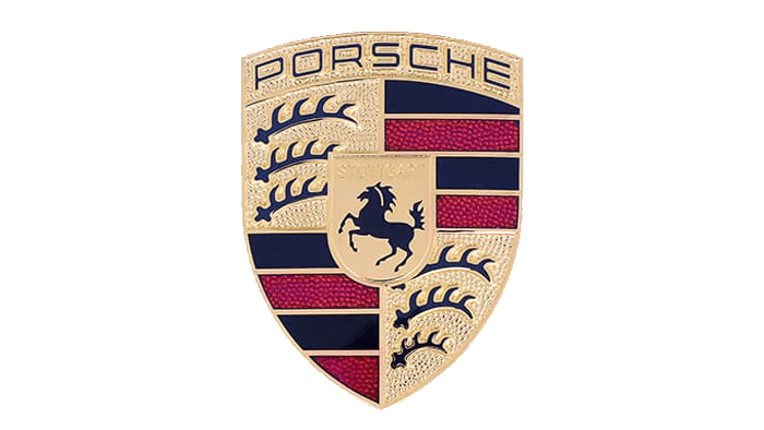
1963
In 1963 the contours of all elements on the Porsche badge were cleaned and strengthened, with all the main components, including the color palette, being kept from the previous version. More gloss was added to the enamel segments of the crest with red horizontal stripes.
1973
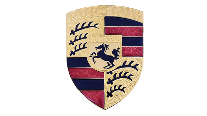
The redesign of 1973 has refined the contour of the stallion in the center of the logo, and darkened up the color palette of the badge, switching bright red to burgundy, and adopting a smoother and calmer shade of gold, creating a very exquisite and chic composition.
1994
In 1994 the lettering, arched along the top part of the Porsche crest, got colored black, hence became more visible, and the overall look of the badge got more balanced and harmonious. The stallion was redrawn again, with thinner and more elegant lines, creating a very sophisticated image in the center of the logo.
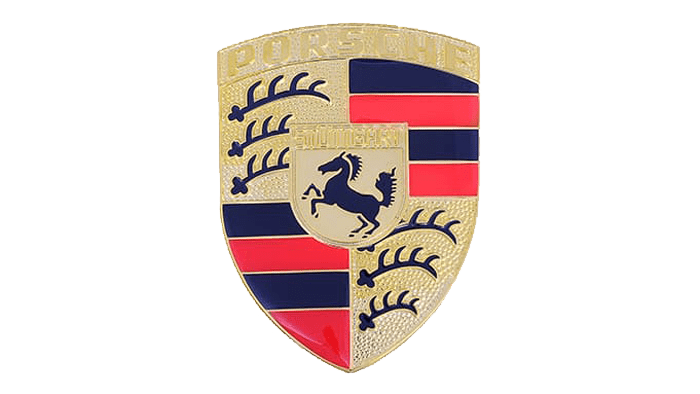
2008
The redesign of 2008 has emboldened and strengthened the lettering of the Porsche logo, cleaning up the contours of all elements and evening up the surface of the badge, making it smoother and glossier. This version of the crest stayed with the German automaker for half a decade.
2014
The Porsche badge was refined again in 2014, with the golden shade becoming a bit brighter on the main crest, and lighter in the central one, with the stallion. The lettering on the upper banner also got refined, with the extended letters set in the medium-weight lines.
Symbol
The main element of the logo is a rampant black horse. For many people it is associated with freedom, speed, and great strength, but those who are familiar with heraldry can get a deeper notion of the symbol. The rampant horse is a reference to Stuttgart coat of arms – this German city houses the headquarters of the company. Four attached sections are taken from the coat of arms of the Kingdom of Württemberg, a currently nonexistent state which used to have Stuttgart as the main city. Antlers are the symbol of natural resources. Red and black stripes are combined to remind of classical traditions and the tendency of self-perfection (the unity of equipment and technologies).
The brand produced designs for heavy tanks, like the Tiger I and the Tiger II, amphibious off-roaders and the classical “car for people”, later known as Volkswagen Beetle.
Emblem
The emblem of Porsche has gone through several updates during the long history of the brand’s existence. However, those changes were not very significant, they were mainly decorative. In particular, the horse was changed. Thus, in 1994, its head got smaller, while its body became thinner.
Print logo
![]()
The text placed in the upper part of the logo has always played an important role. The font hasn’t undergone major changes; the peculiarities of the lettering remain the same. In 1994, the gold colour turned into black. From the one hand, it made the logo look more “democratic” as “steel” replaced “gold”. Moreover, such a combination highlighted the black text on the gold background.
Colour
![]()
The red colour in the logo has gained different tints – from red in 1954 to orange in 1963 and violet in 1973. In 1994, they added golden lines between the colours, which made the sign sharp-cut and well-defined.
The colour of the print also changed from gold to black.
Font
What animal is on the Porsche logo?
The animal depicted on the Porsche logo is an elegant and graceful black stallion. But it is not the only animalistic symbol on the badge. Around the stallion you can see two fragments with antlers, representing a deer, another symbol of royalty and grace.
Does Ferrari make Porsche?
Porsche is a German automaking brand owned by Volkswagen Group, which, apart from Porsche, consists of such brands as Bentley, Lamborghini, Audi, Ducati, and many others. As for Ferrari, it is an Italian company, which was established in the 1940s, and has nothing to do with Porsche.
What is the Porsche badge made of?
The Porsche badge consists of five segments placed on a golden crest with a thin arched banner along its top border. The crest is composed of a small rounded shield with the black stallion, set in the center, and four larger segments: two with black antlers, and two with black and red horizontal stripes.
How many antlers are on the Porsche crest?
The iconic Porsche crest has two segments with the deer antlers depicted on them. There are three black antler images on each of the golden elements, which makes it in total six antlers on the whole Porsche logo.


