

![]() MLB logo PNG
MLB logo PNG
For several years, there was a controversy about the real author of the MLB logo. Two designers, Jerry Dior and James Sherman, claimed to be the authors. However, subsequently Sherman stated that he had made a mistake and his emblem, although looking very similar to Dior’s one, had been created about 10 years later.
Who is on the MLB logo?
The author of the MLB logo, Jerry Dior, claimed he used photos of several players as an inspiration. This was done in order to create an abstract baseball player without giving any hint to his background. And yet, quite a few people believed that the design had been modeled on future Hall of Famer Harmon Killebrew.
Meaning and history
![]()
In 1968, Jerry Dior crafted the original logo for Major League Baseball, an endeavor he claimed was completed in just one afternoon. His objective was to design an abstract representation of a baseball player, a symbol that would intentionally omit any reference to the player’s ethnic background or dominant hand. This new emblem was envisioned as a unifying symbol of pride for fans across all eras, capturing the essence of the sport without bias.
As the years rolled on, this iconic design remained largely unchanged, symbolizing the timeless appeal of baseball from the Detroit Tigers to the Boston Red Sox. It’s a testament to Dior’s skill that his creation continues to resonate with fans, encapsulating the spirit of teams like the Chicago Cubs and the Los Angeles Dodgers without favoring one over the other.
Amid discussions of redesign, the current logo stands as a tribute to the league’s history, from the 1960s to the present. It reflects the evolving landscape of baseball, from the inclusion of teams like the Chicago White Sox to the anticipated excitement around the New York Yankees. The emblem’s enduring legacy is a globe-spanning testament to the sport’s royalty, an illustration of unity and the enduring love of the game.
What is MLB?
A professional baseball organization, it is the oldest of the major professional sports leagues in the United States and Canada, comprising 30 teams that compete in the National and American Leagues.
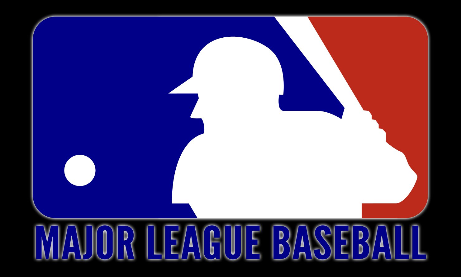
1969 – 1992
![]()
The main design is a wide rectangle with rounded corners. The central piece is, of course, a white silhouette of a baseball player with a bat in their hands. They also separate the rectangle into red space on the right and a blue section on the left. In the latter, there’s also a small white circle meant to be a ball mid-flight.
Beneath, there’s the League’s wordmark written in tall red letters, all capital.
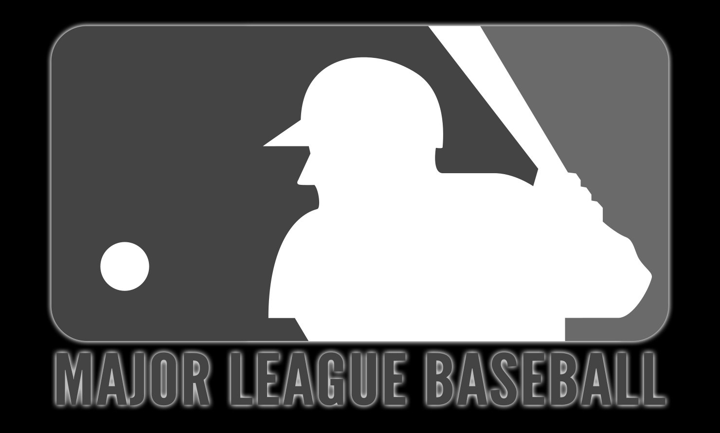
1992 – 2019
![]()
In 1992, they switched the colors to slightly darker shades, but changed nothing else.
2019 – Today
![]()
In 2019, they darkened the color palette again, although this time they also removed the League’s name from the logo.
Symbol and its model
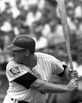
 Quite a few people believed that the MLB symbol was modeled on one of the most famous Major League Baseball players, Harmon Clayton Killebrew. Shortly before his retirement, Killebrew, often called “The Killer”, was the second best player in American League home runs. He has been in the Hall of Fame since 1984.
So, in the cold light of the day, Killebrew could have become a decent model for the Major League Baseball logo. However, according to Jerry Dior, the author of the emblem, he used photographs of several players because his aim was to steer clear of anything that could indicate the player’s background or appearance.
Emblem controversy
 The controversy over the authorship of the MLB emblem lasted several years. Having seen the emblem for the first time, the comic book illustrator James Sherman noticed that it looked very similar to the logo he had designed earlier. So, he claimed, the design had been stolen from him.
However, in the course of time the controversy was resolved. In late 2008, the ESPN writer Paul Lukas contacted James Sherman and asked him when he had designed his logo. Sherman answered that it took place in the early 1980s. However, the MLB logo actually debuted much earlier, in the 1969 season. So, although Sherman’s design was very similar to the one used by Major League Baseball, he was not the real author as he created his emblem later.
Icon
The Major League Baseball icon hasn’t changed since the day of its creation. Only the shades of blue and red got intensified, but the recognizable style has never been touched.
Interestingly, the icon, as a part of the official MLB logo, was created in one day. A rare thing, when someone’s sketch, drawn in minutes, stays for decades, and never loses its actuality.
There were lots of versions about who was pictured on the icon, though, contrary to popular belief, the silhouette of the baseball player was not modeled from any particular player. It is a completely universal image, depicting a man of any height, nationality, or age.
The blue, red, and white color palette of the Major League Baseball icon is not only a patriotic celebration, but also a reflection of strength, professionalism, and loyalty.
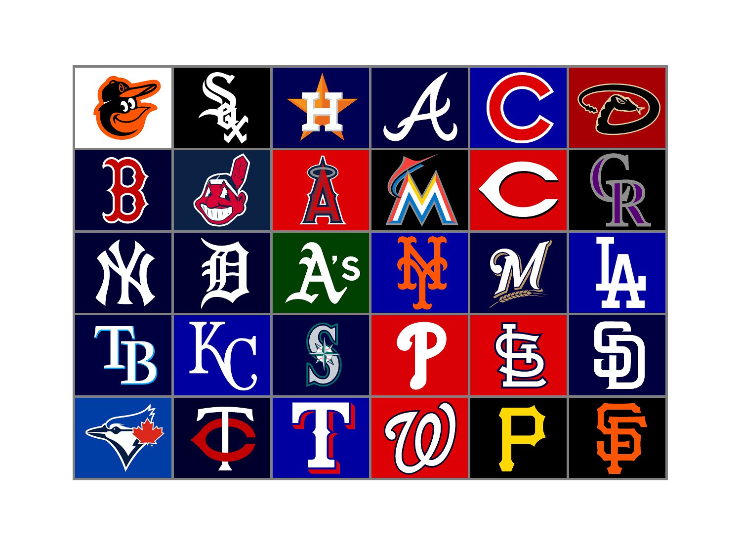
Major League Baseball Team Logos


Who is depicted on the MLB logo?
The man, depicted on the MLB logo in solid white, is Harmon Killebrew, a legendary baseball player, who played in Major League Baseball from 1954 to 1975 and was one of the most popular and successful players of all time.
Is the man from the MLB logo a real person?
Yes, the man from the official logo of Major League Baseball, is real. The image of a player on the badge was based on the image of Harmon Killebrew, a professional baseball player, who competed in the MLB for the Minnesota Twins from 1954 to 1975.
Who has the best MLB logo?
There is no official title for “The Best MLB Logo”, however, some magazines and sports platforms often create their rankings for the most stylish and cool emblem among the teams-members of Major league Baseball. , according to many of them, the owners of the best logos are Milwaukee Brewers, Minnesota Twins, and San Francisco Giants.
What baseball logo is AP?
No team in the MLB has an AP logo. However, there is an AM logo, which was used by the Milwaukee Brewers, and there is a P logo, which is used by the Pittsburgh Pirates baseball club.


