FIFA (Federation Internationale de Football Association) – is a non-profit international governing body of association football, beach soccer, and futsal.
The FIFA logo is the FIFA wordmark written in huge bold capital letters topped with two hemispheres to symbolize the organization’s round-the-world presence. The hemispheres depict the continents and feature a white pentagonal soccer ball pattern. The continents are colored in gold yellow, and the oceans – in blue, to symbolize optimism, drive, passion, grace, and excellence. The FIFA logo is among the most recognizable ones in the world.
Meaning and history
The Federation Internationale de Football Association was established in 1904 in France, and for the first two decades of its existence had no official logo, using only its full wordmark. The first logo for FIFA was designed only in 1928, and stayed with the federation for almost fifty years, with says a lot about its serious approach and consistency.
What is FIFA?
FIFA is the world organization for the management of football. The abbreviation FIFA is French, and stands for the “Fédération Internationale de Football Association”. FIFA unites six continental soccer associations: UEFA (Europe), AFC (Asia), CONCACAF (North and Central America), CONMEBOL (South America), OFC (Oceania), and CAF (Africa). Every four years FIFA holds the FIFA World Cup, which becomes the main sporting event of the year.
1924 — 1928
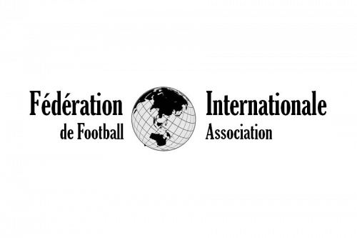
The very first FIFA logo was designed in 1924, and stayed active for four years, becoming a basis for the following redesign. It was a simple monochrome badge with the globe image in the center, andlettering in French on its sides. The globe here represented the international expansion of the organization, enhancing the full name of FIFA.
1928 — 1977
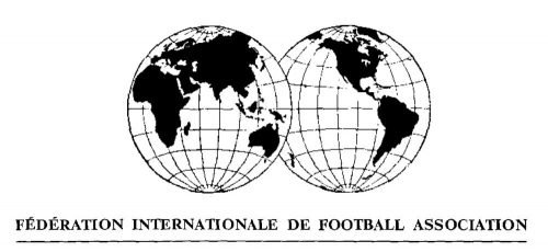
The logo, introduced by FIFA in 1928, featured an elegant emblem, placed above the capitalized and underlined lettering in a strong and bold serif typeface. The graphical part of the logo depicted two monochrome globes slightly overlapping each other. This was a symbol of global extension, unity, and togetherness.
1977 — 1998
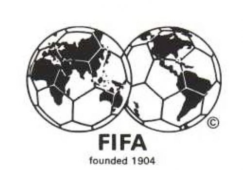
The redesign of 1977 added a football pattern to two globes, and shortened the wordmark to “FIFA”, writing it in a clean and modern sans-serif typeface right under the emblem. This badge was usually executed in a monochrome color palette, but sometimes it was placed on a bright blue background, switching the color of the wordmark from black to yellow.
1998 — 2009
In 1998 the logo became colorful and vivid, getting a new blue and yellow palette with delicate white details. The composition remained unchanged, just the contours of the emblem were modified, and the globes gained some gradient shades, which made them look more voluminous.
As for the wordmark, it was now executed in an extra-bold custom sans-serif typeface, with the edges of both letters “F” cut diagonally and reflecting speed and progress. There were several options of the color palette for this version, used along with the main one, including monochrome, blue and white, and a multicolor one.
2004 — 2015
To celebrate the 100th anniversary, FIFA redesigns its logo in 2004, making the badge a reflection of the extraordinary progress and growth of the federation, and its power. The new logo was executed in a calm yet cool blue and white color palette, where two different shades of blue stood for professionalism and reliability.
The white and blue football was placed on the top of the wave-like abstract construction, in the upper right corner of the badge, and the white bold wordmark in the custom typeface was placed on the bottom line of the emblem, on its dark blue part.
2009 — Today
The current FIFA logo is a wordmark, created in 1998, which became official in 2009. Previously used as a secondary version, today the bold blue lettering with the diagonal cuts of “F”s is the symbol, which is instantly recognizable across the globe and being associated with football at its best.
Font and Color
The bold capitalized FIFA logotype is executed in a custom sans-serif typeface, which is based on traditional geometric shapes and straight lines. Its massive and solid letters look modest and at the same time have a unique mood and style, due to the diagonal lines, going upright and symbolizing movement and development. The typeface of the logotype is pretty close to such fonts as Outlast Regular and Tanseek Sans Pro Extra Bold.
The calm blue color of the emblem looks reliable and confident, poring in such qualities of the Federation as responsibility, confidence, and professionalism. This shade of blue also evokes a calm and pleasant feeling, making the contrast between the logotype and its white background bright and memorable.


