

![]() Minnesota Twins Logo PNG
Minnesota Twins Logo PNG
The Minneapolis-based professional baseball team the Minnesota Twins has two logotypes. In addition to the regular team logo, there is also a cap insignia.
Meaning and history
![]()
Though the name Minnesota Twins was adopted by the baseball club in 1961, and only five logos were designed since that time, the club’s history dates back to 1901, when it was located in Washington and was called Washington Senators. And this makes the number of the Minnesota Twins visual identity redesigns almost reach twenty.
1901
![]()
Established in 1901, Washington Senators adopted a simple arched wordmark in the blue and white color palette as its first official logo. It was a slightly narrowed sans-serif inscription with uneven yet bold lines of the letters. This initial version only stayed with the club for a few months.
1902
![]()
The redesign of 1902 brought a laconic and strict emblem to Washington Senators — a clean and solid sand-serif “W” in intense blue with its contours straight and neat.
1903
![]()
The “W” was redrawn in a smooth and fancy manner with its edges thickened in 1903. The letter became ornate and elegant, bringing some art-deco style to the club’s visual identity.
1904
![]()
The arched “Washington” wordmark came back in 1904 with its contours strengthened and cleaned. The shapes of the letters were refined and now looked more balanced and solid than on the version from 1901.
1905
![]()
The club changed its name to Washington Nationals in 1905 and introduced a new logo — a strict serif “W” in the same dark blue and white color palette, standing for confidence, reliability, and professionalism. The massive square serifs of the letter added power and solidness to the logo, representing the club at its best.
1906
![]()
The smooth and ornate gothic-style “W” became the club’s primary logo in 1906. The thick lines of the emblem were slightly uneven, though it still looked stylish and recognizable.
1907 — 1911
![]()
The “W” from 1907 was hand-drawn and had the ends of its lines forked and rounded. It was a smooth icon, which looked delicate and elegant on the Washington Nationals uniforms.
1912 — 1927
![]()
In 1912 the club starts using a clean and elegant sans-serif “W” in royal blue for its primary logo. The simplicity and minimalism of the letter’s lines made the club’s identity strong and modern, evoking a sense of expertise and authority.
1928
![]()
The redesign of 1928 brought a new color palette to the club’s visual identity — the “W” was now executed in bright red and outlined in blue. As for the style of the lettering, its typeface was switched to a massive and bold serif, which added confidence and power to the new bright logo.
1929 — 1935
![]()
In 1929 the club comes back to its laconic blue logo from 1912 but makes the lines of the “W” a bit thinner, which turns the simple badge into something truly elegant and sophisticated.
1936 — 1947
![]()
The emblem, created for the club in 1936 was something completely different. It was an image of a ball placed over a diagonally oriented baseball bat. Both elements were drawn in thin black and red lines with a lot of white color on them. The upper part of the ball was taken by an image of the Capitol in monochrome with a black baseball cap on its peak. The “Washington Nationals” wordmark was placed under the emblem and set in two levels, with the upper one in black, and the lower — in red. Both text lines were executed in a solid and modern Sanz-serif typeface with a bit extended contours of the letters.
1948 — 1954
![]()
In 1948 the logo was redrawn again, and now the Capitol became its main part. Its white and black image was placed on a blue background with the upper line arched from the center. The bold and bright letter “W” in yellow and black was placed over the emblem and added a sense of energy and dynamics, showing the mood and character of the club.
1955 — 1958
![]()
In 1955 the club got back its original name, Washington Senators, but kept the logo designed in 1948 for another three years, as the only lettering on the badge was a yellow “W”, which suited both Senators and Nationals.
1959 — 1960
![]()
The last logo was designed for Washington Senators in 1959 and featured a bright and modern caricature of a man executed in black and white, placed on a circular badge, where the inner part was colored red and the outline featured a wide white and thin black framing.
1961 — 1969
![]()
The club moves to Minnesota in 1961, and the new name appears with the new logo in the same year. It was a colorful and detailed badge with two baseball players shaking their hands. The men figured drawn in white and red were placed on a deep blue background with an enlarged ball in its middle. The red “Minnesota Twins” wordmark and a distinct yellow outline of the badge complemented it and made it brighter.
1970 — 1975
![]()
The shape of the logo was redrawn repeating the contours of the Minnesota state in 1970. The River between the two players was now more visible, and the color palette for more delightful with the switch of intense blue to sky-blue. The red lettering was removed from the emblem and the baseball had its lines and borders refined and strengthened.
1976 — 1986
![]()
The blue of the club’s official palette became a bit darker and the bold red lotto was added to the logo in 1976. It was a “Win! Twins!” Inscription in a stylized sans-serif typeface with its red thick letters outlined in white, and the dots above both “I”s replaced by five-pointed stars.
1987 — 2009
![]()
The redesign of 1987 brought a modern and fancy badge to the Minnesota Twins’ visual identity. It was a white baseball in a thin black outline with Ted switched, having a bold script “Twins” lettering in red and blue over it and a straight underlined “Minnesota” in blue capitals placed on its upper part.
The club also got its secondary logo designed in the same year — a fancy red “M” underlined by an arched sharp stroke and placed on a calm yet dark blue background. Both the letter and the underline were outlined in white and looked solid and distinct.
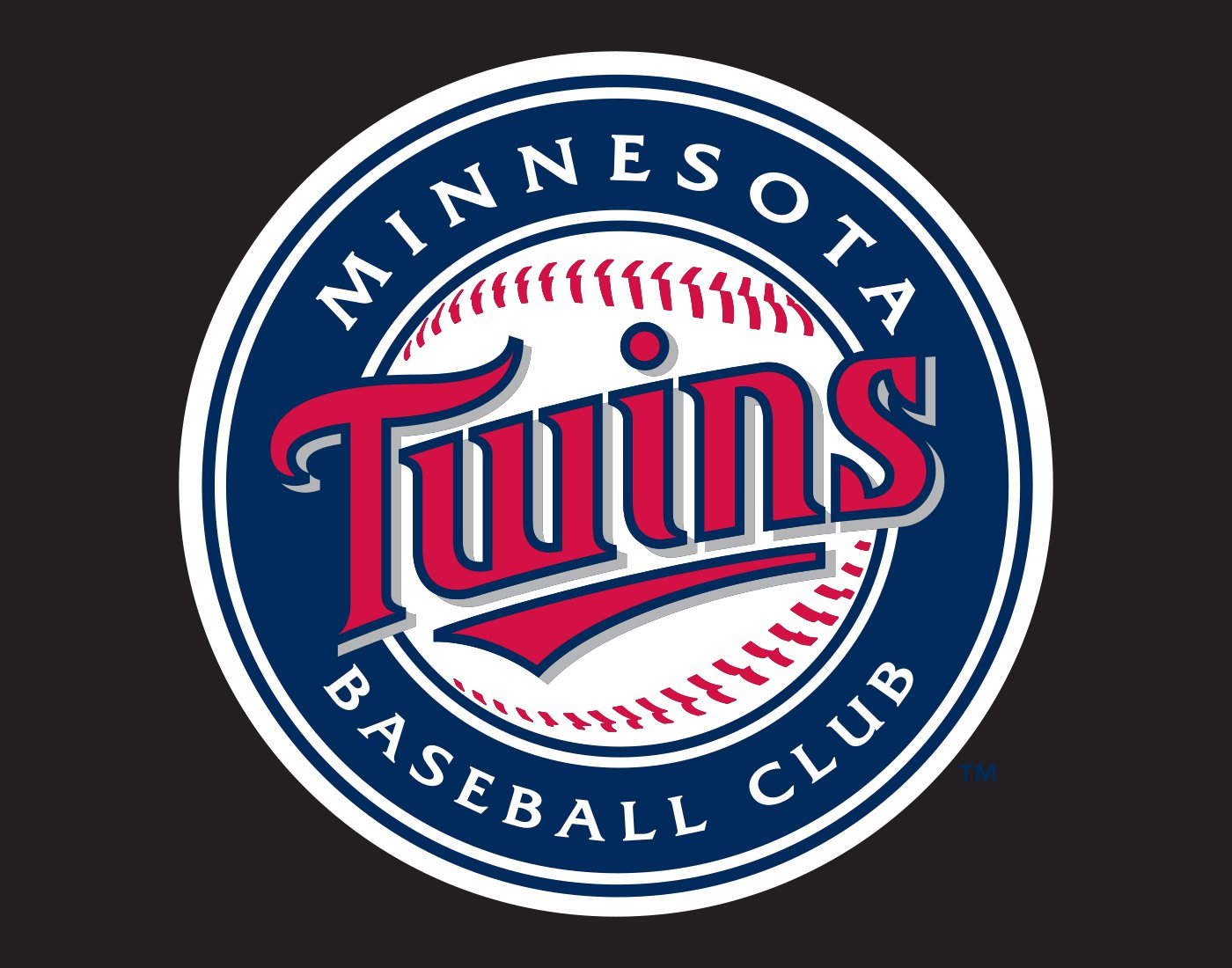
2010 – 2022
![]()
The logo, introduced by the club in 2009 is fully based on the previous version, though now the baseball is enclosed in a thick blue circular frame with lettering around its perimeter. The “Minnesota Baseball Club” white inscription is executed in a stylish serif typeface with wide modern letters and sharp elements on their serifs. The “Twins” with an underlining stroke got its contours thickened, becoming a brighter and a more powerful version of itself.
2022 – Today
![]()
The image displays the iconic logo of the Minnesota Twins, a professional baseball team based in Minneapolis. The logo is a stylized representation of the letters “T” and “C,” standing for “Twin Cities,” which refer to the Minneapolis and St. Paul metropolitan area. The “T” is in navy blue and is superimposed over a red “C,” creating a striking visual contrast with the white outlining and background that frames the design. The interlocking letters symbolize the close connection between the two cities. This design is a classic emblem in Major League Baseball, embodying a sense of athletic energy, team spirit, and regional pride. The use of the trademark symbol indicates the logo’s registered status and the team’s commitment to protecting its brand identity. Simple, bold, and effective, the logo encapsulates the essence of the team and its roots in the heart of the Upper Midwest.
Cap symbol
The cap insignia sports interlacing letters “T” (white) and “C” (scarlet red with a gold outline). The letters appear against the navy blue background.
Font
![]()
The current logo features two fonts: a beautiful script for the word “Twins” and a simple serif typeface for the “Minnesota Baseball Club” lettering.
Color
![]()
The palette is comprised of three colors: navy blue, scarlet red, and white. In addition to the three colors featured in the logo, the team’s official palette also includes a shade of yellow called Minnesota Kasota gold.
Minnesota Twins Colors
TWINS NAVY
HEX COLOR: #002B5C;
RGB: (0,43,92)
HSB: (213,81,25)
CMYK: (99,85,45,50)
PANTONE: PMS 289 C
SCARLET RED
HEX COLOR: #D31145;
RGB: (211,17,69)
HSB: (347,93,72)
CMYK: (18,100,88,9)
PANTONE: PMS 200 C
KASOTA GOLD
HEX COLOR: #B9975B;
RGB: (185,151,91)
HSB: (38,50,72)
CMYK: (27,38,74,3)
PANTONE: PMS 465 C
What does the Minnesota Twins TC logo stand for?
The TC monogram on the alternative Minnesota Twins badge stands for “Twin Cities”, as this club represents two cities, Minneapolis, where it is based, and Saint Paul. This “duality” also gave the name to the team.
What did the Minnesota Twins used to be called?
Minnesota Twins is a team with a pretty intense history. The club was established in 1901 in Washington, and got named Washington Senators. In 1904 the team was renamed Washington Nationals/Senators, and stayed like that for fifty years. Though, in 1956 the “Nationals” part was removed from the official name of the club, and it returned to its original naming. The current, Minnesota Twins, name was given to the club after its move to Minnesota in 1961.
Did the Minnesota Twins change their logo?
As of 2023, the Minnesota Twins’ latest logo redesign was held in 2009. This is when the whole baseball with red stitches and a solid blue lettering across it gained a thick blue framing with the white uppercase lettering written around its perimeter.
When did Minnesota Twins change their logo?
Since the club got renamed Minnesota Twins in 1961, there have been five versions of its logo created. The first redesign happened in 1970, with a bright badge staying for five years, and being slightly refined in 1975. With the redesign of 1987 a completely different concept for the badge was introduced, and this modern and sleek version was modifiers again in 2009.


