The American baseball team Washington Nationals has had two distinctive logos since its relocation to Washington, D. C. in 2004 and renaming.
Meaning and history
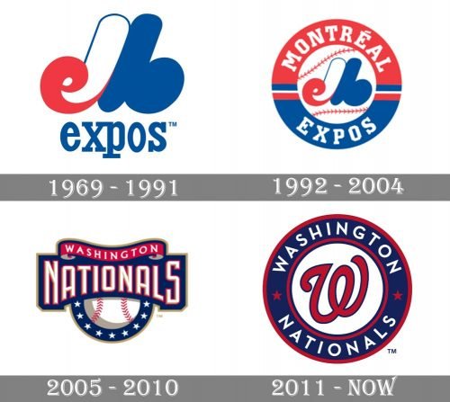
The visual identity history of the club can be divided into two main periods — from 1969 to 2004, when the team was based in Montreal, and from 2004 until now, after its relocation to Washington. Though the color palette of the Nationals’ logo was set in the very beginning and has always featured an elegant and exquisite combination of white, blue, and red.
1969 — 1991
The initial version of the visual identity was created for Montreal Expos in 1969 and boasted a stylized colorful monogram with an “Expos” lettering under it, executed in the lowercase-letters of a simple yet confident and modern serif font. The insignia was composed of a smooth and sophisticated letter “M” in white and blue, with its left bar curved, making a red lowercase “E” on its end. The soft and sleek emblem was balanced by straight elongated serifs of the wordmark.
1992 — 2004
The redesign of 1992 elevated the look of the logo by placing its stylized monogram in the middle of the circular badge with a white baseball in the center. The ball featured red stitches and was enclosed in a wide red and blue outline with white lettering around its border. The lettering on this version was all in caps and used in a strong and straight serif typeface with bold lines and square cuts.
2005 — 2010
The club relocated to Washington in 2005 and the new insignia was adopted in the same year. It was white baseball with red-stitched and a smooth blue banner placed over it on the top part. The white capitalized “Nationals” inscription was placed in a blue banner and had a delicate red ribbon with “Washington”, placed above it. For the additional version of the logo, the club used a cursive letter “W” drawn in white with a blue outline and placed on a red background, or a reversed badge with the red outline and blue background for the “W”.
2011 — Today
The redesign of 2011 placed the red cursive “W”, outlined in blue, on a white circle inside the broad blue and red frame. The “Washington Nationals” headline was written around the frame’s perimeter in all capitals of a classy sans-serif typeface, with the two parts of the wordmark separated by two solid red five-pointed stars.
Current emblem
The iconic “W” borrowed from the Washington Senators helped the Nationals create an illusion of the continuity of the city’s baseball traditions, although they eventually developed their own, unique configuration on its basis. The red “W” was encircled by the name of the franchise in white on the navy background. There were also two red stars and two red circle frames.
Font
While the wordmark seems to have been inspired by the Neutraface Text Bold font, the logo itself features a different type looking refreshingly minimalistic.
Color
The color palette of the Washington Nationals logo doesn’t seem very unusual for a baseball team. It comprises red, white, and blue – the colors seen on the official logo of the Major League Baseball – although the shades are slightly different.


