ESPN (Entertainment and Sports Programming Network) is an American satellite/cable sports TV channel. Headquartered in Bristol, it also runs offices in other USA cities.
Meaning and history
The current ESPN logo has been in use since 1985. The logo is the acronym written in a highly modern signature font. The top parts of the letters are separated from the rest of it by a gap and aligned to complement the remaining part. The simplicity of design leaves no doubt about the ESPN logo’s effectiveness. Most frequently, the acronym comes in white on a red background or vice versa. Red symbolizes passion and power; white denotes purity and excellence.
Who owns ESPN?
ESPN, one of the USA’s most well-known cable tv channels, dedicated to sports, is owned by The Walt Disney Company and Hearst Corporation.
1979 – 1985

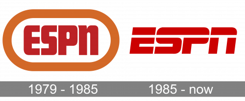
The very first ESPN badge was created in 1979 and had not much in common with the emblem we all know today. The initial logo was composed of stylized dark red lettering in bold lines, with straight cuts and rounded angles. The inscription was placed on a white background and enclosed into a horizontally stretched oval, executed in a thick line of a luxurious terracotta color.
1985 – Today

The redesign of 1985 introduced a new concept of the ESPN logo, and this time the badge became a perfect reflection of the energy and a character of the world’s famous sports network. The stylized scarlet red inscription with wide futuristic sans-serif letters, slightly slanted to the right, has a white horizontal line citing in on its upper part, as a representation of movement and dynamics.
Symbol: print version
 While the digital ESPN symbol combines red, black, and white, the print version is different. Taking into consideration that in many cases, the black-and-white color palette is the only one possible in print, the company suggests using the black lettering on the white background.
Evolution of the emblem
The first ESPN logo was introduced on July 14, 1978, but it was only on September 7, 1979, that it was first included in television programs.
The original emblem featured the letters “ESPN” in a somewhat muted shade of red. The design was placed into a white ellipse with a thick orange border.
The current emblem was created in 1985. While there’s much more motion and dynamism in it than in the previous version, we can still see a link with the heritage logo. For instance, it is pretty obvious in the shape of the letters, especially the “S” and “P.”
Font
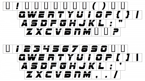
The 1985 logo was inspired by the typeface called Stop, which was designed in 1971 by Aldo Novarese, a prolific type designer who was working for the type foundry Nebiolo at the time.
However, the author of the logo didn’t leave the font as it was. Having chosen the most impactful part, the white stroke on the “E,“ the designer built the logo on its basis. The white stroke was prolonged and now lasted through all the letters. The shape of the glyphs was of course modified to fit the new visual concept.
Colors
Generic as it is, the bright shade of red is unbeatable in its expressive, vivid nature and the tension it adds to any design.


