The Atlanta Braves baseball team was the successor of the MilwaukeeBraves, who moved to Atlanta in 1966. Originally the Atlanta Braves used an almost identical logo, yet in the course of time they developed their own unique brand identity.
Meaning and history
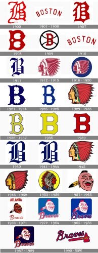
Atlanta Braves is probably one of the world’s baseball teams with the most intense history, and it all is reflected in its visual identity, which has had more than twenty redesigns throughout the years, representing each step of the famous club.
What are Atlanta Braves?
Atlanta Braves is the name of a professional baseball club from the United States, which was established in 1871 as Boston Red Stockings, and moved to Atlanta, getting the new name, in 1966. Today the club competes in Major League Baseball and is owned by Liberty Media.
1900
The club was established in 1900 under the name Boston Beaneaters, and had an ornate gothic-style letter “B” in red as its logo. The letter had it’s tail elongated and curved which added playfulness to an elegant and traditional symbol.
1901 — 1906
With the redesign of 1901, the logo was changed into an arched sans-serif “Boston” inscription in a darker shade of red. It looked simple yet professional and evokes such feelings as expertise, dynamics, and confidence.
1907
The club is being renamed Boston Doves and changed its logo again in 1907. The original visual identity concept was brought back, but now the gothic-style “B” was bolder and stricter, without any smooth lines, just thick and sharp elements.
1908
In 1908 the “B” was redrawn in a wishbone style but with its lines thick, and a small white rhombus placed in the middle of the vertical bar of the letter. The color palette remained the same, red and white, which looked bright and powerful.
1909
The logo was redesigned again one year after, in 1909. The red “B” got another typeface and now was executed in a geometric and straight font with distinct cuts and angles. The letter was placed on a white and black baseball, so the color palette was extended, and the logo started looking more professional and confident.
1910
Before changing its name to Boston Rustlers, the club brought back its logo from 1901, an arched red “Boston” inscription in red. This is how the last logo of Beaneaters became the last logo for the Doves.
1911
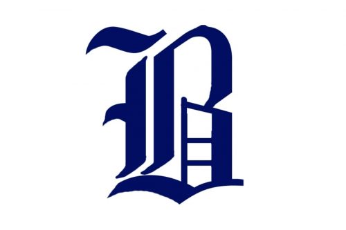
The logo for Boston Rustlers featured a new color palette — navy blue on white and a new shape of the “B”. In 1911 the letter was executed in smooth lines with sharp angles, representing a perfect example of a gothic style.
1912 — 1915
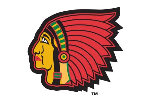
In 1912 the club changed its name again, this time it is Boston Braves, and the new visual identity concept is being adopted. The emblem of the club now depicts a profile of a Native American man executed in red and white, with an ornate feather headpiece. The man was drawn facing to the left, like looking at the pet, into the history of the team.
1916 — 1920
In 1916 the portrait got a bit smaller and placed on a solid blue circle, which added brightness and distinction to the Boston Braves visual identity and made it look more professional.
1921 — 1924
The portrait was replaced by the wishbone “B” in 1921, and the color palette was switched to blue and white, a fresh and professional combination, evoking a sense of expertise and reliability.
1925 — 1928
The contours of the “B” and its color palette were refined in 1925, making the shade of blue lights and the lines of the letter smoother and longer. The new “B” had a small white triangle placed on its vertical bar. It was pointing to the right and reminded a “play” button. The tails of the vertical were elongated and curved, which made the logo look elegant and playful.
1929 — 1935
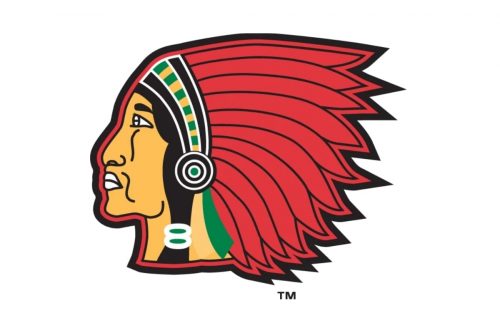
For the last logo of the first era of Boston Braves, the club brought back the Native American portrait for its visual identity, but the image was redrawn with more colors and a natural skin tone. Though the contours remained the same as in the version of 1912.
1936 — 1937
The Boston Bees’ name came out in 1936 along with the renewed logo of the club. It was the same wishbone “B” as on the emblem of 1925, but in a refreshed line and blue color palette, where the body of the letter featured a lime-yellow shade and was outlined in thick yet bright blue lines.
1938
The color palette remained untouched, but the contours of the “B” were modernized in 1938. Now it was a geometric letter with its upper and bottom horizontal sides slightly arched to the center. The blue outline became thinner which made the yellow-lime shade of the letter’s body look lighter and crispier.
1939
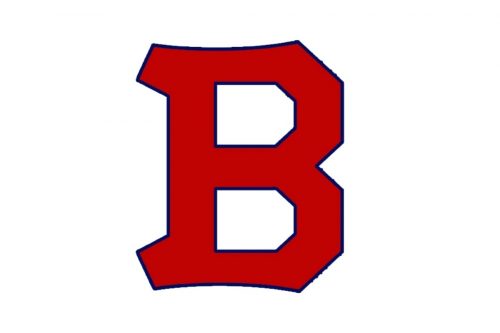
In 1939 the “B” kept its contours but changed the color palette to a dark red in a thin blue outline. The logo became more powerful and evokes a sense of danger and energy. Though it only stayed with the club for one year, it was a very professional and clean image.
1940
The gothic style “B” comes back to the Boston Bees’ visual identity in 1940. Being redrawn with its lines slightly elongated and the upper tail horizontally waved, the letter was executed in royal blue and placed in a white background, evoking a sense of authority and loyalty.
1941 — 1944
The club changed its name back to Boston Braves in 1941, keeping the previous version of the logo unchanged for another three years. There was no need for urgent redesign, as the first letters of the team’s name remained the same.
1945
For one year, in 1945, the club adopts its emblem, created in 1929, with the profile of a Native American man in a red feather headpiece. The contours and the color palette of the logo remained the same as in the 1930s, and the badge looked modern and bright.
1946 — 1952
The Boston Braves logo was modified in 1946, redrawing the lines and slightly elongating them, with the small refinement of the color palette. This the skin tone of the Indian became a bit darker and lips turned red. Also, the black outline of the image got wider, which added a powerful and confident mood to the emblem.
1953 — 1956
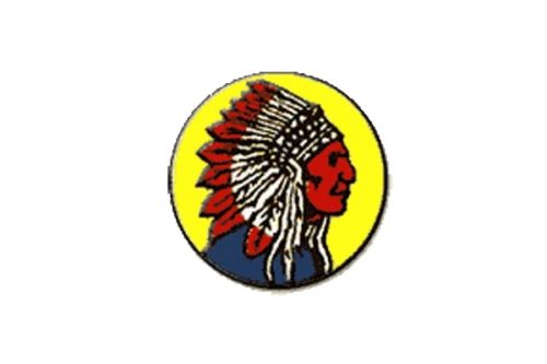
The club relocated to Milwaukee and becomes the Milwaukee Braves in 1953. In the same year, the new emblem was adopted. Depicting a Native American man looking to the right c the logo was composed of a yellow, red, white, and blue color palette, placing the image on a solid yellow circle. This version of the logo stayed with the Braves for three years.
1957 — 1965
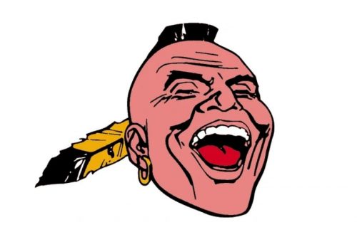
In 1957 the iconic Braves logo was introduced. It was a portrait of an Iroquois Indian man placed in ¾. The man was drawn laughing with his mouth wide open and his eyes closed. He had a golden hoop in his ear and a yellow and black feather coming out from the left side of his hairstyle.
1966 — 1971
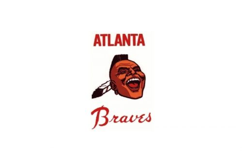
The club relocated to Atlanta in 1966 and changed its name respectively. The new logo was fully based on the previous version, but with an additional lettering and an elevated color palette. The skin tone got switched from pink to Bowen, and the yellow feather was replaced by a white-and-black one. As for the inscription, it was composed of “Atlanta” in all capitals of a rounded and narrowed sans-serif typeface, placed above the portrait, and the “Braves” in a handwritten cursive, under the image. Both parts of the nameplate were executed in intense red color.
1972 — 1984
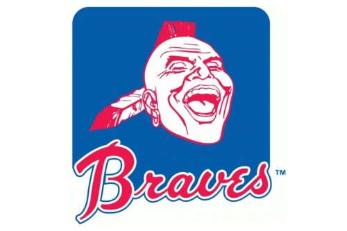
The redesign of 1972 made the iconic Iroquois logo brighter and more modern, drawing the portrait in white and red and placing it on a solid blue square with rounded angles. The “Atlanta” part of the nameplate was removed, and the “Braves” was refined and placed under the portrait, overlapping the blue square. The lettering was executed in red and featured a double white and blue outline.
1985 — 1986
The color palette of the emblem was elevated and the inscription was refined in 1984. The Blue of the background became darker and more intense, while the typeface of the “Braves” got smoother and more elegant. This version of the logo stayed with the club for only one year but was truly remarkable.
1987 — 1989
The blue shade of the Atlanta Braves visual identity became even darker in 1987, and this made a portrait look more contemporary and stylish than ever. As for the inscription, it was refined again, making the letters shorter. But wider, and giving more white to its outlining.
1990 — Today
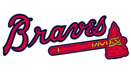
The Iroquois portrait was removed from the club’s visual identity in 1990, and the “Braves” logotype is now the only element of the badge. The club decided to use the typeface from the logo version of 1985, keeping smooth and elegant lines and its color palette untouched. There were also two additional logos created for the club: a fancy red “A” in a bold blue outline and a circular blue badge with a white inscription of it and two massive red hammers, crossed in the middle of the emblem.
Font
The custom curvy script resembles handwriting. One of its most distinctive features is the letter “e”.
Color
In addition to the Navy blue, scarlet red, and white colors comprising the team’s official palette, the Atlanta Braves logo also includes yellow.
Atlanta Braves Colors
SCARLET
PANTONE: PMS 200 C
HEX COLOR: #CE1141;
RGB: (206, 17, 65)
CMYK: (0, 100, 65, 15)
NAVY
PANTONE: PMS 289 C
HEX COLOR: #13274F;
RGB: (19, 39, 79)
CMYK: (100, 76, 12, 70)
GOLD
PANTONE: PMS 124 C
HEX COLOR: #EAAA00;
RGB: (234, 170, 0)
CMYK: (0, 24, 91, 18)
WHITE
HEX CODE: #FFFFFF;
RGB: (255, 255, 255)
CMYK: (0, 0, 0, 0)
Did the Atlanta Braves change their logo?
Atlanta Braves is one of the American baseball clubs with the most number of logo redesigns. However, its last badge was adopted in 1990 and still stayed u changed. The Red Tomahawk from the badge of the Braves has caused a lot of arguments and protests among the American population, as it is a symbol of the Indians.
What is the symbol on the Atlanta Braves uniform?
The symbol, placed on the uniforms of the Atlanta Braves players is a stylized red tomahawk, which is a cultural symbol of Native Americans. The use of this element in the visual identity of the club has caused many scandals in the press and along with the Indians.
Will the Atlanta Braves be changing their name?
Atlanta Braves is the name, adopted by the professional baseball club from Atlanta in 1966. This name is synonymous with power and determination, and, regarding the management of the club, it is not going to be changed. However, the possibility of the logo redesign is still under consideration.
Is the Braves logo trademarked?
Yes, the logo of Atlanta Braves is trademarked, and the club’s management owns the copyright on it, so you can not use the badge of the club without the official permission of Atlanta Braves.


