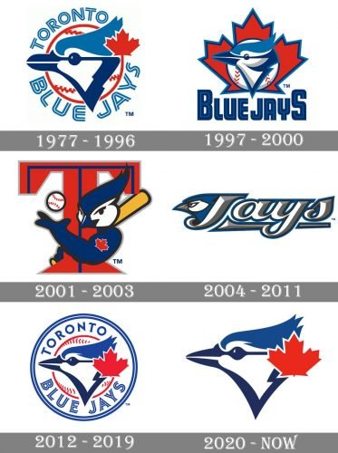
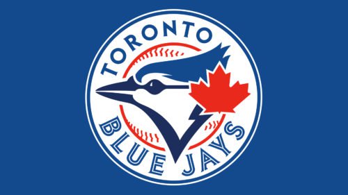
The team played their first game in the American League in April 1977. It was then that their first logo – the one that looks so much like the current emblem – was introduced. The logo featured the side view of the head of a bird, a blue jay to be precise, with a red maple leaf in the top right corner. Behind the bird, a white baseball with red seams was placed. The emblem was encircled by the team’s name.
Meaning and history
The visual identity history of the Toronto Blue Jays is pretty modest in comparison to other baseball clubs, which redesigned their emblems at least once in five years. The Blue Jays had a couple of experiments with their emblem, though in the end the club still came back to its original version, created in 1977.
What is Toronto Blue Jays?
Toronto Blue Jays are the name of a professional baseball club from Canada, which was established in Toronto in 1977. Today the club competes in the Major League Baseball and is owned by Rogers Communications. Toronto Blue Jays are one of two Canadian teams in the MLB.
1977 — 1996
The very first logo was created for the club in 1977 and featured a modern and cool image of the bird’s head, executed in a blue, red, and white color palette. The upper part of the bird’s profile was executed in a lighter shade of blue than the bottom one and had a red maple leaf placed on its right side. The image was placed over a white and red baseball and had a modern outlined “Toronto Blue Jays” inscription written around its perimeter.
1997 — 2000
In 1997 the emblem was refined and redrawn in a more modern manner, with smoother lines and gradient colors. It was placed on a solid red maple leaf in the thick blue outline. In the same year, another version of the logo was created for the club. It featured a caricature of a bird with a baseball bat and ball, hugging the enlarged stylized letter “T” in red and blue. The bird had a maple leaf “tattoo” on its wing.
2001 — 2003
In 2001 the secondary logo, created for the team became the official one. No changes were made to the baseball bird, and it stayed in its original version as the Blue Jays main emblem for two years.
2004 — 2011
Another redesign of the club’s logo was held by the Brandis bureau in 2004. The designers completely changed the concept of the emblem and minimized its color palette, removing red. The new composition was based on an elegant and modern white and gray “Jays” lettering in a custom cursive typeface with a delicate underline. On the left of the logotype, there was a stylized blue and white bird’s head, facing left, placed.
2012 — 2019
In 2012 the club decided to come back to its original version of the logo. It was slightly modernized by cleaning and shortening some lines and adding black color for a stronger accent. The maple leaf on this version was enlarged, which made the logo more patriotic than earlier.
2020 — Today
In 2020 all the extra details, including the baseball, were removed from the Toronto Blue Jays visual identity. Only the seek and modern image of the bird’s head with a maple leaf remained. The black color was switched to a dark blue, which made the logo more balanced and stylish.
Font
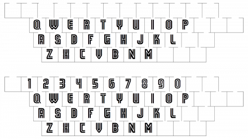
The type seen on the Toronto Blue Jays logo is very similar to the glyphic serif font called ITC Elan Bold, which was created by Albert Boton and published by ITC. The resemblance is particularly noticeable in the way the serifs are designed, while the proportions of some of the letters differ much from those in the original font.
Toronto Blue Jays Colors
PANTONE: PMS 4152 C
HEX COLOR: #134A8E;
RGB: (19, 74, 142)
HSB: (211, 86, 55)
CMYK: (100, 80, 14, 2)
NAVY BLUE
PANTONE: PMS 534 C
HEX COLOR: #1D2D5C;
RGB: (29, 45, 92)
HSB: (224, 68, 36)
CMYK: (100, 91, 35, 28)
RED
PANTONE: PMS 485 C
HEX COLOR: #E8291C;
RGB: (232, 41, 28)
HSB: (2, 87, 90)
CMYK: (3, 97, 100, 0)


