Southern League is one of the major parts within the Minor League Baseball in America. Basically, lower tier teams from Southeast (Florida, Louisiana, Alabama, Mississippi and so forth) get to compete in these matches to potentially become the Major League participants. Well, it was this way, anyhow.
Meaning and History
Southern League was introduced in 1964 as one of the main circuits of MiLB. The games were held all the way until 2020, when another great overhaul happened, and SL was turned into Double-A South – with the same roster, but slightly different rules and a different name.
1995 – 2016
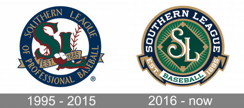
The original logo looked like a roundel with dark blue rims and a baseball in the center. Well, it was basically a white circle with two red seams and the letters ‘SL’ in front. They used a slightly gothic font with green fronts and red undersides. There was also a bronze banner near them with ‘est. 1885’ written on it. ‘Southern League of Professional Baseball’ was written in bronze letters along the edges.
2016 – Today
The 2016 logo is another roundel, except with a green core. In its center, there is a darker green rhomb with short bronze rays emanating from it. In front of it, there still were two letters, but now colored white-and-gold and more elegant. In general, many elements here also had a bronze outline. The name was just the white name ‘Southern League’ along the edges.
The bottom was occupied by a ribbon, saying the year of founding and the word ‘baseball’ in the center.


