

![]() Los Angeles Dodgers Logo PNG
Los Angeles Dodgers Logo PNG
Los Angeles Dodgers is the name of one of the most rewarded baseball teams in the United States. The club was established in 1883 as Brooklyn Atlantics and moved to LA in 1958, changing its name to the current one. Today the team is owned by Guggenheim Baseball Management and managed by Dave Roberts.
Meaning and history
![]()
The history of the club can be divided into two periods — New York, from 1883 to 1958, and Los Angeles, from 1958. As for the visual identity of the famous team, there were three milestones — the establishment of the team, the name change, and the relocation. All these stages are reflected in the numerous logos, designed for the baseball club during its history.
What are Los Angeles Dodgers?
Los Angeles Dodgers is the name of a professional baseball club, which was established in 1883 in Brooklyn, New York, under the name Brooklyn Grays, and moved to Los Angeles in 1958. Today the club competes in the West Division of the Major League Baseball, has Dodger Stadium as its home arena, and is owned by Guggenheim Baseball Management.
1899 — 1901
![]()
Created in New York as Brooklyn Robins, the team got its first logo in 1899. It was a Gothic-style letter “B”, originally designed in red.
1902 — 1908
![]()
Though the color was changed to blue in 1902 and since then, the signature color of the club has been constant.
Blue is the color, which symbolizes professionalism and reliability. And in combination with white is stands for loyalty, which reflects the relationship between the team and their fans.
1909
![]()
The “B” was redesigned in 1909. It was drawn in a lighter shade of blue and featured a new style of the typeface, which was also ornate, but with fewer lines and details than the previous one. The signature “B” was executed in a font with smooth curved lines and pointed peaks, the one, which is close to Bruce Double Pica.
1910
![]()
In 1910 the “B” was enclosed in a rhombus, symbolizing a baseball field, the blue became darker again.
1911
![]()
The Los Angeles Dodgers created in 1911 were only slightly different from the previous version. It was the same letter “B”, the same typeface and blue and white color palette, even the same shape of the frame — rhombus, with the same thickness of the lines. Although the lines of the frame were longer, so the rhombus had its four angles “crossed”.
1912 — 1913
![]()
The contours of the frame were redesigned in 1912 and replaced by a red circle in 1928.
1914 — 1925
![]()
In 1914 the framing was gone from the logo of the Los Angeles Dodgers. The blue “B” was also redrawn and got its lines shortened and emboldened. The white triangle on the left vertical bar of the letter got bigger and now was more visible. No other changes followed.
1926 — 1927
![]()
The logo from 1912 returned to the club’s visual identity in 1926, though the “B” got enlarged and emboldened, so the whole badge started looking more balanced and distinct. It was still a blue and white color palette, a combination, evoking a sense of professionalism, commitment, and dedication.
1928
![]()
The blue “B” got smoother and bolder in 1928. The blue rhombus was changed to a red circle, and this was the first time when the third color appeared on the team’s badge. The new composition looked friendly and soft, showing the club from a completely different side, and making the blue “B” even more eye-catching than earlier.
1929
![]()
In 1929 the frame was completely removed and the “B” was drawn in light blue with the red outline.
1930
![]()
The colors were switched in 1930 and for one year the team used a red letter in a blue outline as their logo.
1931
![]()
In 1931 the club started experimenting with the shape of the “B” and the first geometric logo was designed. A strong and bold serif “B” was drawn in light blue and featured a thin deep-blue outline.
1932 — 1936
![]()
In 1932 the original “B” came back to the logo, but is thinner and cleaner lines, in a calmer shade of blue and without any framing. The lines got longer and smoother, white their curved tails got sharper. The small “TM” sign in the same shade of blue could sometimes be seen on the emblem of the club.
1937
![]()
In 1937 the letter became dark blue with no additional details.
1938 — 1951
![]()
The club was renamed to Dodgers in 1938 and this is when the iconic logotype was first designed. The blue script lettering featured a thick smooth underline, which was coming out of the letter “S”. For the first decade, the logotype was written in blue and simply placed on a white background with no extras.
1952 — 1957
![]()
In 1952 the logotype was placed inside a brown rhombus, which was slightly horizontally extended. There was also a white baseball with blue lines placed above the letter “G”. That was the first step to the iconic logo we all know today.
1958 — 1968
![]()
The team moves to California in 1958 and changes its name to Los Angeles Dodgers. The new logo, designed in 1958 hasn’t changed much by today and became a legendary image in American baseball history.
The LA Dodgers logo from 1958 featured a blue script wordmark, which was placed slightly diagonally. The white baseball with red contours was placed above it and straight lines of different lengths were coming out of it as if they were rays of light.
1968 — 1972
![]()
In 1968 the colors of the emblem became more intense and the lines of the inscription became bolder.
1972 — 1979
![]()
In 1972 the logo was slightly refined, and in 1979 the inscription started gaining finer and more elegant contours.
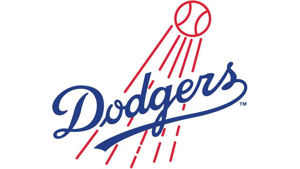
1979 — 2011
![]()
The redesign of 1979 made the script lettering thinner and more elegant. It was not only about the blue logotype, which was placed diagonally, but also about the red and white baseball with those red rays, coming from it to the lettering. All elements started looking sophisticated and chic, and this made the logo perfectly balanced. This version of the badge stayed with the club for decades and became the most recognizable version of all, ever created for the Dodgers.
2012 — Today
![]()
The current Dodgers logo is basically the same, with deep blue, red and white color palette, but the inscription is refined and looks sophisticated and powerful. The logo is now perfectly balanced and executed, evoking a sense of expertise and representing a high level of professionalism.
![]()
Colors
![]()
The modified logo comes in deeper hues of blue and red. The blue color symbolizes excellence and optimism; the red color expresses passion and eagerness to win.
Font
![]()
The Los Angeles Dodgers logo features a signature handwritten “Dodgers” wordmark.
Cap insignia:
![]()
Los Angeles Dodgers Colors
DODGER BLUE
PANTONE: PMS 294 C
HEX COLOR: #005A9C;
RGB: (0, 90, 156)
CMYK: (100, 56, 0, 18.5)
RED
PANTONE: PMS 185 C
HEX COLOR: #EF3E42;
RGB: (239, 62, 66)
CMYK: (0, 91, 76, 0)
SILVER
PANTONE: PMS 877 C
HEX: #A5ACAF;
RGB: (191, 192, 191)
CMYK: (5, 0, 0, 20)
What does Dodger mean in baseball?
Dodger is the name of one of the world’s most famous baseball stadiums, which was opened in 1962 in California. Since its first days, the Dodger Stadium has been the home arena to the iconic American baseball club, the Los Angeles Dodgers.
What is the Los Angeles Dodgers logo?
The logo of the Los Angeles Dodgers club, which was first introduced in 1958, is composed of a diagonally oriented script lettering in bold blue lines, written in the title case against a white background, accompanied by a red contoured baseball, flying above the inscription with additional vertical strokes in red, symbolizing the speed and the motion of the ball.
Are any of the Dodgers from Los Angeles?
The professional baseball club named dodgers was established in 1883 in Brooklyn, New York, and has played in its mother city for more than half a century. The Dodgers moved to Los Angeles at the end of the 1950s, so today it is almost fully composed of players from Los Angeles.
Who designed the Dodgers logo?
The logo of the Los Angeles Dodgers with the diagonally located blue script lettering placed on a plain white background was created at the beginning of the 1930s by the famous American designer Lon Keller.


