The iconic shield silhouette has been a cornerstone of the NFL’s identity since its inception in 1920, embodying the “NFL” initials alongside the stars and stripes of the US flag, crafting a symbol of the league’s storied heritage. Yet, this emblem has not remained static, evolving alongside the league itself, reflecting changes and milestones like the historic NFL-AFL merger. This merger, a pivotal moment, unified rival organizations, laying the groundwork for the modern era of American football and solidifying the NFL as the strongest American professional football league.
As the emblem transformed, so did the league, expanding to incorporate teams from Michigan to New York City, overseen by the NFL headquarters. This expansion mirrored the league’s growth from its original members, such as the Decatur Staleys, to a nationwide competition culminating in the Super Bowl, the ultimate championship game that captures the essence of American football achievement and legacy.
Meaning and history
The NFL, heralded as the pinnacle of American football, embarked on its journey in 1920 under the initial guise of the American Professional Football Conference, a title it briefly held before transforming into the American Professional Football Association later that same year. By 1921, it embraced its enduring identity as the National Football League, a name that has since become synonymous with football excellence in the United States.
As the preeminent football organization in North America, the NFL boasts 32 professional teams vying for supremacy in the sport’s ultimate showdown. Since the 1920s, these clubs have battled annually in a fiercely competitive arena, aiming to etch their names in the annals of football history. Among them, the Green Bay Packers stand out with an unparalleled 13 victories, marking them as the most decorated team in NFL lore.
Throughout the years, the NFL has witnessed periods of upheaval and reorganization, embodying the spirit of resilience and evolution. From the early days featuring the Akron Pros, Dayton Triangles, and Canton Bulldogs, to the introduction of new franchises like the Racine Cardinals and Chicago Tigers, the league’s landscape has been constantly reshaped. The transition from the AFL-NFL Championship Game to the Super Bowl Championship Game highlighted this evolution, cementing the NFL’s status as a beacon of football prowess.
The 1960s brought a significant challenge to the NFL’s dominance with the emergence of the American Football League (AFL), sparking a decade of intense rivalry. This era of instability culminated in the merger of the NFL with the AFL, leading to the creation of the National Football Conference (NFC) and the American Football Conference (AFC), thereby uniting under the NFL’s present name. Teams like the Detroit Heralds, Hammond Pros, Columbus Panhandlers, and Muncie Flyers, though lesser-known, played pivotal roles in the league’s storied past.
In recent years, iconic moments have unfolded on the sidelines and in overtime (OT) battles, featuring stars like Mahomes, Jauan Jennings, and Kelce. Legendary coaches like Andy Reid have strategized their way to NFL championships, highlighting the tactical depth of the game. States like Illinois, Indiana, and Ohio have contributed significantly to the league’s rich tapestry, hosting teams that have left indelible marks on the sport.
As the NFL continues to expand its influence, with ESPN Enterprises chronicling its journey, it remains a testament to American football’s enduring appeal. Whether through historic showdowns in the NFC or AFC, or through the spectacle of the Super Bowl, the NFL’s legacy is a mosaic of triumphs and challenges—a league forever linked to the essence of American sports culture.
What is NFL?
NFL is an abbreviation, which stands for the National Football League, the top-tier league of rugby in the United States. The league was established in 1920, and today it is composed of 32 football clubs from North America, which compete for the main NFL title every year.
1921 — 1929
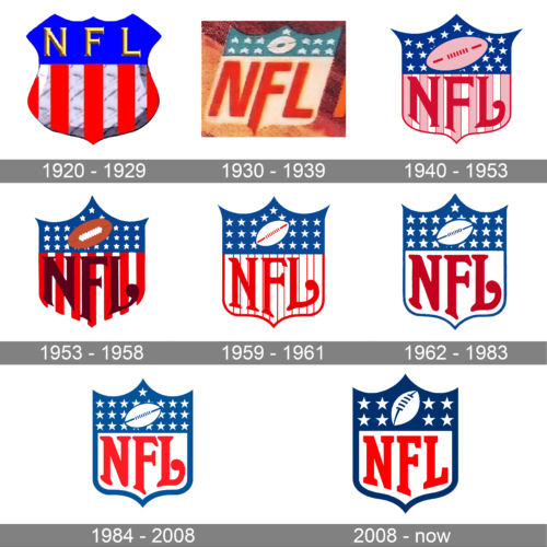
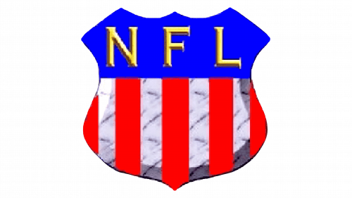
To begin with, we should mention the 1921 logo. The emblem of the main football league in the US was built around the colors of the country’s flag (or at least resembling the country’s flag). Inside the shield shape, we can see two fields. The upper field is blue, with yellow letters “NFL”, while below it there are red vertical stripes on the white background.
1930 – 1939
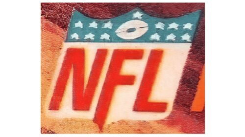
The updated version had even more resemblance to the US Flag. The top portion of the shield featured 13 white stars on a blue background. They represented the 13 original colonies that declared independence from Great Britain. The name was moved to the lower half and was printed in large, sans-serif letters of red color. It was a true national league that remembered the values of its nation.
1940 — 1953
By 1940, the National Football League logo was updated. Stars appeared in the upper part of the emblem, while the wordmark moved down. The stripes were pink with a thin red border, while the letters were red and more intricate in design than in the previous version. The colors grew darker, more refined. Also, there was an angled oval shape (representing a football) inside the blue field. It contained seven short vertical lines and two longer horizontal ones.
1953 — 1958
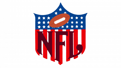
The NFL logo from 1953 stayed with the league for five years. It was a classy crest from the 1940s, but with some modifications. The red and white patter became brighter and the NFL lettering gained a new dark burgundy shade, getting its contours cleaned and emboldened. The upper part of the logo was also slightly refined — the ball changed its main color to brown, hence became more visible on a bright blue background.
1959 — 1961
The NFL visual identity redesign of 1959 introduced a modified version of the crest. It was lighter and more professional than the previous one. The striped became thinner and made the NFL lettering more distinct and visible. The inscription got its color switched to bright red. The ball from the blue part of the logo became bigger and changed its main color to white.
1962 — 1983
There were a couple changes introduced within the period between 1962 and 1983. There was some playing around with the shades of the colors as well as the shape of the letters. However, the overall looks remained the same.
1983 – 2007
 At first glance, the 1983 NFL logo appears very similar to the previous one. And yet, if you take a closer look, you will definitely notice the difference in the width of the emblem’s border: it became wider. Also, designers tweaked the position of the oval shape in the upper field.
2008 — Today
In the 2008 season a redesigned emblem was unveiled. The number of stars grew smaller: there were now 8 of them, one for each of the NFL’s divisions. The oval shape was turned a bit upward and to the side. Also, the intricate typeface was replaced by a straight, serif one.
Font
The current version of the NFL logo features a clear custom serif type. All the letters are capitals and have different height, “F” being the highest.
Color
The colors of the US flag – red, white, and blue – have been the standard colors of the NFL emblem ever since its inception. There were some playing around with the shades, and for a short period pink was also present in the logotype.
National Football League Team Logos
Video
What is NFL?
NFL is one of the most iconic abbreviations in world sports history. Standing for National Football League, it is the American conference of rugby (American football) clubs, with its rating systems.


