The Cincinnati Reds have existed since 1882 so this professional baseball team from Cincinnati (Ohio) has had a long history over which their logo has undergone numerous changes.
Meaning and history
One of the leaders in visual identity redesigns among baseball clubs, Cincinnati Reds, has almost two dozens logo versions created for it throughout the years, though the interesting thing is that the club’s emblem had something but the letters on it only twice in its history.
1890 — 1899
The original emblem for the club boasted a sleek and sharp gothic letter “C” in scarlet red color. It was very laconic but sting and evokes a sense of passion for sports and determination.
1900
In 1900 the logo changed its style to a more geometric and strict, drawing its red “C” in a strong and solid serif font. A lot of angles and clean lines looked professional and distinct.
1901 — 1904
In 1901 the club was using a simple sans-serif red “C” with a clean circular shape. It was a very modest emblem, though the red and white color palette made it look strong and bright.
1905
The “C” from 1905 was executed in a thick red line with a white triangle placed on its left part. Looking like an arrowhead, the triangle added some sharpness to the elegant letter.
1906 — 1907
The lines of the “C” became longer and fancier in 1906. The upper part was elongated and curved, which made the logo look elegant and ornate. The contour of the “C” was slightly extended, which made it more balanced and solid.
1908 — 1912
The elegant “C” got narrower and taller in 1908, and this version was used by the club for four years, which was the longest since 1900. The lines became bolder and the red shade — darker, which gave a more powerful and luxurious look to the Cincinnati Reds’ visual identity.
1913
The new logo design era started for the club in 1913 with its first “Reds” in the “C” emblem introduced. It was a slightly extended wishbone letter with “Reds” in capitals of a bold sans-serif typeface placed in its middle.
1914
In 1914 the “C” became thicker and the “Reds” — smaller. This was not a very balanced emblem and only stayed in use for a year, being replaced with its refined version in 1915.
1915 — 1919
The “Reds” lettering on the club’s emblem from 1915 got narrower and taller, which made the inscription look bolder and more confident and harmonized the thick contours of the wishbone “C”.
1920 — 1935
In 1920 the logo was refined again, by adding a distinct black outline to the “C” and strengthening the contours of the “Reds” wordmark. This was the emblem, which became a team’s symbol for the next eighteen years, being executed in two different color palettes.
1936
In 1936 the “C” turned blue and gained a white outline being placed in a red background. The “Reds” part of the logo also changed its color to blue and white, but with the while lines thinner and more delicate than in the “C”.
1937 — 1938
The team came back to its logo version from 1920 in 1937 and kept it untouched for another year. It was a strong and powerful badge despite its amateur execution, as the color palette and thickness of the lines made it bright and confident.
1939 — 1953
The contours of the logo were refined and the color palette got switched in 1939. The main elements of the badge changed their color back to red, keeping the white outline. Now they were placed on a calm blue background, which repeated the contours of the “C”.
1954 — 1960
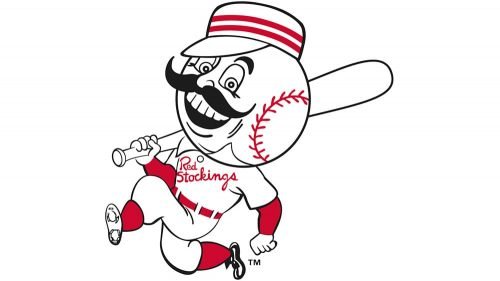
The logo from 1954 depicted a caricature of a running baseball player with his head replaced by a white ball with red stitches. The man had a solid black mustache with curved ends and was smiling, evoking a sense of fun and joy. On his white jersey, there was a “Stockings” red cursive lettering, which curved lines balanced the mustache of the man.
1961 — 1966
The logo designed in 1939 comes back to the club’s visual identity in 1961 in a renewed color palette. The red of the emblem became brighter and the muted blue color was replaced by black, which made the whole image stronger.
1967 — 1971
In 1967 the “C” and the “Reds” wordmark change their color to white and the background becomes red. Following the original color palette of the club, the emblem started looking more modern and sleek.
1972 — 1992
The baseball-head man returns to the badge in 1972, but his mustache was gone. The image was placed inside the “C”, moving the “Reds” lettering to the “C”’s bottom line, and placing the “Cincinnati” on the upper part of the main letter.
1993 — 1998
The concept of the logo from 1967 was refined in 1993, writing the “Reds” in thinner and cleaner lines and using a brighter shade of red for the background. It was a minimalist yet remarkable and delightful badge, which stayed with the club for five years.
1999 — Today
The redesign of 1999 strengthened and darkened the Cincinnati Redd logo, switching its bright red to a more intense tone and adding a black shadow to both the “C” and the “Reds” parts.
Color
Little can be said about the Reds’ official colors, only that they are red, white and black.


