

![]() WWE Logo PNG
WWE Logo PNG
WWE (World Wrestling Entertainment) is a US professional sports entertainment company known in the USA and 145 other countries. Other focuses include product sales, movie, music, and games.
Meaning and history
![]()
World Wrestling Entertainment, Inc. (WWE) is a US integrated media and entertainment company best known for professional wrestling. It also works in various other spheres, from cinema to football.
What is WWE?
WWE is an abbreviation forWorld Wrestling Entertainment, an American organization, which was founded in 1953, and today operates all over the globe, promoting Wrestling on all continents. WWE is headquartered in Connecticut, USA.
1952: Capitol Wrestling Corporation (CWC)
![]()
The earliest WWE logo reflected the company’s original name, Capitol Wrestling Corporation. The design was a highly stylized one and invited various symbolic interpretations.
The most obvious part was, of course, the combination of the initials, the double “C” and “W,” forming a symmetric pattern. For this purpose, the second “C” was given as a mirror reflection of an ordinary “C.”
Also, the emblem resembled horns, which was a good fit for a wrestling company.
1963: World Wide Wrestling Federation
![]()
The company adopted a new name, World Wide Wrestling Federation (WWWF). This meant a new logo, too. It looked nothing like its elegant, minimalist, and symbolic predecessor.
On the other hand, the new emblem explicitly showed the type of company to which it belongs: there were two figures of wrestlers. Both the full and short names of the federation could be seen to the left.
1971
![]()
Similar to the original WWF logo, this one featured a large “W” (a double “W,” to be precise). In the background, a globe symbolizing the “world” could be seen. There was also the full name of the federation.
This logo was no better than its predecessor due to its cluttered structure. The fact it repeated the word “Federation” twice made things even worse.
1979: World Wrestling Federation
![]()
This one looked as generic as the previous version. Once again, it was dominated by the globe. It was larger and more detailed than on the 1971 logo. Luckily, the second word “federation” disappeared.
1982
![]()
This is when the era of the WWF monogram started. The “back” of the “F” was formed by one of the diagonal lines of the “W.” The earliest version was rather bold and heavy. And yet, the white broken line going through the letters added some dynamism.
1982
![]()
While the original WWF monogram was black with a white line, this one featured various colors. The trim and the broken line were gold, while inside, there were light blue, light pink, and black spots.
Additionally, there were two black-and-white versions, which looked different from the previous emblem. In both of them, there was more white space.
1985
![]()
The redesign of 1985 has switched the colors of the geometric WWE monogram, drawing the stylized characters in white and outlining them in black. The new execution of the logo has made it look brighter and more modern, with the clean contours and straight cuts of the lines creating a brutal and confident image.
1995
![]()
The palette of the WWE logo was simplified. The letters were now bright yellow with dark blue trim. In the background, there was a dark blue square.
While on the previous emblem, the monogram was positioned horizontally, this time, it was oriented diagonally.
1997
![]()
The heavy block logo gave way to a light and emotional one. Here, the WWF monogram looked as if it had been scratched on a moderately rough surface. It communicated the wild emotions of the events held by the federation. The red curve “scratched” below the letters looked like blood.
This version was unveiled at Survivor Series 1997 during the Attitude Era. Its official debut took placed at Raw Is War in December 1997. The older version was used for three more months.
2002: World Wrestling Entertainment
![]()
The name was changed following a lawsuit with World Wildlife Fund. While the company introduced a new name, it did not get rid of the old logo but slightly modified it.
As the word “Federation” disappeared from the name, the letter “F” disappeared from the logo, too. The two “W’s” were now separated by more space. There were no more new letters as the initial of the word “Entertainment” was “hidden” in the “W.”
While the overall style of the WWE logo remained unchanged, there were several strokes added or removed here or there.
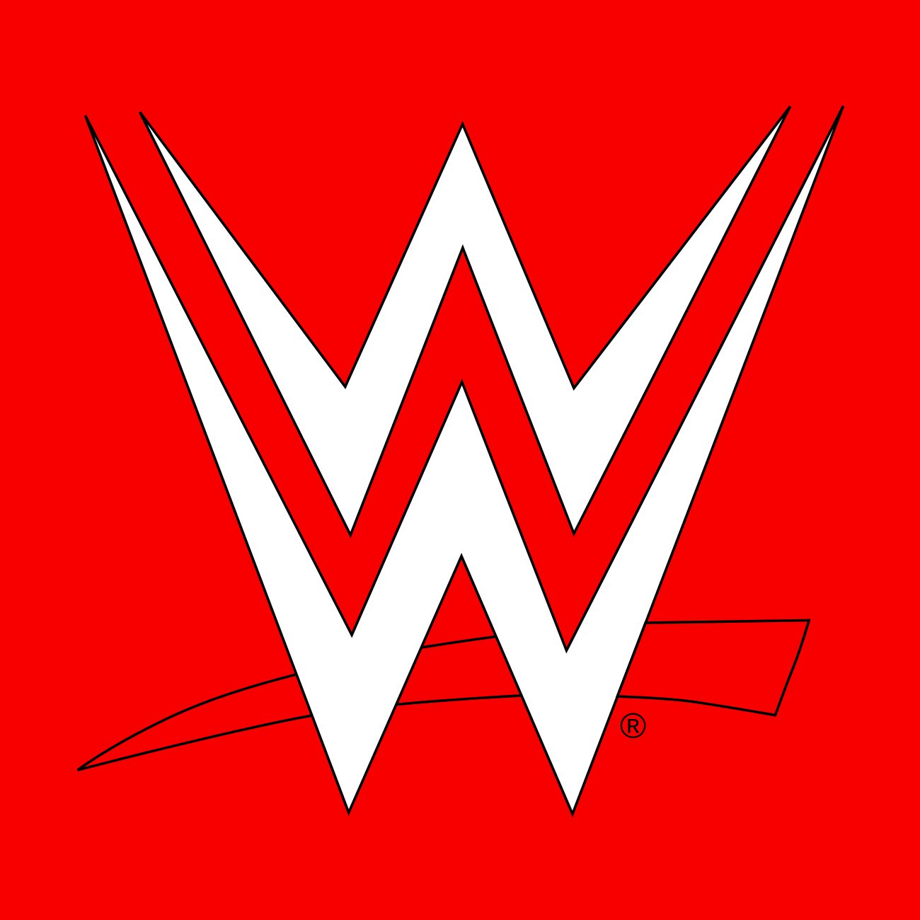
2014 – Today
![]()
The design was unveiled in 2012 as part of WWE Network. It was only in 2014 that the network was launched and the logo started to be used officially.
The new WWE logo was created by John Lefteratos. The structure remained the same. You could see two letters “W” one above the other and a red stroke below. Now, the “scratched” effect was gone, and the letters had smooth sides.
Each event organized by WWE has a distinctive logo and theme. In some cases, the emblem is updated annually, while in other cases, the emblem lingers on.
Emblem

The current WWE logo was designed by John Lefteratos in 2012, and it was not until 2014 that it was introduced. The logo had a 3D version and a black version.
Symbol
The WWE logo is among the most iconic, robust, and effective ones. It symbolizes the company’s integrity, professionalism, and striving to keep up with the changing sports media standards.
Shape
The today’s WWE logo is a regular version of the ‘scratch’ logo, because it retains the “W” and the red underline. The “W” is made up of two lightning-like elements with sharp ends, which add a bit of modernity to the design.
Font
![]()
The WWE logo sports the company’s signature typerface
Color
![]()
The 3D version of the WWE logo features a silver “W”; the underline is dark red. The black version has a black ‘W”, and the underline uses a brighter shade of red.


