

![]() New York Yankees Logo PNG
New York Yankees Logo PNG
Although for more than a century the New York Yankees logo looked almost the same, in fact it went through quite a few amendments to its shape and proportions, some of them barely noticeable to an unprofessional eye.
Meaning and history
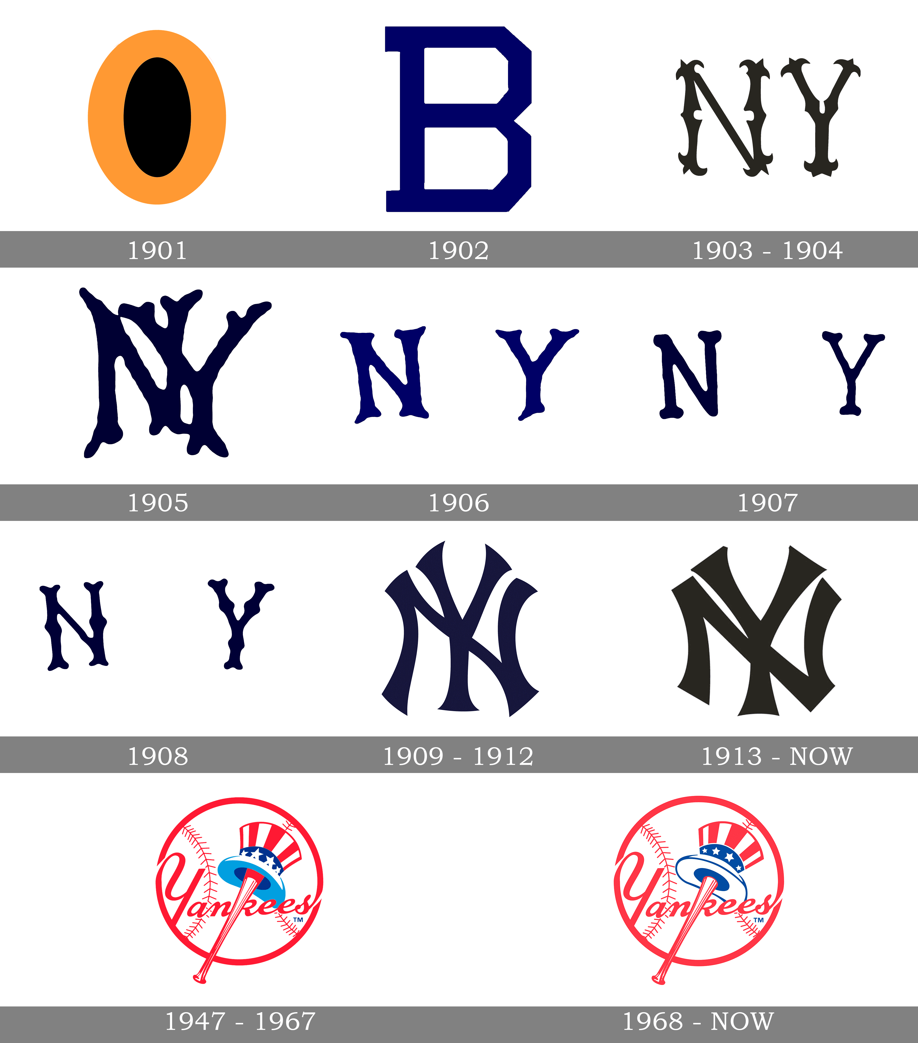
One of the most popular baseball teams in the world, and definitely the most famous New York sports club, the New York Yankees was established in 1901 under the name Baltimore Highlanders. Their first two logos were the modest representations of the original name, and only in 1903, the legendary NY monogram appeared. Though not in the design we all know now.
Two interlocking letters were first introduced in 1905 but didn’t stay for long and were replaced by another emblem, though came back in 1909 and stayed until today.
What are New York Yankees?
New York Yankees is the name of a professional baseball club from the United States, which was established in 1901, and today competes in Major League Baseball, being a member of the East Division of the American League. The club has Yankee Stadium as its home arena and Brian Cashman as the general manager.
1901 — 1902
![]()
Actually, the name Baltimore Highlanders appeared in a few months after the foundation of the team. For almost a year the iconic baseball club was called Baltimore Orioles and has a simple and modest logo — an orange letter “O” placed on a black background. It was a pale orange, a very calm shade, which looked professional and reliable.
1902 — 1903
![]()
Baltimore Highlanders chose the letter “B” for their visual identity. A geometric square capital letters in Blue, placed on white, became the next symbol of the team, staying for another year. It was strong and confident, yet too light and simple.
1903 — 1905
![]()
New York Highlanders appeared in 1903 along with the new logo. Two ornate letters “NY” were executed in blue and placed on a white background. They were separated from each other and on the team’s jerseys, they were placed on the right and left breast sections respectively.
1905 — 1906
![]()
The first version of interlocking letters was created in 1905. The letters had smooth and slightly curved edges, resembling the deer horns. This design didn’t last long and already in a year the team comes back to two letters with a wide space between them.
1906 — 1907
![]()
The logo from 1906 has more distinct and confident contours than the previous versions. The shade of blue is brighter and more eye-catching. The edges of the letters are still smooth and rounded, but now they look more modern and strong.
1907 — 1908
![]()
In 1907 the letters of the logo became thinner and the blue cane back to the original dark shade, which looks professional and powerful. The clean contours of the letters are accompanied by a big space between them, which adds lightness and freshness to the whole monogram.
1908 — 1909
![]()
However, the team decides to come back to ornate lettering in 1908. “N” and “Y” are placed on the invisible arch, and the space between them is now smaller than on the previous logo. As for the color, it remains untouched.
1909 — 1912
![]()
The prototype of the current logo was designed in 1909, basing on the version from 1905. Though the letters are executed in a strict gothic-styled sans-serif, with slightly elongated and pointed edges, adding sharpness and confidence to the whole image.
1913 — Today
![]()
The team got the name New York Yankees in 1913 and the logo was slightly redesigned. The blue became calmer and more “royal”, while the monogram itself gained slightly different shapes, varying depending on the placement of the logo. The most popular version, used on prints and websites, has the letters’ edges slightly arched, looking stylish and sleek. On their jerseys, the team uses a more fancy version with a contemporary character and bolder lines.
1946 — 1967
![]()
The official emblem of the iconic baseball team was designed in 1946 by Lon Keller and changed only once, in 1968. The emblem depicts a white baseball with a thick red outline and stitched. The “Yankees” inscription in script font is also executed in red and placed on the bottom part of the ball, Kroger’s by a baseball bat with a hat on it. The hat features the patterns of the American flag — stripes and stars in blue, red, and white.
1968 — Today
![]()
In 1968 the emblem was refined. The blue color became deeper and darker, adding a more professional look and making the image a tribute to the United States and its legacy. The contours of the lettering are cleaner and more distinct now and the whole image looks powerful and confident, just as the emblem of the most recognizable baseball team in the world has to be.
Symbol

Before the club got its current name and symbol (in 1913 and 1909 respectively), it was called New York Highlanders and used variations of a stylized “N” and “Y” as its logo. For most of the time, the letters were placed separately on either side of the jersey with the only exception of 1905 season, when the letters were interlocked.
Alternative emblems
There are three versions of the New York Yankees logo, each used for a different purpose:
- the cap logo, where both the characters have the same proportions
- the emblem that can be seen on the club’s home jersey: “Y” is a bit larger in comparison to “N”, while the curves are more emphasized
- the print Yankees symbol, where both the letters have slightly emphasized serifs
Font
![]()
The iconic “NY” initials feature customized font. It looks unique and instantly recognizable.
Color
![]()
The letters are navy blue, while the background is white. In addition to these two colors, the club’s official color palette also features grey.
New York Yankees Colors
BLUE
PANTONE: PMS 287 C
HEX COLOR: #003087;
RGB: (0, 48, 135)
CMYK: (100, 69, 0, 11.5)
RED
PANTONE: PMS 185 C
HEX COLOR: #E4002C;
RGB: (228, 0, 44)
CMYK: (0, 91, 76, 0)
UNIFORM NAVY
PANTONE: PMS 289 C
HEX COLOR: #0C2340;
RGB: (12, 35, 64)
CMYK: (100, 60, 0, 56)
UNIFORM GRAY
PANTONE: PMS COOL GRAY 7 C
HEX COLOR: #C4CED3;
RGB: (196, 206, 211)
CMYK: (0, 10, 7, 11)
What does the New York Yankees symbol mean?
The symbol of the New York Yankees club, the NY monogram, which has already become iconic by today, is not just the abbreviation for the name of the city the club plays in, but also a historical heritage, the medal of honor created for the NU City police officer shot in the line of duty in 1877.
What is the origin of the New York Yankees logo?
The New York Yankees logo was adopted by the legendary club in 1909, based on the medal of honor, designed by Tiffany & Co in 1977 for John McDowell, the first police officer shot in New York in the line of duty.
Why do the Yankees have two NY logos?
The NY Yankees have two logos as the representation of their roots and legacy. They both show the historic uniforms of the legendary club, and the Yankees keep using the two badges equally, showing pride and loyalty to its history and background.
Did the Yankees change their logo?
The iconic badge of the New York Yankees the whole world knows today was introduced in 1909, and since that time has only been slightly refined, keeping the original composition, style, and even color palette. Before 1909 the logo was changed several times, but the NY abbreviation was present almost on every version.


