

![]() San Diego Padres Logo PNG
San Diego Padres Logo PNG
The only baseball professional team the San Diego Padres owes its name to the Franciscan friars from Spain. “Padres” is a Spanish word for “fathers”. In this way they paid a tribute to the people who founded San Diego more than three centuries ago.
Meaning and history
![]()
Though the visual identity history of the baseball club from San Diego is pretty intense in the number of its redesigns, there were actually only four main concepts, which the Padres used for its badge throughout the years, and most of the changes made to the badges were more minor refinements, than something significant.
What are San Diego Padres?
San Diego Padres are the name of a professional baseball club from the United States, which was established in 1969, and today plays in the West Division of the Major League Baseball. The club has Petco Park in San Diego, California, as its home arena, and is owned by Peter Seidler.
1969 — 1984
![]()
The original Padres logo was introduced in 1969 and depicted a funny monk playing baseball. The image was executed in a modest brown and white color palette and enclosed in a thin yellow circular frame. The “San Diego Padres” lettering was arched under the emblem.
1985
![]()
In 1985 the club started using a bold elegant logotype as its primary logo. In the very first version the brown inscription, which was placed diagonally, was complemented by two lines of a lightweight text: “San Diego” on the top left and “Baseball Club” on the bottom right.
1986 — 1989
![]()
The additional text was removed from the club’s logo in 1986 and the “Padres” inscription in chocolate brown became the only element of the logo. Its thick smooth letters in an elegant serif typeface featured thin yellow contouring, which made the whole image look brighter and more stylish.
1990
![]()
The logotype was refined and placed on a circular badge in 1990. The badge featured its inner part white, and a thick light beige outer part with two parts of the wordmark, executed in different typefaces. The upper part of the framing comprised a “San Diego” inscription in all capitals of a traditional serif font, while the “Baseball Club” lettering, written along the bottom part of the emblem, used a delicate cursive.
1991
![]()
The color palette of the San Diego Padres visual identity was changed in 1991. Now the logotype was executed in deep blue and yellow and the circular background featured light and muted shades of gray, blue, and white. The new color scheme made the badge look crispier and gave it more energy and dynamics.
1992 — 2003
![]()
The frame turned white and gained a distinct yellow outline in 1992. The inner circle of the logo got its vertical stripes pattern redrawn and now the thin blue lines were placed farther from each other, creating a new look and adding more character and individuality.
2004 — 2010
![]()
A new concept was adopted for the Padres visual identity in 2004. The badge changed its shape and now looked like a pennant with a sharp triangular bottom part. The color palette was changed to intense blue, white, and gold, with some light blue touches. The logotype in white and gold was placed over the bottom, rectangular part of the logo, and was underlined by waves, drawn in the bottom of the pennant. The delicate “San Diego” wordmark in all capitals was placed on the upper right part of the badge, executed in a sleek and sophisticated serif font.
2011
![]()
The logo was refined in 2011, having the “San Diego” lettering removed and keeping the “Padres” in a smooth and sleek custom typeface the only text-part of the visual identity.
2012 — 2014
![]()
The new badge was designed for the club in 2012. It was a bold blue circle in a double white outline, with a sleek white “SD” monogram in the center. The “San Diego Padres” in all capitals was placed in the upper part of the frame, and the “Baseball Club” in the smaller size — in the bottom one.
2015 — 2019
![]()
The logo was simplified to just a monogram in 2015. Keeping the blue and white color palette, two intertwined letters were executed in a fancy typeface with rounded angles, clean contours, and sharp serifs, elongated to only one side of the bar.
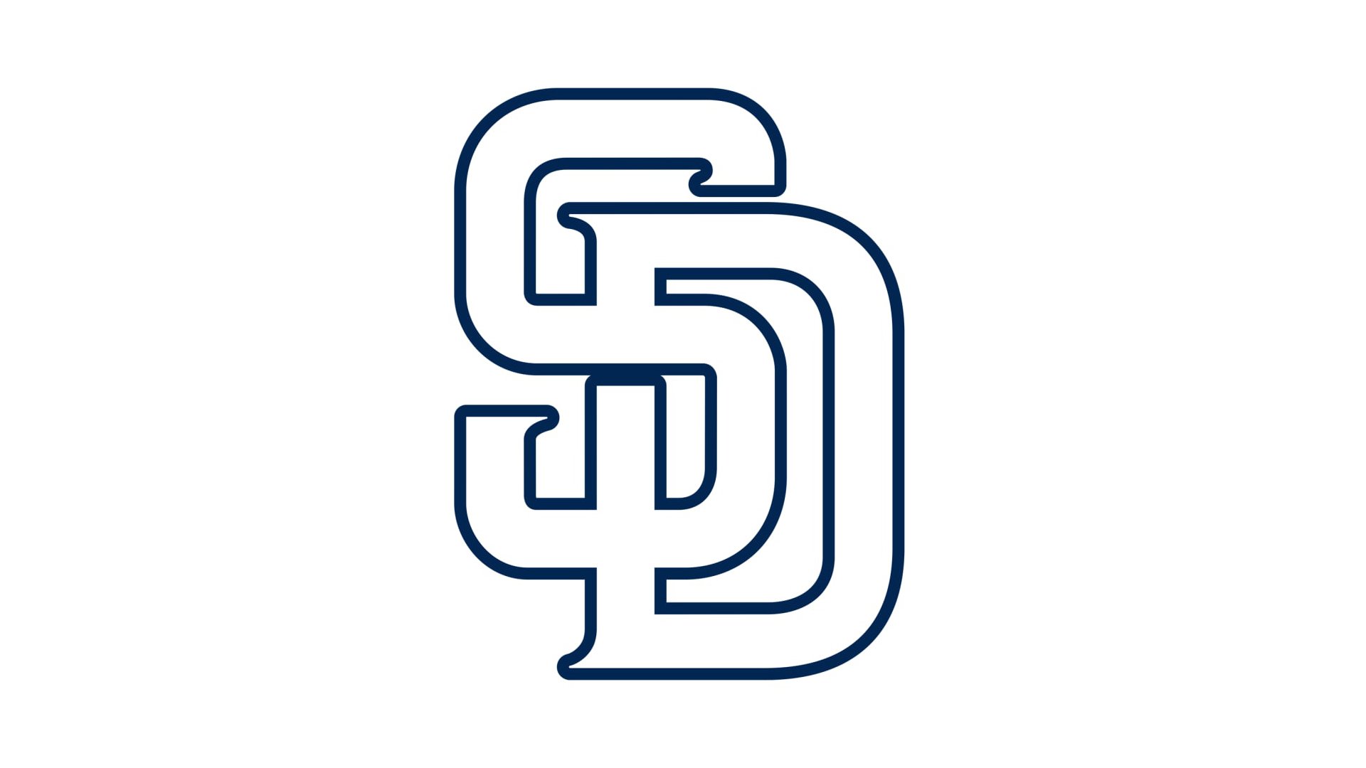
2020 — Today
![]()
The color palette of the San Diego Padres visual identity came back to its original combination of brown and white, but with the shade of brown elevated to a more chocolate one. The series of the letters were shortened and now are almost invisible, but it did not affect the elegance and style of the lettering.
San Diego Padres Colors
SAN DIEGO PADRES BROWN
HEX COLOR: #2F241D;
RGB: (47, 36, 29)
CMYK: (61, 66, 72, 72)
PANTONE: PMS 412 C
SAN DIEGO PADRES GOLD
HEX COLOR: #FFC425;
RGB: (255, 196, 37)
CMYK: (0, 24, 93, 0)
PANTONE: PMS 7-8 C
Why is the Padres mascot a friar?
The famous American baseball club Sand Diego Padres are known among its fans as “The Friars”, and the mascot of the club is the Swinging Friar, a huge monk in a long blue robe with a white enlarged SD monogram on his chest. The Friar was chosen as the club’s mascot, as a representation of its name, as in Spanish “Padres” means “Fathers”, or “Priests”.
When did the Padres change their logo?
The logo of the San Diego Padres baseball club has been changed several times throughout the long club’s history. The very first logo was designed for the club at the end of the 1960s, with the first redesign held in 1985. Since then the badge was changed six more times until the club has come up with the iconic monogram logo in 2012. As for the current version of the Padres logo, it was introduced in 2020, being a complete copy of the previous version, but executed in a new color palette.
Why is the San Diego Padres called that?
The name of the famous American baseball club is a tribute to its motherland; the city of San Diego, California, which was founded by catholic priests. The club got its name in 1968 and has never changed it since then. That was an idea of the Padres’ owner, with whom a very weird chapter in the club’s history is connected. The owner ditched the club and resold its name to another team, which today is known as the San Diego Padres of the National League.


