

![]() New York Giants Logo PNG
New York Giants Logo PNG
Since their first season, the New York Giants has had a succession of emblems looking very different from one another.
Meaning and history
![]()
The history of the New York Giants’ visual identity can be split into two periods — the graphical era, which started in the 1940s and lasted until the 1960s when the club switched to the modern era and began using text-based logos for its badges. The blue and white color palette, which is strongly associated with Giants today was set by the club in 1961 and has never left the emblem design since then.
1946 — 1949
![]()
The initial logo for New York Giants was designed in a traditional for its times’ manner — a football player in a red and white uniform, placed on an orange bag round of a horizontally oriented oval, aimed to repeat the shape of the ball. The “New York Football Giants” wordmark was arched along the perimeter of the badge, above the player’s figure, written in yellow capitals of a simple sans-serif typeface.
1950 — 1955
![]()
The badge from 1950 changed its shape from oval to circle, and the orange background — to red. In this version, the white and gray skyscrapers, drawn along the bottom line of the badge, were more visible than on the previous one, Rut to the elongation of its line and stronger color contrast. The player was now wearing a white uniform with blue lettering on it, and the ball in his hand was colored blue.
1956 — 1960
![]()
The redesign of 1956 framed the logo, drawing the upper part of the player with the football above the image of the Giants’ home stadium. The whole composition was executed in a light blue color palette which looked bright and fresh.
1961 — 1974
![]()
The new design era came to the New York Giants’ visual identity at the beginning of the 1960s, when the team started using a plain bold monogram as its primary logo. The very first version of the new style featured two lowercase “NY” letters in an extra-bold custom typeface with massive geometric serifs. The tail of the “Y” was elongated and curved, underlining the “N”. The Royal-blue color of the new insignia looked chic and confident on a white background. This badge is still used by Giants as the secondary version.
1975
![]()
In 1975 the club decided to experiment with its logo and introduced its new version, where two white connected letters were outlined in blue. The “N” was capitalized, while the “Y” was written in the lowercase, with its tail forming two parallel thick lines under the whole monogram. This badge only stayed with the team for a few months and was replaced by a new emblem in 1976.
1976 — 1999
![]()
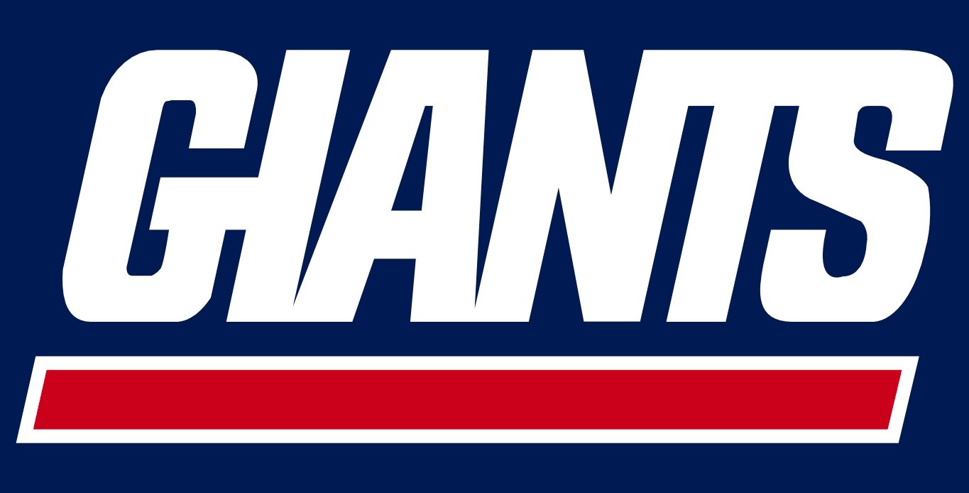
The redesign of 1976 emphasized the “Giants” part of the club’s name, writing it in a bold narrowed sans-serif, with its capital letters italicized and underlined. The symbols of the wordmark were placed pretty close to each other, touching each other’s bars, and looked solid and serious in a dark blue color. This version of the logo still can be seen, as the team uses it as a secondary one.
2000 — Today
![]()
New York Giants come back to the logo version of 1961 in 2000. The bold lowercase “NY” monogram in dark blue gains a delicate red outline and this is the only changed thing of the original version. This laconic yet bright and memorable insignia brilliantly reflects the club’s character and spirit, pointing to its professionalism and value of a good game.
The “NY” symbol
Probably the most popular of all the New York Giants logos was first introduced for the 1961 season. Created by Marie Barclay Steinmuller, it was used for about 15 consecutive years and then replaced by a blue uppercase “NY” emblem. However, it did not stay long and was changed for the Giants script emblem the following season. In 2000 a tweaked lowercase “ny” emblem returned as the team’s primary logo.
Font
![]()
The current version of the New York Giants logo sports a customized lowercase typeface.
Color
![]()
The combination of dark blue and red, which is the basis of the emblem, stands out against the white background. These colors were used in the team’s logo for much of their history, with the exception of the first 25 years and the period from 1955 to 1976, when red was not present in the emblem.
New York Giants Helmets
The history of the New York Giants helmet design is quite strict and drama-less, however, there were five years in the club’s history, when it started using a much darker color palette than it used to before and after.
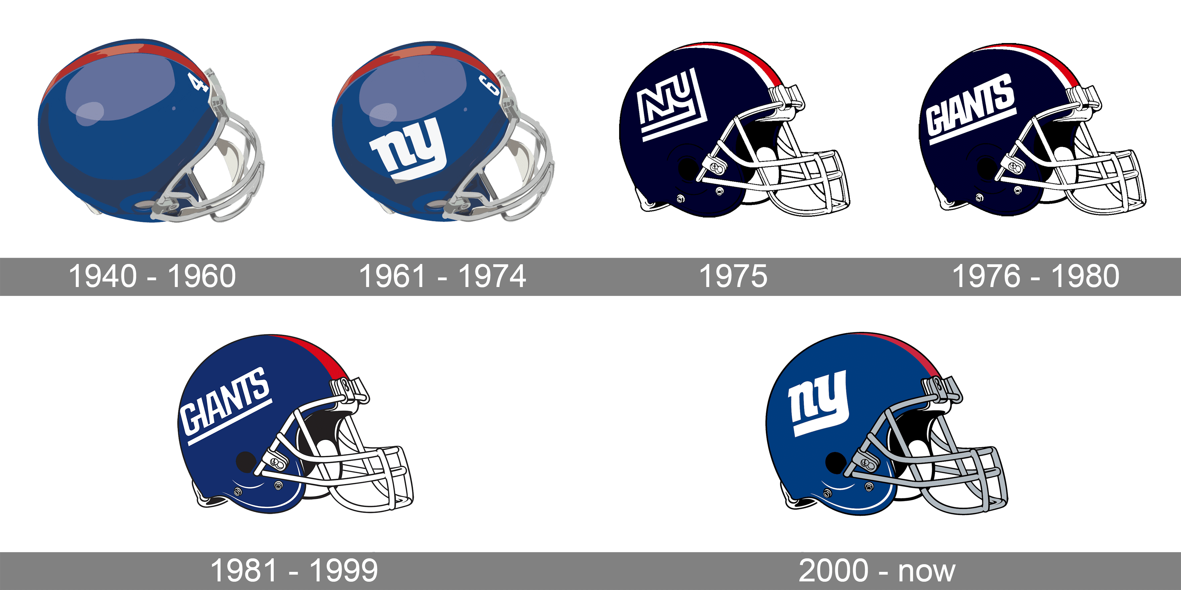
1940 – 1960

The original design of the New York Giants helmets, introduced in 1940, was very modest and simple. Painted in solid blue, the helm featured a wide red stripe in the center and a white player’s number on its left. The grille was traditionally executed in silver metallic.
1961 – 1974
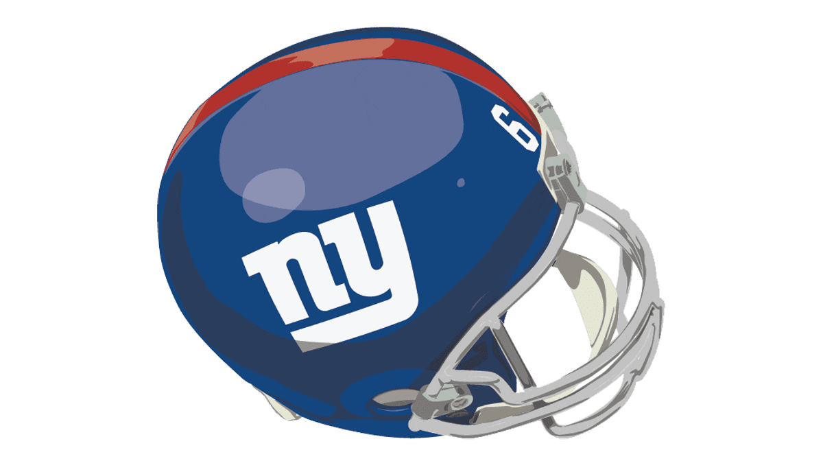
In 1961 the helmets of the players were decorated with a bold white logo of the club, which was the stylized lowercase “NY” abbreviation, written in a custom sans-serif typeface, where the elongated tail of the “Y” was underlining the stable “N”.
1975
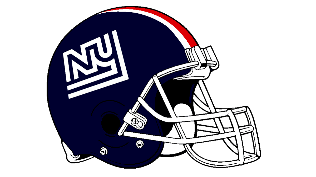
The more dark and dramatic color palette was adopted by the club in 1975. The smooth shade of blue was replaced by a super dark navy, almost black; the shade of red was also intensified. Now the center of the helmet was decorated not by one stripe, but by three — two whites in the sides from the red. The logo was also redrawn — an uppercase “NY” in a contoured designer font was written in bold white lines on the side of a helmet.
1976 – 1980
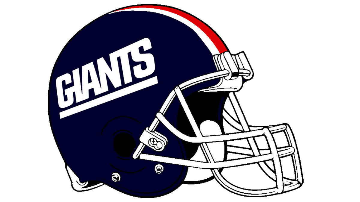
The “NY” abbreviation was replaced by the bold uppercase “Giants” logotype in a custom sans-serif typeface, where all characters were glued to each other, and the whole wordmark — underlined. All other elements, including the dark color palette, remained the same.
1981 – 1999
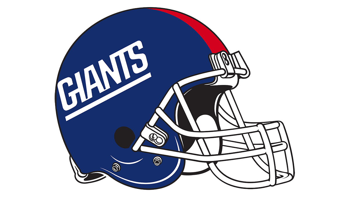
The shade of blue became lighter again in 1981, and three stripes were changed to one red too. The white grille was balancing the bold white “Giants” lettering on the side. It got a bit lighter and had more air in between the characters than the one from the previous design.
2000 – Today
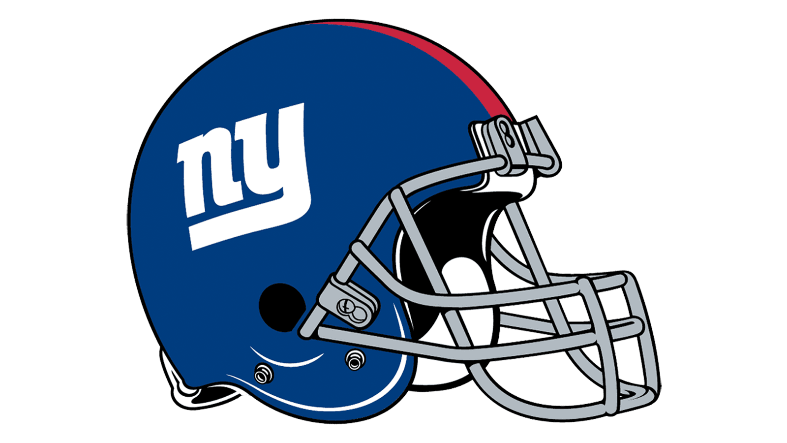
The design, adopted for the New York Giants helmets in 2000 is still actual today. Set in the same color palette with a medium shade of blue, the helmets are decorated with wide red stripes and a white logo on the side. The logo is just the same as on the version from 1961, the lowercase abbreviation. The grille got silver again.
New York Giants Uniform

There are two versions of the New York Giants uniform: color and white. The color uniform is composed of solid blue jerseys with white detailing and the player’s numbers in the same color, white pants with triple red, blue, and white stripes on the sides, and solid blue gaiters. As for the white uniform, it has a white jersey with red decorative elements, and light-gray pants with the same stripes as on the color version; the uniform is accompanied by solid red gaiters.
Stadium
Logo
![]()
View
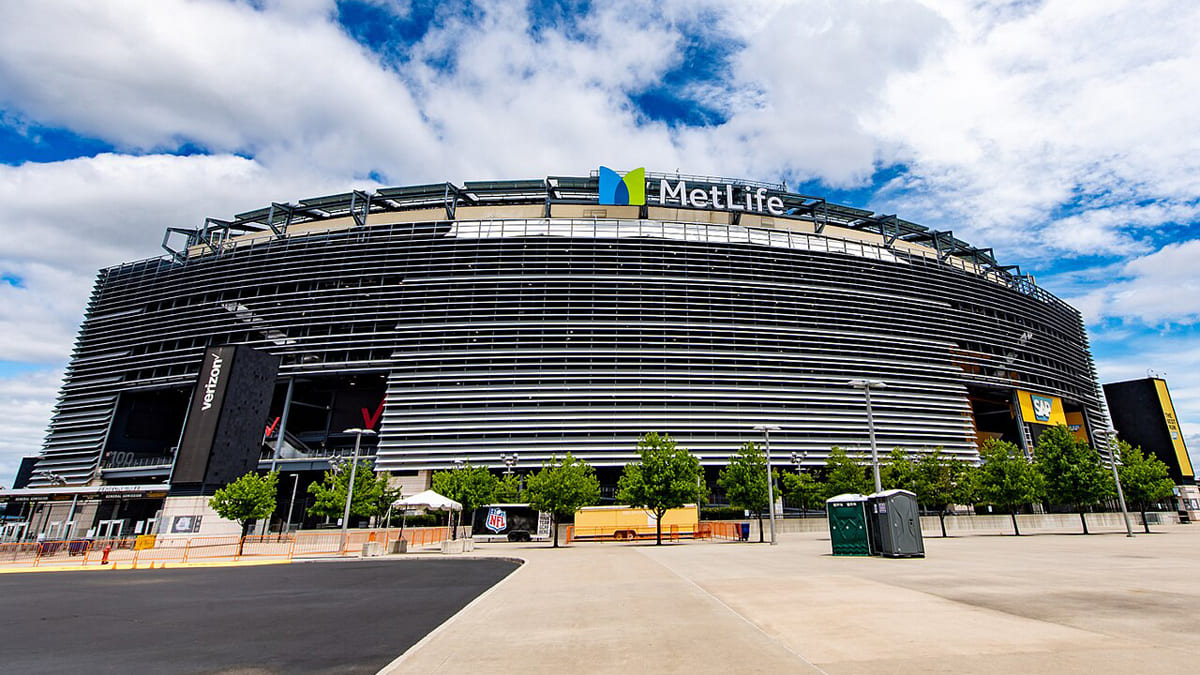
The home ground of the New York Giants football club is MetLife Stadium, built in East Rutherford, New Jersey, in 2010. It replaced the previous Giants Stadium, which was built in 1976. With a cost of $1.6 billion, MetLife Stadium was the most expensive stadium built in the United States at the time of its construction. It is also one of only two NFL stadiums that are home to two teams at once: the New York Giants and the New York Jets.
New York Giants Colors
DARK BLUE
PANTONE: PMS 2758 C
CMYK: (100, 75, 0, 30)
RGB: (1, 35, 82)
HEX: #0B2265;
RED
PANTONE: PMS 187 C
CMYK: (20, 100, 80, 0)
RGB: (163, 13, 45)
HEX: #A71930;
GRAY
PANTONE: PMS 429 C
CMYK: (5, 0, 0, 30)
RGB: (155, 161, 162)
HEX: #A5ACAF;
Why did the Giants change their logo?
The professional club from New York has had several redesigns of its badge throughout its long history, and some of them were pretty dramatic, with a complete change of the visual identity. The first three badges of the team featured an image of a giant pitcher this logo was redesigned twice until the new era of the Giants’ visual identity started in 1961. The rethought badge featured a heavily stylized lowercase “NY” lettering. The badge was redesigned twice more, and finally, in 2000 the current version, fully based on the badge from 1961, saw the light. The minimalistic yet bright lettering reflects the spirit of the club’s players, their professionalism, and their determination.
Why is the NY Giants logo lowercase?
After the three first versions of the club’s logo, with the depiction of a Giant pitcher, drawn above the stadium, the club decided to completely rethink its identity, and did the following: removed all graphical elements, made the “NY” lettering the only symbol on the badge, and write it in the lowercase, as opposed to the name and the original badge of the club. The small characters are heavy and stable, and leave the “Giant” thing to the club and its players, not accenting on the logo, but on the game.
When did NY Giants change their logo?
The logo of the New York Giants club was changed several times throughout the years, and its logo history can be divided into two periods: the Giant Pitcher era, which lasted until 1961, and the lettering era, which is still on today. The latest redesign of the Giants badge was held in 2000, with the heavy geometric NY monogram from 1961 strengthened and brightened up.


