

![]()
Houston Texans logo PNG
While the football team the Houston Texans (AFC South division) played their first game in 2002, the story of their logo started three years earlier.
Meaning and history
![]()
In 1997, Houston was left without professional football for the first time since the late 1950s. This happened because the local NFL team, the Houston Oilers, moved to another city. A local businessman, Bob McNair, tried to create a National Hockey League expansion team here. Having failed to do this, he decided to focus on football and created Houston NFL Holdings in collaboration with Steve Patterson. Eventually, in the fall of 1999, the NFL decided the city deserved its own team.
Just a month later, the Houston NFL Holdings introduced a “transition” logotype created by NFL Properties. It was used until the brand identity for the club was developed.
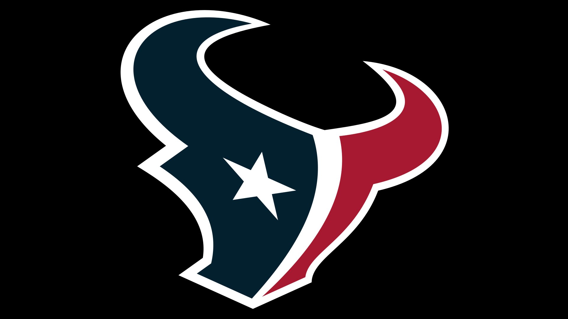
![]()
By April 2000, the list of possible names included three versions (Apollos, Stallions, and Texans). For each of them, logo concepts in full color were developed. The logo versions were introduced to focus groups. The final logo was selected by August when it underwent TV and photo testing. The official merchandise debut took place in September 2000. The Houston Texans logo, as well as the team’s name and official colors, were introduced during a rally on Texas Avenue.
The first 10 players were signed to contracts by the beginning of 2002. In the summer of the same year, the club had its debut campaign (against the New York Giants) in front of more than 20,000 fans.
Symbol
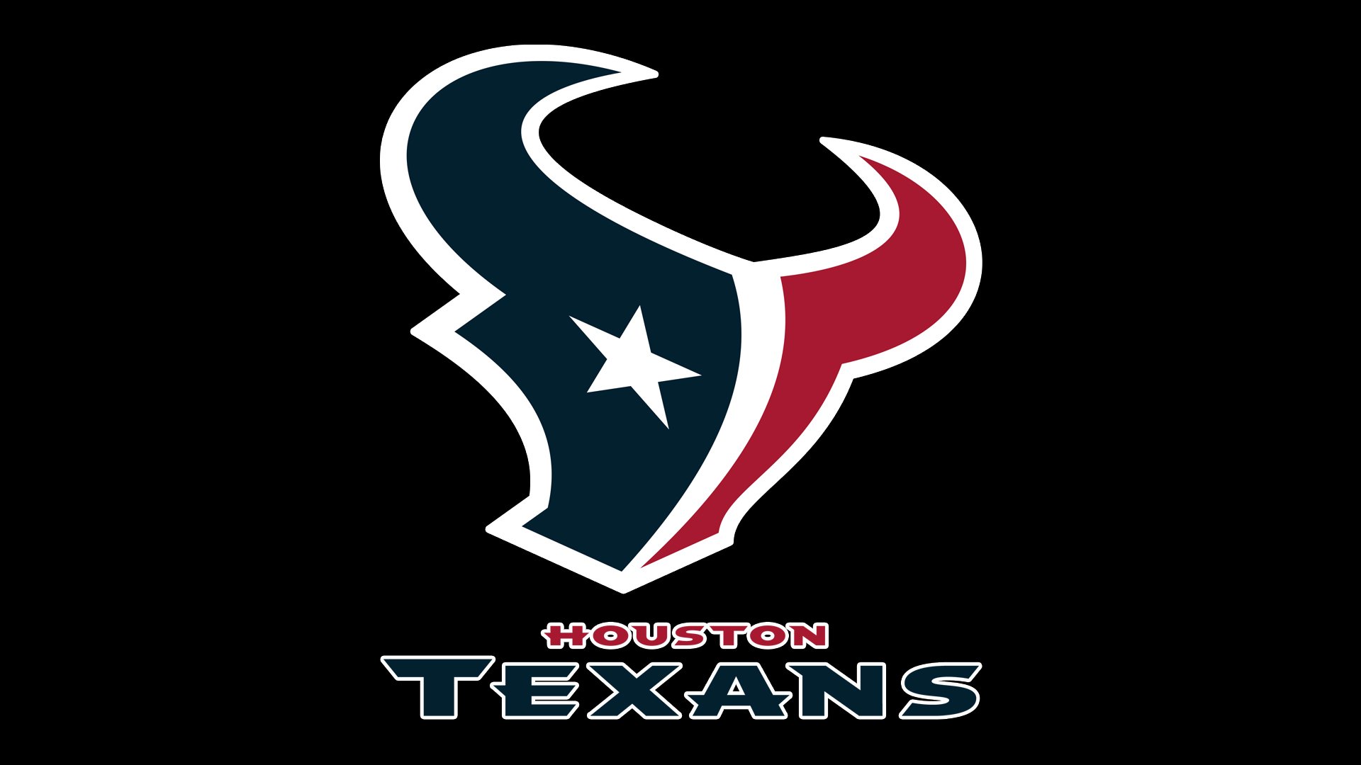
The logotype depicts the head of a bull split into two parts. The head is given in the way that makes it look like the flag of the Texas state. The flag of Texas also comprises blue and red, but the shades of the colors are different. As McNair pointed out, the bull that is depicted on the logo isn’t a longhorn or a cow, but a noble Spanish fighting bull, which had been chosen to represent the spirit of Texas.
The star used instead of the eye has a symbolic meaning. Each of the 5 points symbolizes one of the team’s core values. The logotype was developed by a California-based branding consultancy and design firm Verlander Design.
![]()
Secondary emblem
While sharing the color palette with the primary logo, the secondary one, which was introduced in 2006, depicts the capital letters “H” and “T” in red and dark blue respectively. Right below the “H,” there is a stylized depiction of the map of Texas. The white star that can be seen on the map is exactly the same as on the primary Houston Texans logo and has the same symbolic meaning.
Font
![]()
You’ve definitely noticed the most unusual element of the typeface, the sharp edges that are especially visible on the “E,” “A,” and “N.” Unnecessary from the utilitarian point of view, they conjure up the idea of something as sharp as a bull’s horns and in this way help to create an aggressive, if not menacing, impression.
Colors
![]()
The team’s official palette includes colors (dark blue, red, and white), all of which can be seen on the Houston Texans logo.
Houston Texans Colors
DEEP STEEL BLUE
PANTONE: PMS 5395 C
HEX COLOR: #03202F;
RGB: (3, 32, 47)
CMYK: (100, 60, 0, 80)
BATTLE RED
PANTONE: PMS 187 C
HEX CODE: #A71930;
RGB: (167, 25, 48)
CMYK: (0, 100, 79, 20)


