

![]() Minnesota Vikings Logo PNG
Minnesota Vikings Logo PNG
All the three versions of Minnesota Vikings logo may look rather similar as all of them feature the same Norseman. And yet, if you compare them side-by-side, the differences between them become obvious.
Brand Overview
The Minnesota Vikings professional soccer club was founded on January 28, 1960, with its first playing season in the NFL in 1961. In August 1960, former Los Angeles Rams public relations manager Burt Rose became general manager of the team. This club definitely has a large number of fans in Scandinavian countries, as the region where the team is located has a very strong Scandinavian tradition.
The Vikings are members of the National Football Conference North Division (NFC North) of the National Football League, having previously played in the Western Conference and the National Football Conference Central Division.
In August 1959, three businessmen, Bill Boyer, H.P. Skogland, and Max Winter, get a franchise for a new team from theAmerican Football League. With the emergence of AFL competition, the NFL decides to expand the League, giving the franchises to Dallas and Minneapolis-St. Paul. Winter and a group of companions decide to relinquish the franchise to the AFL and get the NFL one.
In 1960, Burt Rose was appointed general manager of the new club. Bill Boyer becomes the club’s first president. In August of the same year, the club’s management chooses the name for the new team, “Minnesota Vikings”, as a sign that Minnesota is a center of Scandinavian-American culture.
The team from Minnesota has never won a Super Bowl but has a record amount of playoff appearances— 31.
Meaning and history
![]()
The strong and sharp logo of Minnesota Viking was created at the beginning of the 1960s and has arrived in the 2000s with almost no major changes. By today the emblem was redesigned only twice, keeping the main theme and color palette of the initial version barely touched.
What are Minnesota Vikings?
Minnesota Vikings are the name of a professional American football club, which was established in 1961 and today competes in the National Football League as a member of the North Division. The club has U. S. Bank Stadium as its home arena and Kevin O’Connell as the head coach.
1961 – 1965
![]()
The initial logo for the football club from Minnesota was introduced in 1961 and featured a white and yellow portrait of a Viking in profile. The man with yellow hair and helmet was facing left and has its face with an elongated mustache in white. The horn on the Viking’s helmet was elongated and pointing upright, creating a sense of progress and motion. Their sharp peaks reflected determination and danger, while the serious face of the man stood for professionalism and confidence.
1966 – 1996
![]()
The redesign of 1966 changed the direction of the emblem and the Viking got turned to the right, looking into the future, being ready to step in and fight. The color palette of the logo was also switched and now the face of the man gained a light-beige skin tone, and the mustache became yellow, the same color the Viking’s hair and helmet were colored in.
The thick purple stripe was added to the helmet’s bottom part, to create a contrast between the elements and add an adventurous and creative feeling the purple color usually stands for. The horns on the helmet were now colored white, which gave a better balance to the whole image.
1997 – 2001
![]()
In 1997 the yellow color on the Minnesota Vikings logo was intensified, which created a stronger look from the whole image. As for all other elements, they remained untouched. In the refined palette the badge stayed active for another four years.
2002 – 2009
![]()
With the redesign of 2002 the yellow shades of the Minnesota Vikings logo got even deeper, and this time it was not only about the hair of the Viking, but also about his skin, which gained a new shade.
2010 – 2012
![]()
In 2010 the color palette of the Minnesota Vikings visual identity came back to its version from the 1960s, with a more naturalistic skin tone of the man, and a lighter shade of yellow for his hair. The black contours of all elements were slightly emboldened, creating a more brutal look of the badge.
2013 – Today
![]()
In 2013 the logo of the Minnesota Vikings was refined, with the contours of the Viking slightly modified and cleaned. The head and the horn became a bit smaller; white the hair and the bottom line of the image was slightly stretched horizontally, which made h the e logo look more progressive and gave a sense of movement and energy to the club’s visual identity. As for the color palette — it stays the same, as was on the previous version.
Font
The letters “M” and “V” look unique due to the unusual shape of the script.
Color
![]()
The original combination of white, black, and yellow (nicknamed Vikings Gold) was enriched with purple in 1966 and has stayed like this until now.
Helmet
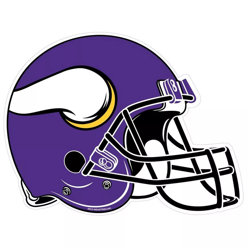
The helmets of the Minnesota Vikings club are definitely one of the coolest in the NFL in terms of colors and design. It is executed in sleek purple with a matte surface, and has two stylized white horns on the sides, coming out of two golden rings. It resembles the ancient helmets of the original Vikings, but the modern style and color scheme makes it look very progressive and memorable. The mask on the helmet is set in plain black, which adds seriousness and brutality.
Uniform

The official color palette of the Minnesota Vikings football club is composed of just three shades: purple, golden-yellow, and white. But the quantity means nothing here, as the shades work brilliantly together, creating a strong contrast and making the players stand out on the field. The primary uniform of the club features purple jerseys and white pants with yellow stripes and small elements, and the player’s numbers are set in white. The secondary option of the uniforms haswhite jerseys and purple pants, with the same yellow decorative elements. As for the alternate uniform of the Vikings, it is all purple with only yellow details.
Stadium
Logo
![]()
View

Since 2016 the Minnesota Vikings football club has been playing at the U. S. Bank Stadium, an arena, which is located in Minneapolis, that has a capacity of 72,711 seats.
Before moving to U. S. Bank Stadium, the Vikings used to play at Metropolitan Stadium for twenty years, starting from 1961, Hubert H. Humphrey Metrodome arena from 1982 to 2013, and for just one season in 2013 — 2014, at TCF Bank Stadium.
Minnesota Vikings Mascot
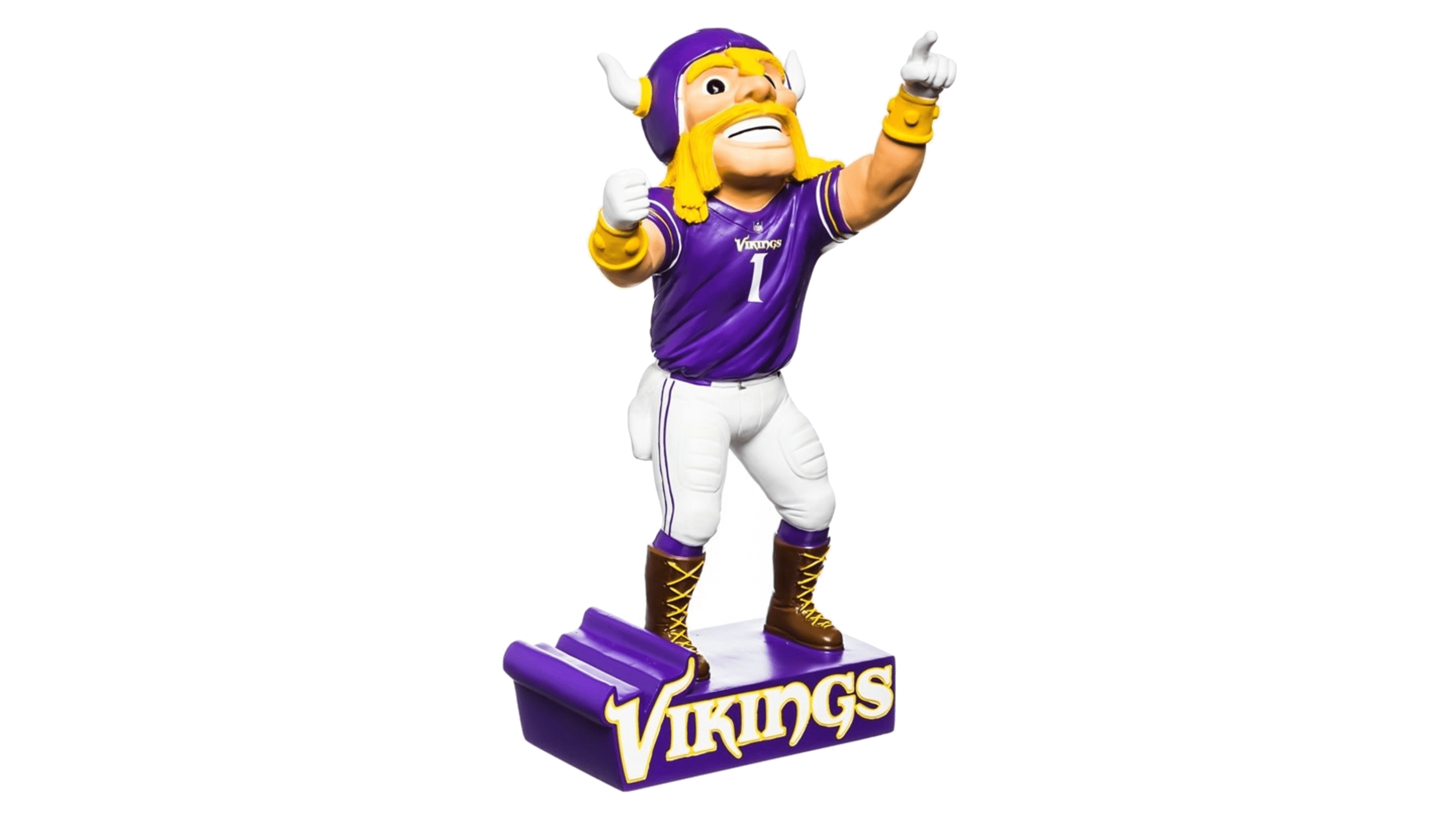
Throughout its long history, the Minnesota Vikings football team has had two official mascots — Ragnar the Viking, and the current one, Viktor the Viking. It is a smiling blonde Viking in a traditional helmet with two horns, wearing the team’s uniform, consisting of a purple jersey with the number “1” on the chest, and white pants. The helmet is not the only Viking attribute: the mascot also wears high-laced leather boots.
Anniversary Logos
The Minnesota Vikings football club was established in 1960, as many other NFL teams. Hence, the club has had quite a significant amount of anniversaries today. And for each of them, the designers did create special celebration badges.
1985
![]()
For the 25th season of the club, the logo was set in a gray and purple color palette, with the white Vikings emblem on it it was a classic circular medallion with a gray background and purple frame, accompanied by purple digits and lettering.
1989
![]()
The color palette of the 20th-anniversary emblem was already more intense and delightful — blue and golden-yellow. The medallion was underlined by a rectangular banner with the “40 For 70” inscription. As for the main element, the coin, its central part only contained the emblem of the club, while all the lettering was written around the golden frame of the logo.
1995
![]()
For the 35th anniversary, in 1995, the logo of the Vikings was drawn in a new, triangular shape. That was a crest, formed by two overlapping triangles pointing down, inserted in a white ring with the blue and yellow “35” on it. The emblem of the club was drawn on top of the composition, it the blue, white, and yellow color palette.
2000
![]()
In 2000, for the 40th season of the club, the logo was drawn more ornately. A wide crest with an arched top border was executed in a dark yellow and blue color palette, with the white rays coming from the center point behind the Viking’s head. The dates were written on the sides from the emblem, and the celebration lettering — on a solid blue ribbon, which was stretched under the banner.
2010
![]()
The emblem, designed for the celebration of the 50th anniversary of the club featured the shape of a Viking ship, with a solid purple body and a striped yellow and white sail. On the sail, there was a bold purple “50”, while the emblem of the Vikings was overlapping the ship in the middle. The dates were written in white on the sides of the emblem.
2020
![]()
For the 60th anniversary of the Minnesota Vikings football team, the logo was introduced in 2020. It was a classy and elegant badge in the shape of a roundel standing on a horizontally stretched ribbon. Both elements were set in a gradient purple and yellow color palette. The central part of the medallion was taken by the glossy golden “60 Seasons” lettering, while the emblem of the club was pretty small, and set at the bottom of the composition.
Minnesota Vikings Colors
PURPLE
PANTONE: PMS 268 C
HEX COLOR: #4F2683;
RGB: (79, 38, 131)
CMYK: (82, 100, 0, 12)
GOLD
PANTONE: PMS 123 C
HEX COLOR: #FFC62F;
RGB: (255, 198, 47)
CMYK: (0, 23, 91, 0)
What does the Minnesota Vikings logo mean?
The logo of the Minnesota Vikings professional football club depicts a yellow-hair Viking in a yellow and purple helmet with two horns. There are no hidden meanings in this badge, and it only graphically represents the name of the club, its character, and its energy.
Why are the Minnesota Vikings called the Vikings?
Minnesota is one of the states of the USA, which was founded by Scandinavian people, so to reflect the historical legacy of the state, the professional football club from Minnesota adopted the Vikings name in 1960. The “Vikings” is not only the representation of the Minnesota background but also a symbol of strength and determination.
Who designed the Vikings logo?
The original version of the Minnesota Vikings was designed in 1961 by Karl Hubenthal, who created a powerful image of a Viking in profile, turned to the left, with his hair and helmet yellow, and long massive mustache — white. The logo of the club was redesigned only twice throughout the years, with the initial concept remaining untouched, but the color palette and the contours were cleaned up and strengthened.
How many Vikings are in the Hall of Fame?
Minnesota Vikings is a very strong member of the National Football League. The club was established at the beginning of the 1960s, and since then has sent twenty-two players to the Hall of Fame. The “oldest” Hall of Fame member of the club is Fran Tarkington, inducted in 1987, and the “youngest”’one is Steve Hutchinson, with his induction in 2020.


