

![]() Oakland Raiders Logo PNG
Oakland Raiders Logo PNG
Although the Oakland Raiders logo has been tweaked several times, it has always stayed consistent in its main part – the depiction of a pirate’s face.
Meaning and history
![]()
Oakland Raiders is one of the steams, which have been very constant and stable with its visual identity design throughout the club’s history. Though the team was moving from Oakland to Los Angeles, then back, and then to Las Vegas, and changed its name four times, the logo stayed almost untouched.
What are Oakland Raiders?
Oakland Raiders is the name of a professional football club from the United States, which was established in 1960, and today plays in the West Division of the National Football League. The club has Allegiant Stadium in Las Vegas, Nevada, as its home arena, and Josh McDaniels as the head coach.
1960 — 1962
![]()
The original logo for the Raiders featured a monochrome portrait of a modern pirate, placed on a yellow vertically located football with two crossed sabers on the background. The man had one of his eyes covered and was wearing a leather black helmet. The yellow color of the football was balanced by sabers’ handles, drawn in the same color with an addition of black.
1963
![]()
The emblem, introduced in 1963, had its shape switched from Ivan to a crest-like, with the sharp top part. The color palette of the logo was changed to silver-gray and black, where the pirate’s head and two sabers were set on a light gray background of the shield, outlined in black. The top part of the badge was colored black and had a two-leveled wordmark on it — the small arched “The Oakland” and the bold enlarged “Raiders” in a clean strict sans-serif.
1964 — 1981
![]()
The lettering In the badge was shortened to “Raiders” and the background of the crest turned all black in 1964. The black leather helmet of the pirate was replaced by a gray one, with a thick black stripe in the middle. The Sabers on this version were a bit shorter than on the previous ones.
1982 — 1994
![]()
The club moves to Los Angeles and changes its name in 1982, though the emblem remains untouched, as it had no geographical marks on it, so the black and gray crest with a modern pirate on it stays with Los Angeles Raiders for another decade.
1995 — 2019
![]()
In 1995 the team comes back home, to Oakland, and keeps using the previous logo without any changes. The image with a traditional shield shape and a contemporary portrait on it became iconic and instantly recognizable by people all over the globe.
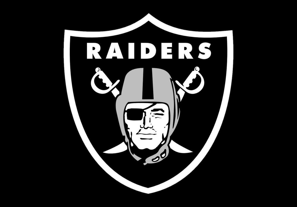
2020 — Today
![]()
The Raiders relocate to Las Vegas at the end of 2019, changing their name to Las Vegas Raiders, but keeping their iconic emblem almost untouched. The color palette was slightly switched, by adding a darker shade of gray to the pirate’s helmet, another minor change of 2020 was an addition of a thick white frame to the Raiders’ crest.
Font
![]()
The bold sans-serif all-cap font featured in the current wordmark looks solid and highly legible.
Color
![]()
The color scheme is pretty simple and includes only three colors: white, black, and a light shade of grey.
Oakland Raiders Colors
RAIDERS BLACK
PANTONE: PMS BLACK 6 C
HEX COLOR: #000000;
RGB: (0, 0, 0)
CMYK: (0, 0, 0, 100)
RAIDERS SILVER
PANTONE: PMS 8180 C
HEX COLOR: #A5ACAF;
RGB: (165, 172, 175)
CMYK: (50, 38, 32, 2)
What does the Oakland Raiders logo represent?
The Oakland Raiders logo depicts a portrait of a pirate wearing a raiders helmet, accompanied by two cross sabers. The image brilliantly represents the name of the club and has stayed with the professional team for decades, since its introduction in 1960.
Who is the guy on the Raiders logo?
The man from the logo of the Oakland Raiders was modeled after American film actor Randolph Scott. His face became the face of the iconic raider pirate, which has been a symbol of the club since the beginning of the 1960s.
Will the Raiders change their logo?
The Oakland Raiders haven’t changed the main part of their logo since 1960. The surrounding, color palette, and shape of the background have been changed several times, but with no dramatic switches. And the club is not going to change its iconic badge with the image of a raider pirate on it.
Why is the Raiders logo a pirate?
The logo of the Oakland Raiders has contained an image of a pirate in a raider’s helmet since 1960. The portrait, modeled from the face of the famous American actor Randolph Scott has become a symbol of the club, and the essential inevitablepart of its identity.


