

![]() Atlanta Falcons Logo PNG
Atlanta Falcons Logo PNG
The Atlanta Falcons logo is a remarkable example of visual consistency. The side view of the falcon bird has always been the one and only visual center of the logotype.
Meaning and history
![]()
Atlanta Falcons boasts one of the most stylish and exquisite logo designs in American football history. Its brutal geometric badge was first introduced in 1967, and for the first years it was slightly resembling a Nazi symbol is, but after two redesigns and refinement, the badge became an extremely elegant and chic representation of the power and confidence of the club.
What are Atlanta Falcons?
Atlanta Falcons is the name of a professional football club in the United States, which was established in 1965 in Atlanta, Georgia. Today the club competes in the National Football League, has Arthur Smith as the head coach, and Mercedes-Benz Stadium as the home arena.
1966 — 1989
![]()
The very first badge of Atlanta Falcons featured a monochrome geometric image of a flying bird with a flattened straight top line of the wings. The black falcon with white strapped on its solid large wings was outlined in thick white and very thin red frames, which added a sense of style and elegance.
1990 — 2002
![]()
With the redesign of 1990, the club removed the red color from its official palette, switching the logo completely to a monochrome combination and even changing its iconic red helmets to black ones. It was a decade without any bright details on the powerful and masculine falcon badge, which started looking even more dangerous and evil.
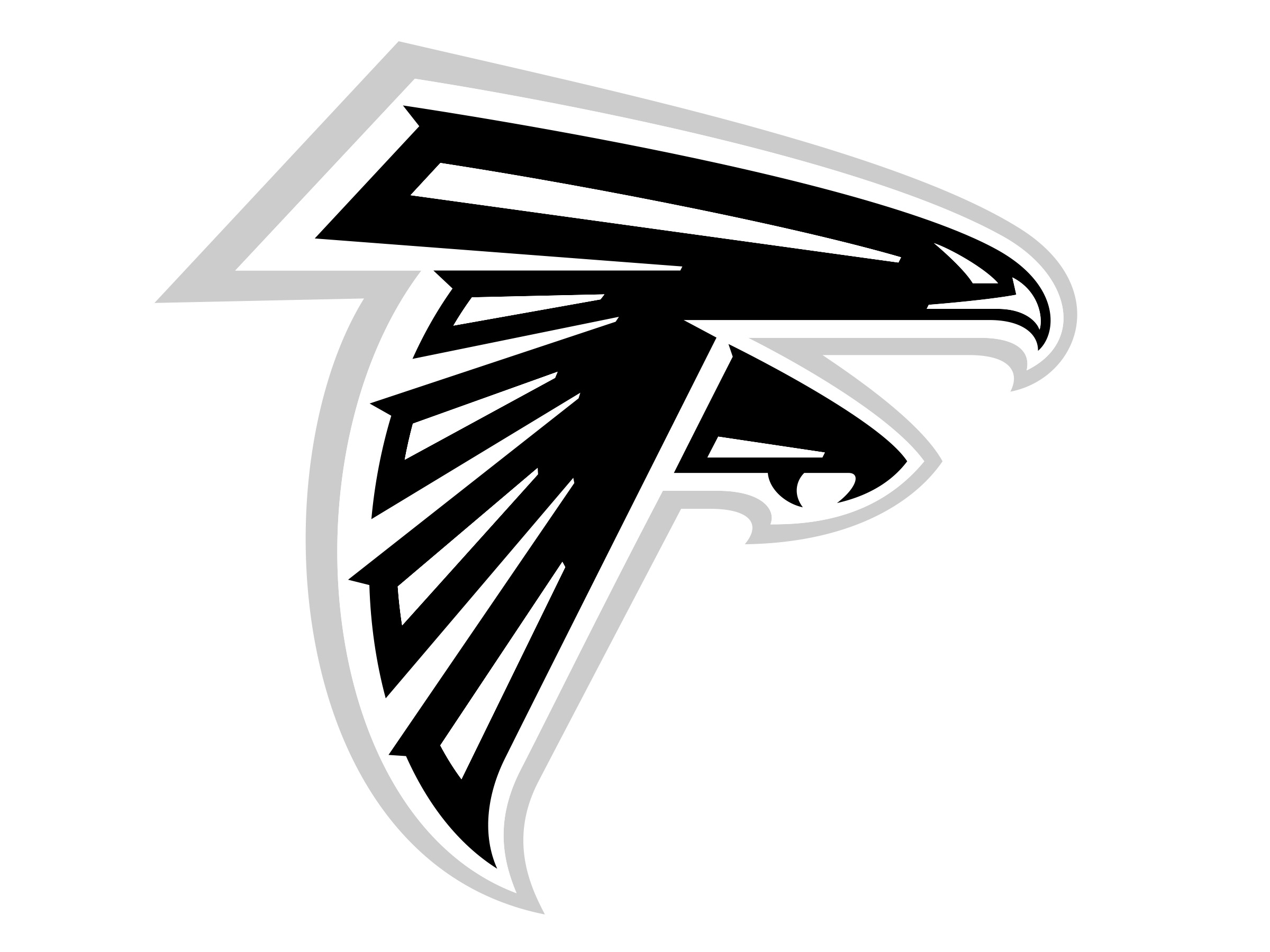
2003 — Today
![]()
The logo was redrawn in 2003, by changing the contours and adding red color to the falcon’s body and wings. The burst is now executed in smooth rounded shapes with sharp angles, forming the beak, claws, and edges of the bird’s wings, which are slightly elongated and pointed, looking elegant and even playful.

A triangular red line is now added to each of the emblem’s elements, making the pattern striped and the color contrast — smoother yet more intense. White is almost gone from the image itself, staying only in the falcon’s eyes and beak, and fully moving to the badge’s background, which is outlined in thick gray.
Font
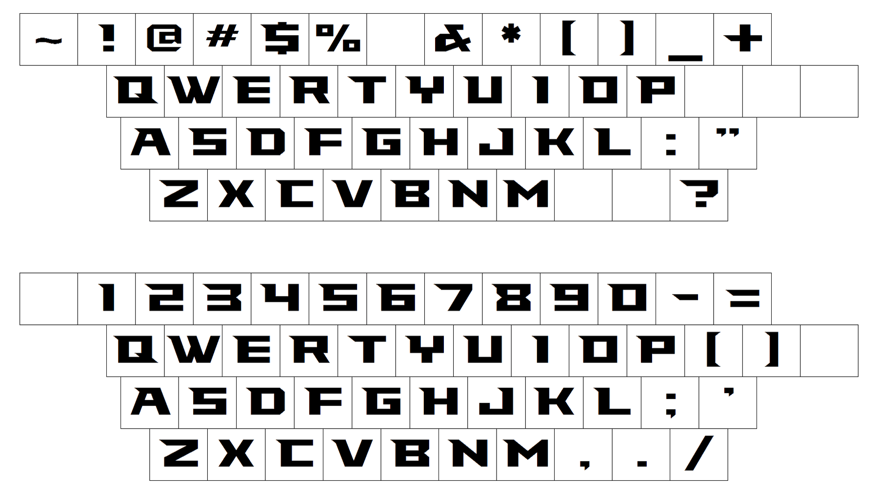
The typeface is a custom one. It was created specifically for the football team and named the Falcons font in its honor. The sharp elements on some of the letters arguably resemble the bird’s beak.
Color
![]()
Each of the colors included into the team’s official palette (black, red, silver, and white) can be spotted on its logotype.
Atlanta Falcons Colors
RED
PANTONE: PMS 187 C
HEX COLOR: #A71930;
RGB: (167, 25, 48)
CMYK: (20, 100, 80, 0)
BLACK
HEX COLOR CODE: #000000;
RGB: (0, 0, 0)
CMYK: (70, 50, 50, 100)
PANTONE: PMS BLACK 6 C
SILVER
PANTONE: PMS 877 C
HEX COLOR CODE: #A5ACAF;
RGB: (165, 172, 175)
CMYK: (5, 0, 0, 25)


