

![]() Green Bay Packers Logo PNG
Green Bay Packers Logo PNG
The Green Bay Packers are an American football team competing in the NFL. The club is a member of the national Football Conference North Division. The club was founded in 1919.
Meaning and history
![]()
The minimalist Green Bay Packers logo we all can see today was created in the 1960s, but it was not the first attempt of the club to find its perfect visual identity design. Before adopting the current emblem, the team had four experiments, which all featured various styles and executions, though were connected by the green color as the main in the palette.
What are Green Bay Packers?
Green Bay Packers is the name of a professional football club in the United States, which was established in 1919. Today the club plays in the North Division of the National Football League, has Lambeau Field in Green Bay, Wisconsin, as its home arena, and Matt LaFleur as the head coach.
1921 — 1936
![]()
The football club was established in 1921 under the name ACME Packers, and its first logo, introduced in the same year, was composed of strict bold lettering set in two levels, with both parts in yellow with a thick green outline. The clean and neat lines of the inscription were balanced by a dark outline, which added a sense of confidence and solidness.
1937 — 1955
![]()
The team was renamed Green Bay Packers in 1937, and the need for the new emblem appeared, so the square bold “GB” monogram was introduced by the club. The lettering was executed in a geometric typeface with the contour of the “G” horizontally stretched, and the “B” — narrowed. The color palette of the new logo consisted of dark blue for the body of the letters, and light gray for the outline.
1951 — 1955
![]()
The new color palette was introduced with the new logo in 1951. The bold sans-serif “Packers” wordmark in all capitals had its first letter enlarged. The inscription was executed in dark green with a thin yellow outline and placed on a background with a red and yellow football, which was located slightly diagonally. Four thin cross-like stars in red were placed from both sides of the ball, balancing the colors of the logo.
1955 — 1961
![]()
The redesign of 1955 drought another image to Green Bay Packers. It was a vertically placed yellow football with a green silhouette of Wisconsin State on it. The football player in a yellow uniform with green accents was placed on a green background, with the yellow football in his hand. It was a delightful and memorable logo, which stayed with the club for only six years.
There was also a secondary version of the emblem, used by Green Bay Packers over this period — the running football player in a green and yellow uniform was located on a green background, repeating the Wisconsin contours.
1961 — 1979
![]()
The logo, introduced by the club in 1961 was something completely different and new. The clean minimalist badge featured a horizontally oriented dark green oval with a white capitalized “G” placed on it repeating its perimeter. The letter was executed in a clean and bold sans-serif typeface with its contours neat and sleek. The dark shade of green on the new emblem is a reflection of Green Bay Packers’ growth and success, while white stands for the club’s loyalty to its fans.
1980 — Today
![]()
With the redesign of 1989, the laconic Green Bay Packers emblem gained a new color. The horizontal oval is now outlined in yellow, which resembles the first logo versions of the club and adds a sense of energy and happiness to the overall composition. Though the club keeps using its previous badge (with no outline) for its helmets.
Shape
![]()
The current primary Green Bay Packers logo is that same white “G” on that same green oval background, except it is lined with a yellow border. Most likely, it was added because this logo appears on the players’ helmets. This logo version was accepted in 1980 and is in use so far.
Colors
![]()
The logo uses dark green, yellow, and white – a combination, which expresses perseverance, eagerness to win, excellence, and strength. The yellow line exerts a kind of encouraging effect and has motivating power.
Font
The alternate Green Bay Packers logo is a yellow square featuring the primary logo and the “Packers” wordmark beneath, which is written in a stencil font.
Green Bay Packers Helmet
The design of the Green Bay Packers helmets is very strong and distinctive, due to the use of contrasting colors and clean shapes of the elements. The solid yellow helmets have green and white stripes coming through their central part, accompanied by the emblem of the team, placed on the sides. The emblems feature a wide capital “G” inscribed into a solid green oval. The green is also used for the grille of the helmet.
Stadium
Logo
![]()
View
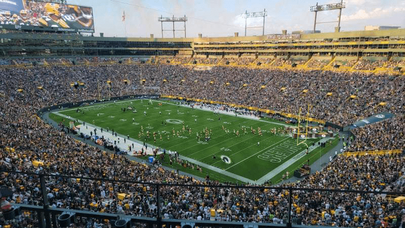
The home ground of the Green Bay Packers Football Club is the Lambeau Field, a stadium in Wisconsin, which opened its doors in 1957. The stadium was originally named New City Stadium but was renamed in 1965 in honor of Packers founder, player, and head coach Earl Curly Lambeau. The Lambeau Field was renovated three times throughout the years, and its capacity was also expanded several times, reaching 81,4 thousand seats today.
Uniform
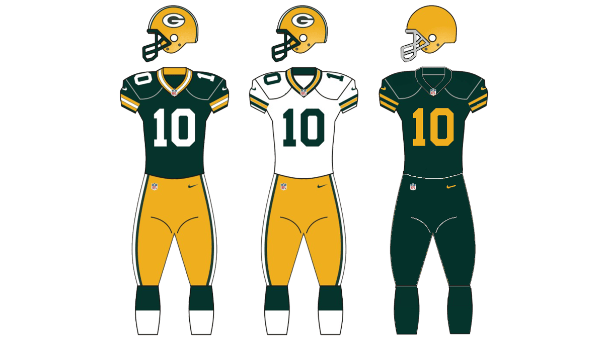
All three uniforms of the Green Bay Packers players are executed in the official team’s color palette, composed of green, yellow, and white. The color version of the uniform consists of green jerseys with yellow and white details along the collar and the sleeves, and yellow pants with green and white side stripes, the set is accompanied by green and white gaiters. The white uniform of the club features the same yellow pants and green and white gaiters, but the jerseys are white with green and yellow detailing. There is also the alternate uniform, which is solid green with yellow stripes and numbers on the jerseys.
Green Bay Packers Anniversary Logo of 1993
![]()
For the 75th season of the team, the anniversary logo for the Green Bay Packers was introduced in 1993. It was a green triangular crest pointing down, crossed by a narrow yellow ribbon with the green uppercase lettering on it. The body of the crest has yellow strokes in the upper corners and a diamond-shaped frame around the enlarged “75” set in light gray with a medium-thick white outline. It was a very strong and contrasting badge, which evoked a sense of power and determination.
Green Bay Packers Colors
DARK GREEN
PANTONE: PMS 5535 C
HEX COLOR: #203731;
RGB: (24, 48, 40)
CMYK: (79, 34, 62, 84)
GOLD
PANTONE: PMS 1235 C
HEX COLOR: #FFB612;
RGB: (255, 184, 28)
CMYK: (0, 31, 98, 0)
What does the Green Bay Packers logo mean?
The minimalistic and stylish logo of the Green Bay Packers club is based on a stylized horizontally stretched letter “G”, which is the first letter of the club’s name, and its main signifier. The distinctive contours of the letter and the intense color palette of the badge represent the club’s determination, power, and energy.
Where did the Green Bay Packers logo come from?
The first version of the current Green Bay Packers logo was introduced at the very beginning of the 1960s, created by Gerald Brashier and John Gordon. Brashier was the manager of the club, and the author of the initial idea, and Gordon was a famous designer, who turned the thoughts of the manager into a graphical symbol, which has become iconic throughout the years.
When did the Packers change from blue to green?
The blue and gray badge was used by the Greek Bay Packers for more than a decade — from 1937 to 150, and was replaced by a green and orange badge in 1951. This redesign was held by the club after Curly Lambeau has left it. So the change of the palette has a double meaning for the Packers.


