When the team started their career in 1960, fans knew them as the Houston Oilers as their location was in Houston, Texas. The relocation to Tennessee led to the change of the name. So in 1997 they became the Tennessee Oilers and since 1999 the club has been known as Tennessee Titans.
Meaning and history
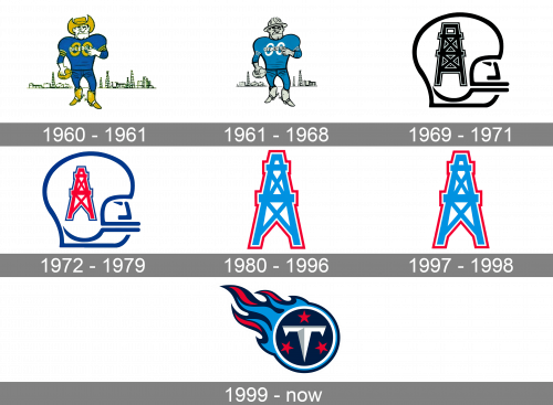
The Tennessee Titans logo history is inseparably connected with the history of the team. It also reflects the local peculiarities. The Titans have had several logos that have undergone different modifications, from minor to substantial. On the whole, their collection of primary logos includes seven emblems.
What are Tennessee Titans?
Tennessee Titans arethe name of a professional football club in the United States, which was established in 1959 in Nashville, Tennessee. Today the club competes in the National Football League, has Nissan Stadium as the home arena, and Mike Vrabel as the head coach.
1960 – 1961
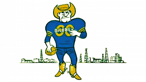
When the Houston Oilers appeared on the football field for the first time, their emblem represented a man that looked like both a football player and a cowboy for he was wearing a cowboy hat and a uniform and holding a football. The color scheme included blue (the uniform) and gold (the hat and the boots). There were oil derricks in the background.
Later a few minor changes were made including an alteration in the color scheme. Thus, the gold color was eliminated.
1961 – 1968
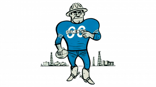
In 1961, they decided to change the coloring of their human mascot, in addition to several more things. The color scheme generally changed to light blue and white. Moreover, the cowboy head became a safety helmet (while the boots remained as they were). There are also fewer structures in the background in this edition.
1969 – 1971
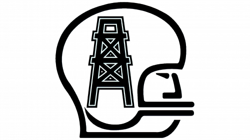
A totally new symbol replaced the old logo in 1969. It was a silhouette of a football player’s helmet outlined with a thick black line and an oil derrick on the helmet.
1972 – 1979
In 1972 the oil derrick changed its color from black to red and got a blue boarder. The helmet was outlined with a blue line.
1980 – 1996
The Oilers’ logo introduced in 1980 looked very simple and at the same time symbolic ‒ just an oil derrick in blue with a red outline against the white background. The club kept this laconic logo unchanged for 18 years, except the fact that the blue color became a little more saturated.
1997 – 1998
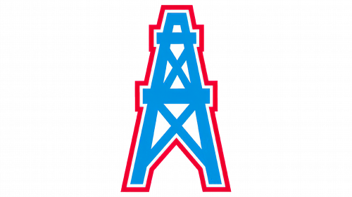
This next version is basically the same old tower, but with a slightly darker color scheme.
1999 – Today
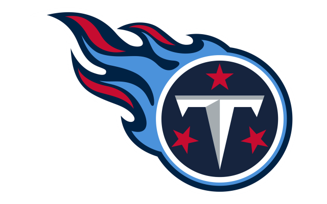
In 1999 the new nickname required an entirely new logo. The Tennessee Titans logo includes a white ring that symbolizes the sun with three stars inside placed against a dark blue background and a large letter “T” that reminds a sword. There is also fire which makes it look like a comet.
There have been some arguments as for the logo meaning. Thus, some people insist that the ring in the Tenn Titans logo is in fact a shield, and they are somewhat skeptical about it, saying that it symbolizes defense rather than attacking.
But what is evident for sure is the fact that the stars and the colors are the same as in the Tennessee flag.
Color
The team’s palette includes such colors as navy, Titans blue, red, metallic silver and white.
What does the Tennessee Titans logo mean?
The bright and powerful Tennessee Titans logo depicts a contrasting roundel with the flame and a sharp letter “T” surrounded by three red five-pointed stars. The main element, the circle, is a symbol of the sun, while the “T” is the first letter of the club’s name, and the three stars represent the Tennessee State, as are also present on its flag. As for the flame, it is a tribute to the historical roots of the “Titans” name and the Greek mythology it comes from.
Did Tennessee Titans change their logo?
The Tennessee Titans club has never had its logo changed since 1999, when the team was renamed from Oilers. Although, before that the Oilers logo was being changed pretty often.
How is the Tennessee Titans logo related to Greek mythology?
The “Titans” part of the club’s name is a reference to Greek Mythology. As for the graphical connections, there are also some. First of all, the style the letter “T” on the logo is drawn in — as a weapon and the shield at the same time. Secondly, the Greek Mythology can be seen in the flame, which comes out of the roundel to the left.
Why is Tennessee called the Titans?
The “Tennessee” part of the club’s name doesn’t have to be explained, but the “Titans” one is not that obvious. The team got its name after its relocation to Nashville, Tennessee, and this city is also known as the “Athens of the South”. This is why the club decided to dig into the Greek part of its history, and found the Titan god the most suitable for its needs.
Tennessee Titans Colors
TITANS NAVY
HEX COLOR: #0C2340;
RGB: (12, 35, 64)
CMYK: (100, 76, 12, 70)
PANTONE: PMS 289 C
TITANS BLUE
HEX COLOR: #4B92DB;
RGB: (75, 146, 219)
CMYK: (66, 33, 0, 14)
PANTONE: PMS 279 C
TITANS RED
HEX COLOR: #C8102E;
RGB: (200, 16, 46)
CMYK: (2, 100, 85, 6)
PANTONE: PMS 186 C
TITANS SILVER
HEX COLOR: #8A8D8F;
RGB: (138, 141, 143)
CMYK: (45, 34, 34, 0)
PANTONE: PMS 877 C
WOLF GREY
HEX COLOR: #A2AAAD;
RGB: (162, 170, 173)
CMYK: (21, 11, 9, 23)
PANTONE: PMS 429 C
STEEL GREY
HEX COLOR: #54585A;
RGB: (84, 88, 90)
CMYK: (48, 29, 26, 76)
PANTONE: PMS 425 C


